Willkommen bei den Top‑Schriften – hier treffen Beliebtheit und Qualität aufeinander. Das sind die in diesem Jahr am häufigsten heruntergeladenen und genutzten Fonts. Wenn Sie sichere Optionen für Logo, Web oder Social suchen, starten Sie hier.
Jeder Top‑Font überzeugt durch Balance, Lesbarkeit und Vielseitigkeit. Sie finden moderne Sans‑Serifs, elegante Scripts, Vintage‑Serifs und minimalistische Displays.
-
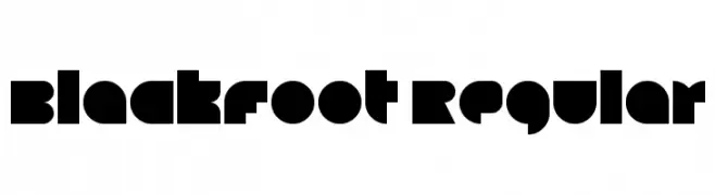
( Fonts by Jamie Place [FontBlast Design] - Personal-use only. For commercial use please contact owner. )
A bold, geometric font with strong, angular shapes and a modern aesthetic.
 Herunterladen 233 Downloads@WebFont
 -
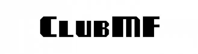
( Fonts by Rick Mueller )
A bold, geometric font with sharp, angular edges.
![ClubMF Frei Schriftart Herunterladen]() Herunterladen 233 Downloads@WebFont
Herunterladen 233 Downloads@WebFont -
![Airplanes in the Night Sky Frei Schriftart Herunterladen]() Herunterladen 233 Downloads@WebFont
Herunterladen 233 Downloads@WebFont -
![SamtolAmritLight Bold Frei Schriftart Herunterladen]() Herunterladen 233 Downloads@WebFont
Herunterladen 233 Downloads@WebFont -
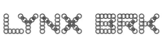
( Fonts by www.aenigmafonts.com )
A decorative font made of interconnected circles, offering a playful and modern look.
![LYNX BRK Frei Schriftart Herunterladen]() Herunterladen 233 Downloads@WebFont
Herunterladen 233 Downloads@WebFont -
-
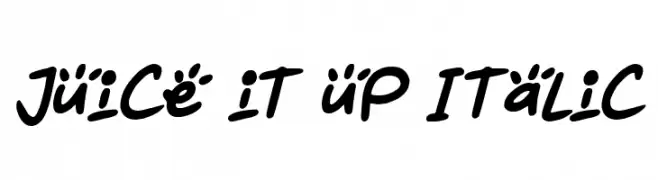
( Fonts by Darrell Flood )
A playful, handwritten font with bold, rounded strokes and a dynamic slant.
![Juice it up Italic Frei Schriftart Herunterladen]() Herunterladen 233 Downloads@WebFont
Herunterladen 233 Downloads@WebFont -
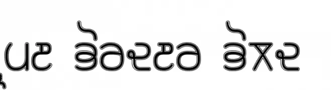
( Please check the owner website: http://www.billie.grosse.is-a-geek.com )
A bold, decorative font with a double-line effect and artistic curves.
![Rupe Border Bold Frei Schriftart Herunterladen]() Herunterladen 233 Downloads@WebFont
Herunterladen 233 Downloads@WebFont -
![Flooke Kana Frei Schriftart Herunterladen]() Herunterladen 233 Downloads@WebFont
Herunterladen 233 Downloads@WebFont -
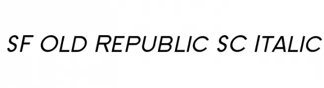
( Fonts by ShyFonts )
A modern, italicized font with sleek, dynamic characters.
![SF Old Republic SC Italic Frei Schriftart Herunterladen]() Herunterladen 233 Downloads@WebFont
Herunterladen 233 Downloads@WebFont -
( www.behance.net/SRCDesigns )
A playful, handwritten font with a casual and friendly style.
![Fruit Sale Frei Schriftart Herunterladen]() Herunterladen 233 Downloads@WebFont
Herunterladen 233 Downloads@WebFont


Welche Schriften sind gerade am populärsten?
Poppins, Roboto, Montserrat, Open Sans und Lato sind wegen ihrer klaren Formen und breiten Einsetzbarkeit sehr gefragt – von Markenauftritt über Landingpages bis hin zu Postern.
Welche Fonts eignen sich für Logos?
Geometrische Sans‑Serifs (z. B. Poppins, Familien im Gotham‑Stil) sind ein häufiger Griff für sauberes, skalierbares Branding. Für eine persönlichere Note bleiben Scripts und Handschrift‑Stile beliebt. Kombinieren Sie einen prägnanten Headline‑Font mit einer neutralen Brotschrift für Wiedererkennung und Harmonie.
Wie oft wird die Top‑Liste aktualisiert?
Regelmäßig – basierend auf realen Downloads und Interaktionen. Schauen Sie öfter vorbei, um aufstrebende Favoriten früh zu entdecken.
💡 Tipp: Seite bookmarken – Trends wechseln schnell, und heutige Top‑Schriften inspirieren morgen vielleicht das Rebranding.