Willkommen bei den Top‑Schriften – hier treffen Beliebtheit und Qualität aufeinander. Das sind die in diesem Jahr am häufigsten heruntergeladenen und genutzten Fonts. Wenn Sie sichere Optionen für Logo, Web oder Social suchen, starten Sie hier.
Jeder Top‑Font überzeugt durch Balance, Lesbarkeit und Vielseitigkeit. Sie finden moderne Sans‑Serifs, elegante Scripts, Vintage‑Serifs und minimalistische Displays.
-
 Herunterladen 233 Downloads@WebFont
 -
( Fonts by Yadhie Setiawan - typelinestudio.com - Personal-use only. For commercial use please contact owner. )
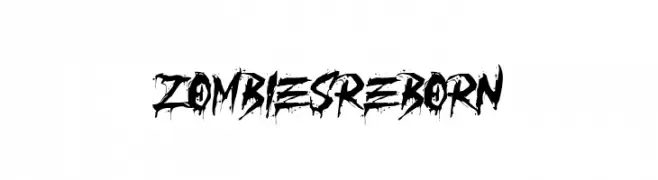
A bold, distressed font with a grungy, horror-themed aesthetic.
![ZOMBIES REBORN Frei Schriftart Herunterladen]() Herunterladen 233 Downloads@WebFont
Herunterladen 233 Downloads@WebFont -
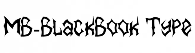
![MB-BlackBook Type Frei Schriftart Herunterladen]() Herunterladen 233 Downloads@WebFont
Herunterladen 233 Downloads@WebFont -
( !Exclamachine Type Foundry - exclamachine.com/ )
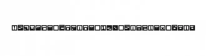
A bold, geometric font with characters enclosed in square outlines, offering a modern and mechanical look.
![!Square Engine 150 Simplex Bold Frei Schriftart Herunterladen]() Herunterladen 233 Downloads@WebFont
Herunterladen 233 Downloads@WebFont -
![invader Frei Schriftart Herunterladen]() Herunterladen 233 Downloads@WebFont
Herunterladen 233 Downloads@WebFont -
-
( Fonts by Kurnia Setyadi )
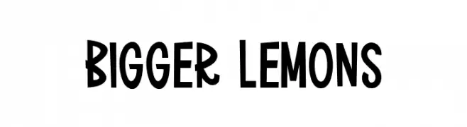
A playful and bold font with exaggerated curves and a whimsical style.
![Bigger Lemons Frei Schriftart Herunterladen]() Herunterladen 233 Downloads@WebFont
Herunterladen 233 Downloads@WebFont -
( JapanYoshi - Harry Wakamatsu - behance.net/japanyoshi )
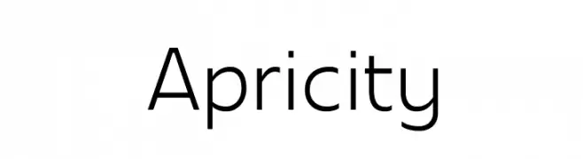
A modern, geometric sans-serif font with clean lines and uniform strokes.
![Apricity Frei Schriftart Herunterladen]() Herunterladen 233 Downloads@WebFont
Herunterladen 233 Downloads@WebFont -
( Fonts by Vunira Design )
Playful and casual handwritten font.
![Bluefish Frei Schriftart Herunterladen]() Herunterladen 233 Downloads@WebFont
Herunterladen 233 Downloads@WebFont -
( Måns Grebäck - www.mansgreback.com )
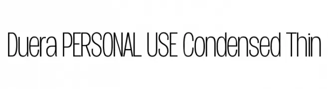
A modern, condensed, and thin font with a sleek and elegant design.
![Duera PERSONAL USE Condensed Thin Frei Schriftart Herunterladen]() Herunterladen 233 Downloads@WebFont
Herunterladen 233 Downloads@WebFont -
![Planetoid X Frei Schriftart Herunterladen]() Herunterladen 233 Downloads@WebFont
Herunterladen 233 Downloads@WebFont


Welche Schriften sind gerade am populärsten?
Poppins, Roboto, Montserrat, Open Sans und Lato sind wegen ihrer klaren Formen und breiten Einsetzbarkeit sehr gefragt – von Markenauftritt über Landingpages bis hin zu Postern.
Welche Fonts eignen sich für Logos?
Geometrische Sans‑Serifs (z. B. Poppins, Familien im Gotham‑Stil) sind ein häufiger Griff für sauberes, skalierbares Branding. Für eine persönlichere Note bleiben Scripts und Handschrift‑Stile beliebt. Kombinieren Sie einen prägnanten Headline‑Font mit einer neutralen Brotschrift für Wiedererkennung und Harmonie.
Wie oft wird die Top‑Liste aktualisiert?
Regelmäßig – basierend auf realen Downloads und Interaktionen. Schauen Sie öfter vorbei, um aufstrebende Favoriten früh zu entdecken.
💡 Tipp: Seite bookmarken – Trends wechseln schnell, und heutige Top‑Schriften inspirieren morgen vielleicht das Rebranding.