Willkommen bei den Top‑Schriften – hier treffen Beliebtheit und Qualität aufeinander. Das sind die in diesem Jahr am häufigsten heruntergeladenen und genutzten Fonts. Wenn Sie sichere Optionen für Logo, Web oder Social suchen, starten Sie hier.
Jeder Top‑Font überzeugt durch Balance, Lesbarkeit und Vielseitigkeit. Sie finden moderne Sans‑Serifs, elegante Scripts, Vintage‑Serifs und minimalistische Displays.
-
 Herunterladen 232 Downloads@WebFont
 -
( Fonts by Nick's Fonts )
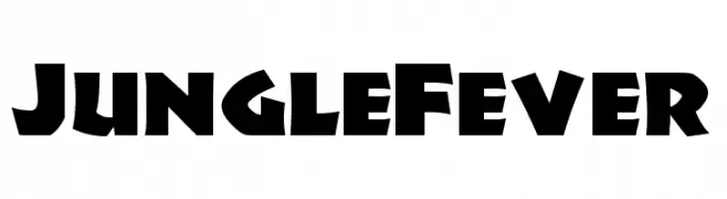
A bold, angular font with a playful, adventurous style.
![JungleFever Frei Schriftart Herunterladen]() Herunterladen 232 Downloads@WebFont
Herunterladen 232 Downloads@WebFont -
( Fonts by Mukhlis Muhammad - variatype.com - Personal-use only. For commercial use please contact owner. )
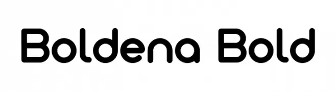
A bold, rounded sans-serif font with smooth curves and a modern look.
![Boldena Bold Frei Schriftart Herunterladen]() Herunterladen 232 Downloads@WebFont
Herunterladen 232 Downloads@WebFont -
( Fonts by Omega Font Labs )
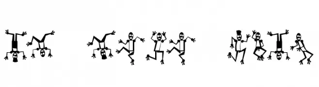
A playful, robot-themed decorative font with dynamic and whimsical character designs.
![Mr Robo Funk Frei Schriftart Herunterladen]() Herunterladen 232 Downloads@WebFont
Herunterladen 232 Downloads@WebFont -
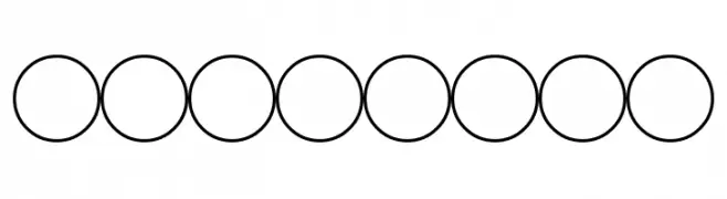
![Woolbats Frei Schriftart Herunterladen]() Herunterladen 232 Downloads@WebFont
Herunterladen 232 Downloads@WebFont -
-
![Abreviater Frei Schriftart Herunterladen]() Herunterladen 232 Downloads@WebFont
Herunterladen 232 Downloads@WebFont -
( Fonts by Mozatype - Personal-use only. For commercial use please contact owner. )
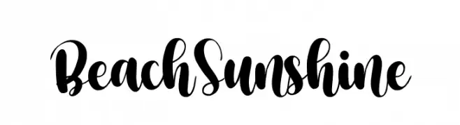
A lively and flowing script font with bold, sweeping strokes and elegant flourishes.
![Beach Sunshine Frei Schriftart Herunterladen]() Herunterladen 232 Downloads@WebFont
Herunterladen 232 Downloads@WebFont -
( Fonts by Allouse Studio - Personal-use only. For commercial use please contact owner. )
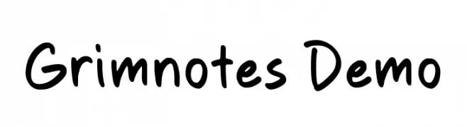
A playful, handwritten font with smooth, rounded strokes and a casual style.
![Grimnotes Demo Frei Schriftart Herunterladen]() Herunterladen 232 Downloads@WebFont
Herunterladen 232 Downloads@WebFont -
( Fonts by Daniel Zadorozny - www.iconian.com - Free for personal use )
A futuristic, italic font with bold, outlined characters and a tech-inspired design.
![Droid Lover Pro Italic Frei Schriftart Herunterladen]() Herunterladen 232 Downloads@WebFont
Herunterladen 232 Downloads@WebFont -
( Fonts by a Des Gomez. Personal-use only. For commercial use please contact owner. )
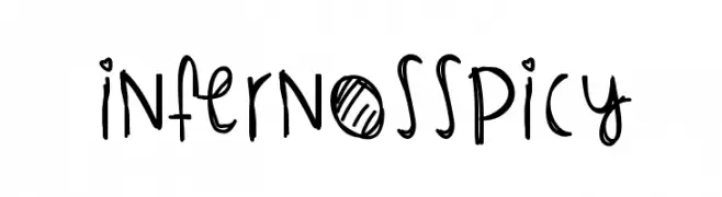
A playful, handwritten font with quirky, energetic characters.
![InfernosSpicy Frei Schriftart Herunterladen]() Herunterladen 232 Downloads@WebFont
Herunterladen 232 Downloads@WebFont

Welche Schriften sind gerade am populärsten?
Poppins, Roboto, Montserrat, Open Sans und Lato sind wegen ihrer klaren Formen und breiten Einsetzbarkeit sehr gefragt – von Markenauftritt über Landingpages bis hin zu Postern.
Welche Fonts eignen sich für Logos?
Geometrische Sans‑Serifs (z. B. Poppins, Familien im Gotham‑Stil) sind ein häufiger Griff für sauberes, skalierbares Branding. Für eine persönlichere Note bleiben Scripts und Handschrift‑Stile beliebt. Kombinieren Sie einen prägnanten Headline‑Font mit einer neutralen Brotschrift für Wiedererkennung und Harmonie.
Wie oft wird die Top‑Liste aktualisiert?
Regelmäßig – basierend auf realen Downloads und Interaktionen. Schauen Sie öfter vorbei, um aufstrebende Favoriten früh zu entdecken.
💡 Tipp: Seite bookmarken – Trends wechseln schnell, und heutige Top‑Schriften inspirieren morgen vielleicht das Rebranding.