Willkommen bei den Top‑Schriften – hier treffen Beliebtheit und Qualität aufeinander. Das sind die in diesem Jahr am häufigsten heruntergeladenen und genutzten Fonts. Wenn Sie sichere Optionen für Logo, Web oder Social suchen, starten Sie hier.
Jeder Top‑Font überzeugt durch Balance, Lesbarkeit und Vielseitigkeit. Sie finden moderne Sans‑Serifs, elegante Scripts, Vintage‑Serifs und minimalistische Displays.
-
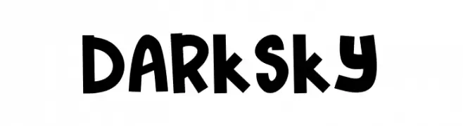
( Fonts by Docallisme HAS )
A playful, bold font with a hand-drawn, whimsical style.
 Herunterladen 234 Downloads@WebFont
 -
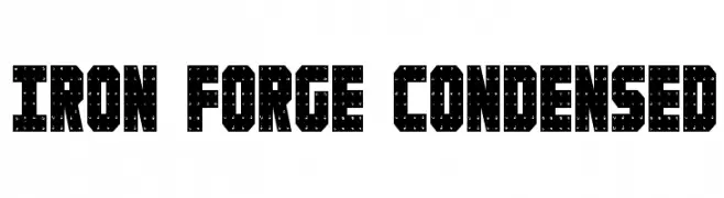
( Fonts by Daniel Zadorozny - www.iconian.com )
A bold, industrial font with a dotted, textured design and condensed width.
![Iron Forge Condensed Frei Schriftart Herunterladen]() Herunterladen 234 Downloads@WebFont
Herunterladen 234 Downloads@WebFont -
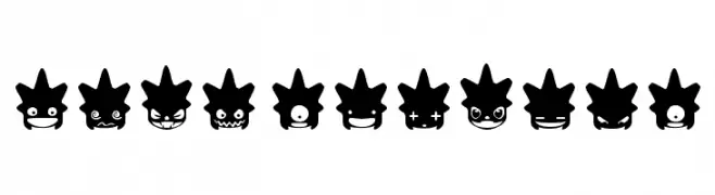
( Fonts by Maelle.K - Thomas Boucherie )
Expressive punk smiley faces form each character in a bold, decorative style.
![Punk Smileys Frei Schriftart Herunterladen]() Herunterladen 234 Downloads@WebFont
Herunterladen 234 Downloads@WebFont -
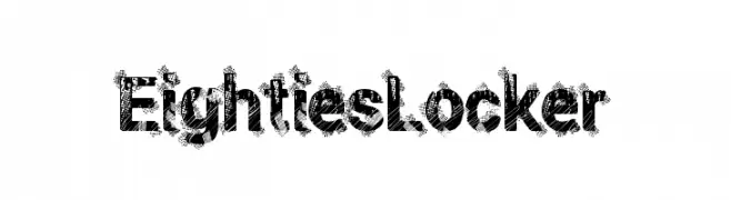
( Fonts by a Max Infeld - XEROGRAPHER FONTS - xerographer.blogspot.com . Personal-use only. For commercial use please contact owner. )
A bold, textured font with a distressed, 1980s-inspired style.
![EightiesLocker Frei Schriftart Herunterladen]() Herunterladen 234 Downloads@WebFont
Herunterladen 234 Downloads@WebFont -
( Fonts by CannotIntoSpaceFonts - KineticPlasma Fonts - Personal-use only. For commercial use please contact owner. )
A modern, extended sans-serif font with a clean, minimalist design.
![Give A Hoot Light Extended Frei Schriftart Herunterladen]() Herunterladen 234 Downloads@WebFont
Herunterladen 234 Downloads@WebFont -
-
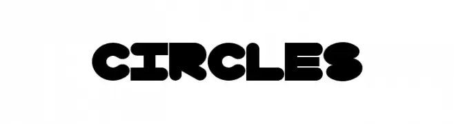
![Circles Frei Schriftart Herunterladen]() Herunterladen 234 Downloads@WebFont
Herunterladen 234 Downloads@WebFont -
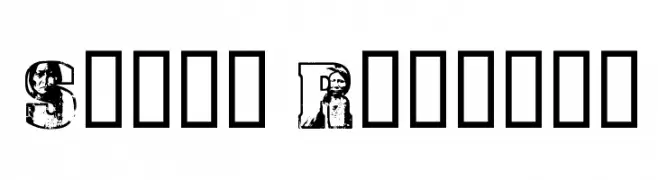
![Sioux Regular Frei Schriftart Herunterladen]() Herunterladen 234 Downloads@WebFont
Herunterladen 234 Downloads@WebFont -
( Fonts by ToniStudio )
A flowing, cursive script font with elegant, connected characters.
![Advera Script Frei Schriftart Herunterladen]() Herunterladen 234 Downloads@WebFont
Herunterladen 234 Downloads@WebFont -
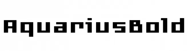
( Fonts by www.floodfonts.com )
A bold, pixelated font with a retro, digital aesthetic.
![AquariusBold Frei Schriftart Herunterladen]() Herunterladen 234 Downloads@WebFont
Herunterladen 234 Downloads@WebFont -
![5 Cent Game Regular Frei Schriftart Herunterladen]() Herunterladen 234 Downloads@WebFont
Herunterladen 234 Downloads@WebFont


Welche Schriften sind gerade am populärsten?
Poppins, Roboto, Montserrat, Open Sans und Lato sind wegen ihrer klaren Formen und breiten Einsetzbarkeit sehr gefragt – von Markenauftritt über Landingpages bis hin zu Postern.
Welche Fonts eignen sich für Logos?
Geometrische Sans‑Serifs (z. B. Poppins, Familien im Gotham‑Stil) sind ein häufiger Griff für sauberes, skalierbares Branding. Für eine persönlichere Note bleiben Scripts und Handschrift‑Stile beliebt. Kombinieren Sie einen prägnanten Headline‑Font mit einer neutralen Brotschrift für Wiedererkennung und Harmonie.
Wie oft wird die Top‑Liste aktualisiert?
Regelmäßig – basierend auf realen Downloads und Interaktionen. Schauen Sie öfter vorbei, um aufstrebende Favoriten früh zu entdecken.
💡 Tipp: Seite bookmarken – Trends wechseln schnell, und heutige Top‑Schriften inspirieren morgen vielleicht das Rebranding.