Willkommen bei den Top‑Schriften – hier treffen Beliebtheit und Qualität aufeinander. Das sind die in diesem Jahr am häufigsten heruntergeladenen und genutzten Fonts. Wenn Sie sichere Optionen für Logo, Web oder Social suchen, starten Sie hier.
Jeder Top‑Font überzeugt durch Balance, Lesbarkeit und Vielseitigkeit. Sie finden moderne Sans‑Serifs, elegante Scripts, Vintage‑Serifs und minimalistische Displays.
-
 Herunterladen 943 Downloads@WebFont
 -
( Fonts by arwah12 - Personal-use only. For commercial use please contact owner. )
An elegant script font with decorative loops and swashes.
![Hatachi Frei Schriftart Herunterladen]() Herunterladen 943 Downloads@WebFont
Herunterladen 943 Downloads@WebFont -
Schriftart von HammerBro101. For commercial use please contact the owner.
![New Super Koopa Bros Wii Regular Frei Schriftart Herunterladen]() Herunterladen 943 Downloads@WebFont
Herunterladen 943 Downloads@WebFont -
![Cobalt Alien Italic Frei Schriftart Herunterladen]() Herunterladen 943 Downloads@WebFont
Herunterladen 943 Downloads@WebFont -
( Copyright 2012 The Encode Project Authors (impallari@gmail.com), with Reserved Font Name "Encode Sansâ€. )
A bold, expanded sans-serif font with a modern and impactful style.
![Encode Sans Expanded Black Frei Schriftart Herunterladen]() Herunterladen 943 Downloads@WebFont
Herunterladen 943 Downloads@WebFont -
-
( Demo - www.joebob.nl )
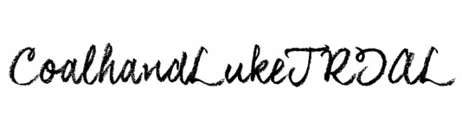
A textured, brush-like script font with a dynamic and expressive style.
![CoalhandLukeTRIAL Frei Schriftart Herunterladen]() Herunterladen 943 Downloads@WebFont
Herunterladen 943 Downloads@WebFont -
( Fonts by Geronimo Fonts - Personal-use only. For commercial use please contact owner. )
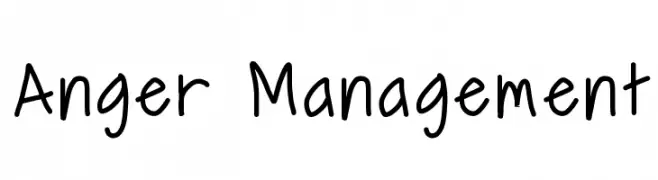
A playful, informal handwritten font with rounded edges and consistent strokes.
![Anger Management Frei Schriftart Herunterladen]() Herunterladen 943 Downloads@WebFont
Herunterladen 943 Downloads@WebFont -
( Fonts by John Isles )
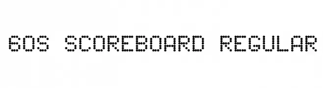
A dot matrix font with a retro, digital display aesthetic.
![60s Scoreboard Regular Frei Schriftart Herunterladen]() Herunterladen 943 Downloads@WebFont
Herunterladen 943 Downloads@WebFont -
( Fonts by Daniel Zadorozny - www.iconian.com )
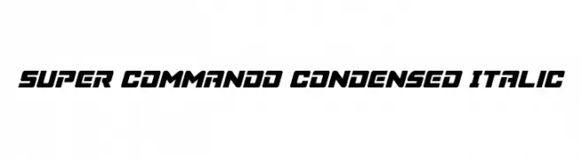
A bold, condensed italic font with a dynamic and futuristic style.
![Super Commando Condensed Italic Frei Schriftart Herunterladen]() Herunterladen 943 Downloads@WebFont
Herunterladen 943 Downloads@WebFont -
( Fonts by Galdino Otten - galdinootten.com )
A tall, narrow, and modern font with a sleek, minimalist design.
![Thin Design Frei Schriftart Herunterladen]() Herunterladen 943 Downloads@WebFont
Herunterladen 943 Downloads@WebFont -
( Fonts by Büro Sequenz )
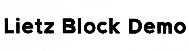
A bold, blocky typeface with strong, uniform characters ideal for impactful designs.
![Lietz Block Demo Frei Schriftart Herunterladen]() Herunterladen 943 Downloads@WebFont
Herunterladen 943 Downloads@WebFont -
( Fonts by Khrys Bosland )
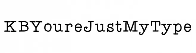
A vintage typewriter-style monospaced font with consistent stroke width and prominent serifs.
![KBYoureJustMyType Frei Schriftart Herunterladen]() Herunterladen 943 Downloads@WebFont
Herunterladen 943 Downloads@WebFont -
![25000 Frei Schriftart Herunterladen]() Herunterladen 943 Downloads@WebFont
Herunterladen 943 Downloads@WebFont -
( Fonts by www.kimberlygeswein.com - Kimberly Geswein )
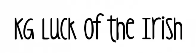
A playful, hand-drawn font with tall, narrow letters and rounded edges.
![KG Luck of the Irish Frei Schriftart Herunterladen]() Herunterladen 943 Downloads@WebFont
Herunterladen 943 Downloads@WebFont -
![Wasser Frei Schriftart Herunterladen]() Herunterladen 943 Downloads@WebFont
Herunterladen 943 Downloads@WebFont -
( Fonts by Mohammed Rahman )
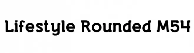
A rounded, bold font with a modern and approachable style.
![Lifestyle Rounded M54 Frei Schriftart Herunterladen]() Herunterladen 943 Downloads@WebFont
Herunterladen 943 Downloads@WebFont -
![WilhelmKlingsporGotisch Wd Frei Schriftart Herunterladen]() Herunterladen 943 Downloads@WebFont
Herunterladen 943 Downloads@WebFont -
![Yucatan Frei Schriftart Herunterladen]() Herunterladen 943 Downloads@WebFont
Herunterladen 943 Downloads@WebFont -
( Fonts by Blue Vinyl - Jess Latham - www.bvfonts.com )
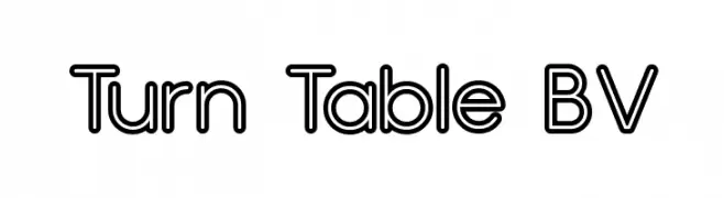
A bold, rounded outline font with a modern and playful style.
![Turn Table BV Frei Schriftart Herunterladen]() Herunterladen 943 Downloads@WebFont
Herunterladen 943 Downloads@WebFont -
( Fonts by Nick Curtis - www.nicksfonts.com )
A bold, decorative serif font with artistic flair and intricate details.
![ShangriLaNFSmallCaps Frei Schriftart Herunterladen]() Herunterladen 943 Downloads@WebFont
Herunterladen 943 Downloads@WebFont -
( Fonts by Gyom Seguin - last-soundtrack.daportfolio.com )
A modern, geometric font with clean lines and a minimalist style.
![THE MAPLE ORIGINS Frei Schriftart Herunterladen]() Herunterladen 943 Downloads@WebFont
Herunterladen 943 Downloads@WebFont -
( Fonts by Manfred Klein - manfred-klein.ina-mar.com )
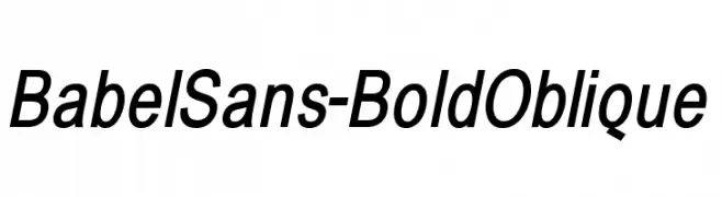
A bold, oblique sans-serif font with a modern and dynamic style.
![BabelSans-BoldOblique Frei Schriftart Herunterladen]() Herunterladen 943 Downloads@WebFont
Herunterladen 943 Downloads@WebFont -
![GM Exp Shadow Gravestone Frei Schriftart Herunterladen]() Herunterladen 943 Downloads@WebFont
Herunterladen 943 Downloads@WebFont -
![Nasal Frei Schriftart Herunterladen]() Herunterladen 943 Downloads@WebFont
Herunterladen 943 Downloads@WebFont -
( Fonts by Dibujado )
A playful, bold font with rounded edges and a bubbly appearance.
![Unocide Frei Schriftart Herunterladen]() Herunterladen 943 Downloads@WebFont
Herunterladen 943 Downloads@WebFont -
( Fonts by Fontfabric - Svetoslav Simov - Personal-use only. For commercial use please contact owner. )
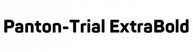
A bold, modern sans-serif font with geometric shapes and clean lines.
![Panton-Trial ExtraBold Frei Schriftart Herunterladen]() Herunterladen 942 Downloads@WebFont
Herunterladen 942 Downloads@WebFont -
( Fonts by Octotype - www.foundmyfont.com - Personal-use only. For commercial use please contact owner. )
A bold, flowing script font with elegant, cursive letterforms.
![TheScalphunters Frei Schriftart Herunterladen]() Herunterladen 942 Downloads@WebFont
Herunterladen 942 Downloads@WebFont -
( Fonts by dot colon - Personal-use only. For commercial use please contact owner. )
A modern sans-serif font with clean lines and excellent readability.
![Route159-Regular Frei Schriftart Herunterladen]() Herunterladen 942 Downloads@WebFont
Herunterladen 942 Downloads@WebFont -
( Zetafonts - www.zetafonts.com )
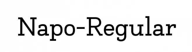
A modern serif font with balanced structure and elegant readability.
![Napo-Regular Frei Schriftart Herunterladen]() Herunterladen 942 Downloads@WebFont
Herunterladen 942 Downloads@WebFont -
( Måns Grebäck - www.mansgreback.com )
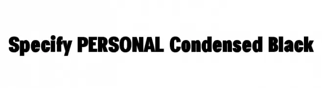
A bold, condensed font with a strong, modern style.
![Specify PERSONAL Condensed Black Frei Schriftart Herunterladen]() Herunterladen 942 Downloads@WebFont
Herunterladen 942 Downloads@WebFont -
( Khurasan - Syaf Rizal - creativemarket.com/khurasan?u=khurasan )
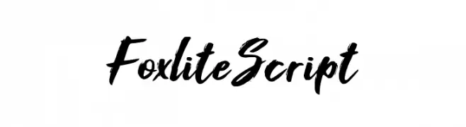
A bold, brush-style script font with dynamic, hand-drawn strokes.
![Foxlite Script Frei Schriftart Herunterladen]() Herunterladen 942 Downloads@WebFont
Herunterladen 942 Downloads@WebFont -
( Fonts by Iconian Fonts )
Bold, italicized font with a three-dimensional effect and strong presence.
![Governor Punch Italic Frei Schriftart Herunterladen]() Herunterladen 942 Downloads@WebFont
Herunterladen 942 Downloads@WebFont -
![WHISPERS CALLIGRAPHY_DEMO_essential_BOLD Frei Schriftart Herunterladen]() Herunterladen 942 Downloads@WebFont
Herunterladen 942 Downloads@WebFont -
( Fonts by www.typedepot.com )
A playful, dotted outline font with a hand-drawn, lively style.
![Afro House Frei Schriftart Herunterladen]() Herunterladen 942 Downloads@WebFont
Herunterladen 942 Downloads@WebFont -
( Fonts by www.blambot.com )
A bold, angular font with a dynamic, edgy style.
![KillCrazy BB Italic Frei Schriftart Herunterladen]() Herunterladen 942 Downloads@WebFont
Herunterladen 942 Downloads@WebFont


Welche Schriften sind gerade am populärsten?
Poppins, Roboto, Montserrat, Open Sans und Lato sind wegen ihrer klaren Formen und breiten Einsetzbarkeit sehr gefragt – von Markenauftritt über Landingpages bis hin zu Postern.
Welche Fonts eignen sich für Logos?
Geometrische Sans‑Serifs (z. B. Poppins, Familien im Gotham‑Stil) sind ein häufiger Griff für sauberes, skalierbares Branding. Für eine persönlichere Note bleiben Scripts und Handschrift‑Stile beliebt. Kombinieren Sie einen prägnanten Headline‑Font mit einer neutralen Brotschrift für Wiedererkennung und Harmonie.
Wie oft wird die Top‑Liste aktualisiert?
Regelmäßig – basierend auf realen Downloads und Interaktionen. Schauen Sie öfter vorbei, um aufstrebende Favoriten früh zu entdecken.
💡 Tipp: Seite bookmarken – Trends wechseln schnell, und heutige Top‑Schriften inspirieren morgen vielleicht das Rebranding.