Willkommen bei den Top‑Schriften – hier treffen Beliebtheit und Qualität aufeinander. Das sind die in diesem Jahr am häufigsten heruntergeladenen und genutzten Fonts. Wenn Sie sichere Optionen für Logo, Web oder Social suchen, starten Sie hier.
Jeder Top‑Font überzeugt durch Balance, Lesbarkeit und Vielseitigkeit. Sie finden moderne Sans‑Serifs, elegante Scripts, Vintage‑Serifs und minimalistische Displays.
-
( Fonts by www.junkohanhero.com - Personal-use only. For commercial use please contact owner. )
A bold, hand-drawn font with a rough, textured, graffiti-like style.
 Herunterladen 219 Downloads@WebFont
 -
( Fonts by PressGang Studios )
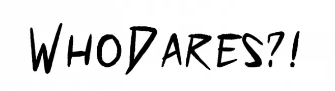
A bold, hand-drawn font with sharp, angular strokes and a dynamic, energetic style.
![Who Dares?! Frei Schriftart Herunterladen]() Herunterladen 219 Downloads@WebFont
Herunterladen 219 Downloads@WebFont -
![Droid Robot JapaneseRegular Frei Schriftart Herunterladen]() Herunterladen 219 Downloads@WebFont
Herunterladen 219 Downloads@WebFont -
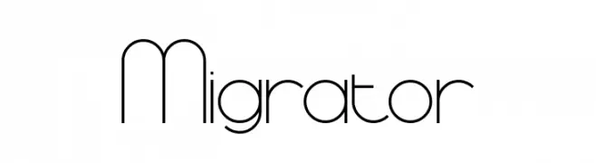
![Migrator Frei Schriftart Herunterladen]() Herunterladen 219 Downloads@WebFont
Herunterladen 219 Downloads@WebFont -
![Princess OT Frei Schriftart Herunterladen]() Herunterladen 219 Downloads@WebFont
Herunterladen 219 Downloads@WebFont -
-
( Fonts by Daniel Zadorozny - www.iconian.com - Free for personal use )
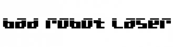
A bold, geometric font with a futuristic, digital aesthetic.
![bad robot laser Frei Schriftart Herunterladen]() Herunterladen 219 Downloads@WebFont
Herunterladen 219 Downloads@WebFont -
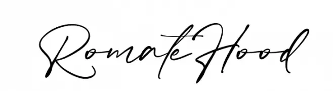
( Fonts by Vultype - Candra Hamdani - Personal-use only. For commercial use please contact owner. )
A dynamic and elegant handwritten font with fluid strokes.
![Romate Hood Frei Schriftart Herunterladen]() Herunterladen 219 Downloads@WebFont
Herunterladen 219 Downloads@WebFont -
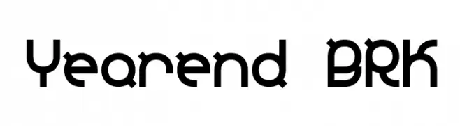
( Fonts by www.aenigmafonts.com )
A bold, geometric font with a modern, tech-inspired design.
![Yearend BRK Frei Schriftart Herunterladen]() Herunterladen 219 Downloads@WebFont
Herunterladen 219 Downloads@WebFont -
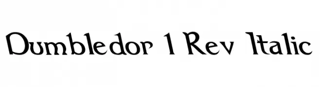
( Fonts by Graham Meade - GemFonts )
A whimsical, medieval-inspired font with italicized, angular serifs.
![Dumbledor 1 Rev Italic Frei Schriftart Herunterladen]() Herunterladen 219 Downloads@WebFont
Herunterladen 219 Downloads@WebFont -
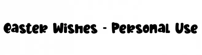
( Fonts by Stefani Letter )
A bold, playful font with rounded, hand-drawn style characters.
![Easter Wishes - Personal Use Frei Schriftart Herunterladen]() Herunterladen 219 Downloads@WebFont
Herunterladen 219 Downloads@WebFont

Welche Schriften sind gerade am populärsten?
Poppins, Roboto, Montserrat, Open Sans und Lato sind wegen ihrer klaren Formen und breiten Einsetzbarkeit sehr gefragt – von Markenauftritt über Landingpages bis hin zu Postern.
Welche Fonts eignen sich für Logos?
Geometrische Sans‑Serifs (z. B. Poppins, Familien im Gotham‑Stil) sind ein häufiger Griff für sauberes, skalierbares Branding. Für eine persönlichere Note bleiben Scripts und Handschrift‑Stile beliebt. Kombinieren Sie einen prägnanten Headline‑Font mit einer neutralen Brotschrift für Wiedererkennung und Harmonie.
Wie oft wird die Top‑Liste aktualisiert?
Regelmäßig – basierend auf realen Downloads und Interaktionen. Schauen Sie öfter vorbei, um aufstrebende Favoriten früh zu entdecken.
💡 Tipp: Seite bookmarken – Trends wechseln schnell, und heutige Top‑Schriften inspirieren morgen vielleicht das Rebranding.