Willkommen bei den Top‑Schriften – hier treffen Beliebtheit und Qualität aufeinander. Das sind die in diesem Jahr am häufigsten heruntergeladenen und genutzten Fonts. Wenn Sie sichere Optionen für Logo, Web oder Social suchen, starten Sie hier.
Jeder Top‑Font überzeugt durch Balance, Lesbarkeit und Vielseitigkeit. Sie finden moderne Sans‑Serifs, elegante Scripts, Vintage‑Serifs und minimalistische Displays.
-
( Fonts by Luke Owens - Personal-use only. For commercial use please contact owner. )
A modern oblique font with smooth, slanted letterforms and moderate contrast.
 Herunterladen 219 Downloads@WebFont
 -
( Fonts by Zetafonts - Personal-use only. For commercial use please contact owner. )
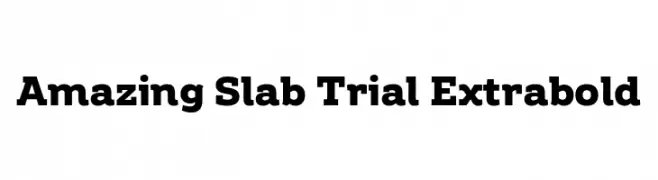
A bold slab serif font with strong, block-like serifs for impactful text.
![Amazing Slab Trial Extrabold Frei Schriftart Herunterladen]() Herunterladen 219 Downloads@WebFont
Herunterladen 219 Downloads@WebFont -
( Fonts by RGB Studio )
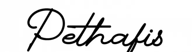
Elegant cursive script with a handwritten style.
![Pethafis Frei Schriftart Herunterladen]() Herunterladen 219 Downloads@WebFont
Herunterladen 219 Downloads@WebFont -
( Fonts by Graham Meade - GemFonts )
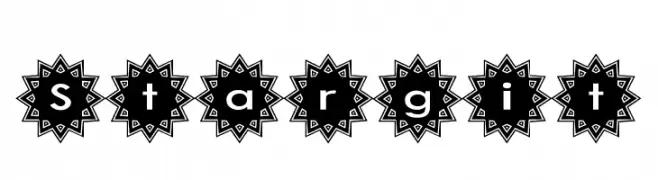
A decorative font with characters enclosed in starburst shapes, offering a bold and playful look.
![Stargit Frei Schriftart Herunterladen]() Herunterladen 219 Downloads@WebFont
Herunterladen 219 Downloads@WebFont -
( www.leodsen.com )
A bold, distressed font with a grunge texture for impactful designs.
![Beboline Frei Schriftart Herunterladen]() Herunterladen 219 Downloads@WebFont
Herunterladen 219 Downloads@WebFont -
-
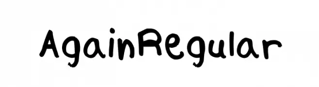
![Again Regular Frei Schriftart Herunterladen]() Herunterladen 219 Downloads@WebFont
Herunterladen 219 Downloads@WebFont -
( Fonts by Noah Type - noahtype.com - Personal-use only. For commercial use please contact owner. )
A bold, geometric sans-serif font with a modern and clean design.
![Reversed Demo Frei Schriftart Herunterladen]() Herunterladen 219 Downloads@WebFont
Herunterladen 219 Downloads@WebFont -
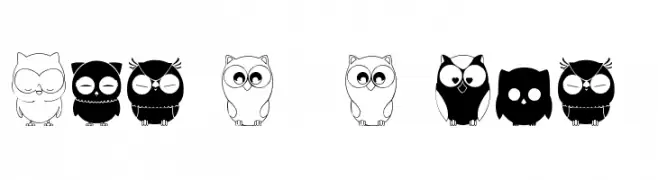
( Fonts by Maelle.K - Thomas Boucherie )
A decorative dingbat font with cute owl and heart illustrations.
![Chouette alors Frei Schriftart Herunterladen]() Herunterladen 219 Downloads@WebFont
Herunterladen 219 Downloads@WebFont -
( Fonts by www.junkohanhero.com - Personal-use only. For commercial use please contact owner. )
A bold, hand-drawn font with a rough, textured, graffiti-like style.
![Trash! More trash! Frei Schriftart Herunterladen]() Herunterladen 219 Downloads@WebFont
Herunterladen 219 Downloads@WebFont -
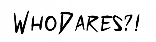
( Fonts by PressGang Studios )
A bold, hand-drawn font with sharp, angular strokes and a dynamic, energetic style.
![Who Dares?! Frei Schriftart Herunterladen]() Herunterladen 219 Downloads@WebFont
Herunterladen 219 Downloads@WebFont


Welche Schriften sind gerade am populärsten?
Poppins, Roboto, Montserrat, Open Sans und Lato sind wegen ihrer klaren Formen und breiten Einsetzbarkeit sehr gefragt – von Markenauftritt über Landingpages bis hin zu Postern.
Welche Fonts eignen sich für Logos?
Geometrische Sans‑Serifs (z. B. Poppins, Familien im Gotham‑Stil) sind ein häufiger Griff für sauberes, skalierbares Branding. Für eine persönlichere Note bleiben Scripts und Handschrift‑Stile beliebt. Kombinieren Sie einen prägnanten Headline‑Font mit einer neutralen Brotschrift für Wiedererkennung und Harmonie.
Wie oft wird die Top‑Liste aktualisiert?
Regelmäßig – basierend auf realen Downloads und Interaktionen. Schauen Sie öfter vorbei, um aufstrebende Favoriten früh zu entdecken.
💡 Tipp: Seite bookmarken – Trends wechseln schnell, und heutige Top‑Schriften inspirieren morgen vielleicht das Rebranding.