Willkommen bei den Top‑Schriften – hier treffen Beliebtheit und Qualität aufeinander. Das sind die in diesem Jahr am häufigsten heruntergeladenen und genutzten Fonts. Wenn Sie sichere Optionen für Logo, Web oder Social suchen, starten Sie hier.
Jeder Top‑Font überzeugt durch Balance, Lesbarkeit und Vielseitigkeit. Sie finden moderne Sans‑Serifs, elegante Scripts, Vintage‑Serifs und minimalistische Displays.
-
( Fonts by Alex Slobzheninov - Personal-use only. For commercial use please contact owner. )
A bold, geometric font with strong visual impact and high contrast.
 Herunterladen 217 Downloads@WebFont
 -
( Fonts by Peax Webdesign - www.peax-webdesign.com. Personal-use only. For commercial use please contact owner. )
A playful, handwritten font with tall, narrow characters and consistent stroke width.
![PWVerticalized Frei Schriftart Herunterladen]() Herunterladen 217 Downloads@WebFont
Herunterladen 217 Downloads@WebFont -
( Fonts by Dieter Steffmann )
A bold, industrial font with a 3D effect and mechanical design.
![Messing Lettern Frei Schriftart Herunterladen]() Herunterladen 217 Downloads@WebFont
Herunterladen 217 Downloads@WebFont -
( Fonts by a Colm Clafferty - colmfonts.hol.es. Personal-use only. For commercial use please contact owner. )
A bold, jagged font with a punk rock, graffiti-inspired style.
![Punkband Frei Schriftart Herunterladen]() Herunterladen 217 Downloads@WebFont
Herunterladen 217 Downloads@WebFont -
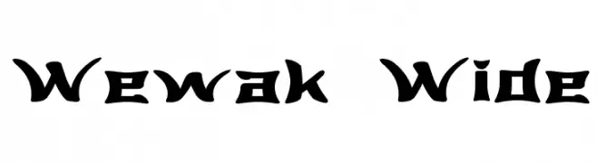
( Fonts by Graham Meade - GemFonts )
A bold, angular font with a modern geometric style.
![Wewak Wide Frei Schriftart Herunterladen]() Herunterladen 217 Downloads@WebFont
Herunterladen 217 Downloads@WebFont -
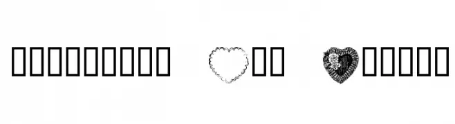
-
![Valentine Day Normal Frei Schriftart Herunterladen]() Herunterladen 217 Downloads@WebFont
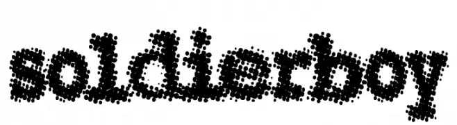
Herunterladen 217 Downloads@WebFont -
![Soldierboy Frei Schriftart Herunterladen]() Herunterladen 217 Downloads@WebFont
Herunterladen 217 Downloads@WebFont -
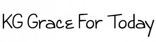
( Fonts by www.kimberlygeswein.com - Kimberly Geswein )
A playful, casual handwritten font with rounded, irregular letterforms.
![KG Grace For Today Frei Schriftart Herunterladen]() Herunterladen 217 Downloads@WebFont
Herunterladen 217 Downloads@WebFont -
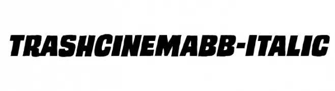
( Fonts by www.blambot.com )
Bold, italic font with a vintage, dynamic style.
![TrashCinemaBB-Italic Frei Schriftart Herunterladen]() Herunterladen 217 Downloads@WebFont
Herunterladen 217 Downloads@WebFont -
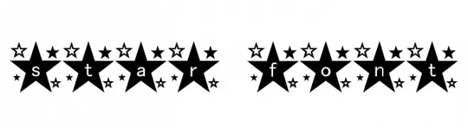
![star_font Frei Schriftart Herunterladen]() Herunterladen 217 Downloads@WebFont
Herunterladen 217 Downloads@WebFont
Welche Schriften sind gerade am populärsten?
Poppins, Roboto, Montserrat, Open Sans und Lato sind wegen ihrer klaren Formen und breiten Einsetzbarkeit sehr gefragt – von Markenauftritt über Landingpages bis hin zu Postern.
Welche Fonts eignen sich für Logos?
Geometrische Sans‑Serifs (z. B. Poppins, Familien im Gotham‑Stil) sind ein häufiger Griff für sauberes, skalierbares Branding. Für eine persönlichere Note bleiben Scripts und Handschrift‑Stile beliebt. Kombinieren Sie einen prägnanten Headline‑Font mit einer neutralen Brotschrift für Wiedererkennung und Harmonie.
Wie oft wird die Top‑Liste aktualisiert?
Regelmäßig – basierend auf realen Downloads und Interaktionen. Schauen Sie öfter vorbei, um aufstrebende Favoriten früh zu entdecken.
💡 Tipp: Seite bookmarken – Trends wechseln schnell, und heutige Top‑Schriften inspirieren morgen vielleicht das Rebranding.