Willkommen bei den Top‑Schriften – hier treffen Beliebtheit und Qualität aufeinander. Das sind die in diesem Jahr am häufigsten heruntergeladenen und genutzten Fonts. Wenn Sie sichere Optionen für Logo, Web oder Social suchen, starten Sie hier.
Jeder Top‑Font überzeugt durch Balance, Lesbarkeit und Vielseitigkeit. Sie finden moderne Sans‑Serifs, elegante Scripts, Vintage‑Serifs und minimalistische Displays.
-
 Herunterladen 218 Downloads@WebFont
 -
( Fonts by imagex )
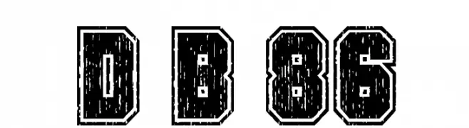
A bold, distressed font with a rugged, vintage appearance.
![Dirty Bowl 86 Frei Schriftart Herunterladen]() Herunterladen 218 Downloads@WebFont
Herunterladen 218 Downloads@WebFont -
( Fonts by Hatf Type )
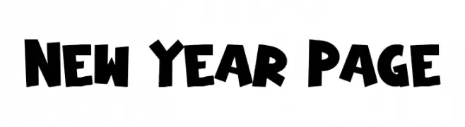
A bold, playful font with thick, rounded strokes and a lively, energetic style.
![New Year Page Frei Schriftart Herunterladen]() Herunterladen 218 Downloads@WebFont
Herunterladen 218 Downloads@WebFont -
( Fonts by Manfred Klein. Free for private and charity use. Free for commercial with donation to organizations )
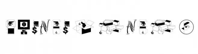
An artistic and illustrative font featuring unique graphic representations for each character.
![Coincidences Frei Schriftart Herunterladen]() Herunterladen 218 Downloads@WebFont
Herunterladen 218 Downloads@WebFont -
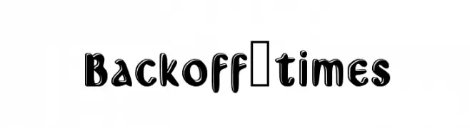
![Backoff_times Frei Schriftart Herunterladen]() Herunterladen 218 Downloads@WebFont
Herunterladen 218 Downloads@WebFont -
-
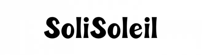
( Fonts by sez_inn )
A playful and bold font with dynamic curves and artistic flair.
![Soli Soleil Frei Schriftart Herunterladen]() Herunterladen 218 Downloads@WebFont
Herunterladen 218 Downloads@WebFont -
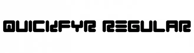
![Quickfyr Regular Frei Schriftart Herunterladen]() Herunterladen 218 Downloads@WebFont
Herunterladen 218 Downloads@WebFont -
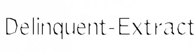
![Delinquent-Extract Frei Schriftart Herunterladen]() Herunterladen 218 Downloads@WebFont
Herunterladen 218 Downloads@WebFont -
( Fonts by HyFont Studio )
A playful, handwritten font with bold strokes and a casual, friendly style.
![HFComic Frei Schriftart Herunterladen]() Herunterladen 218 Downloads@WebFont
Herunterladen 218 Downloads@WebFont -
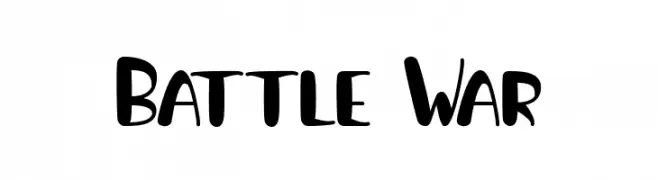
( Fonts by Priogi Rahayu )
A bold, playful font with a hand-drawn, dynamic style.
![Battle War Frei Schriftart Herunterladen]() Herunterladen 218 Downloads@WebFont
Herunterladen 218 Downloads@WebFont

Welche Schriften sind gerade am populärsten?
Poppins, Roboto, Montserrat, Open Sans und Lato sind wegen ihrer klaren Formen und breiten Einsetzbarkeit sehr gefragt – von Markenauftritt über Landingpages bis hin zu Postern.
Welche Fonts eignen sich für Logos?
Geometrische Sans‑Serifs (z. B. Poppins, Familien im Gotham‑Stil) sind ein häufiger Griff für sauberes, skalierbares Branding. Für eine persönlichere Note bleiben Scripts und Handschrift‑Stile beliebt. Kombinieren Sie einen prägnanten Headline‑Font mit einer neutralen Brotschrift für Wiedererkennung und Harmonie.
Wie oft wird die Top‑Liste aktualisiert?
Regelmäßig – basierend auf realen Downloads und Interaktionen. Schauen Sie öfter vorbei, um aufstrebende Favoriten früh zu entdecken.
💡 Tipp: Seite bookmarken – Trends wechseln schnell, und heutige Top‑Schriften inspirieren morgen vielleicht das Rebranding.