Willkommen bei den Top‑Schriften – hier treffen Beliebtheit und Qualität aufeinander. Das sind die in diesem Jahr am häufigsten heruntergeladenen und genutzten Fonts. Wenn Sie sichere Optionen für Logo, Web oder Social suchen, starten Sie hier.
Jeder Top‑Font überzeugt durch Balance, Lesbarkeit und Vielseitigkeit. Sie finden moderne Sans‑Serifs, elegante Scripts, Vintage‑Serifs und minimalistische Displays.
-
( Fonts by Dave Kellam - Brian Stuparyk - www.eightface.com )
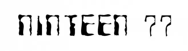
A bold, distressed font with an irregular, grunge aesthetic.
 Herunterladen 205 Downloads@WebFont
 -
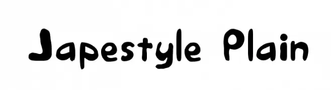
![Japestyle Plain Frei Schriftart Herunterladen]() Herunterladen 205 Downloads@WebFont
Herunterladen 205 Downloads@WebFont -
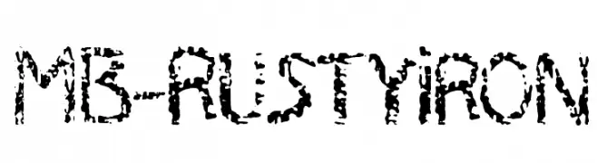
![MB-RustyIron Frei Schriftart Herunterladen]() Herunterladen 205 Downloads@WebFont
Herunterladen 205 Downloads@WebFont -
![The Rustic - Demo Frei Schriftart Herunterladen]() Herunterladen 205 Downloads@WebFont
Herunterladen 205 Downloads@WebFont -
( Fonts by Mocha Frappuccino - Personal-use only. For commercial use please contact owner. )
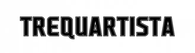
Bold, decorative font with strong outlines.
![Trequartista Frei Schriftart Herunterladen]() Herunterladen 205 Downloads@WebFont
Herunterladen 205 Downloads@WebFont -
-
![Runoff Frei Schriftart Herunterladen]() Herunterladen 205 Downloads
Herunterladen 205 Downloads -
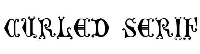
![Curled Serif Frei Schriftart Herunterladen]() Herunterladen 205 Downloads@WebFont
Herunterladen 205 Downloads@WebFont -
( Maxime Tolbecq - www.mplusm.be )
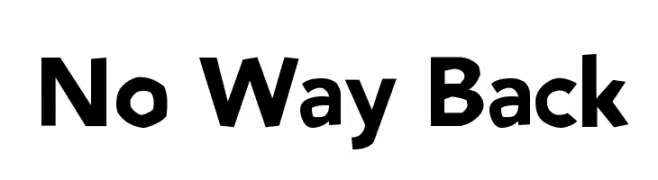
A bold, modern sans-serif font with clean lines and a strong presence.
![No Way Back Frei Schriftart Herunterladen]() Herunterladen 205 Downloads@WebFont
Herunterladen 205 Downloads@WebFont -
( Fonts by a Neale Davidson - www.pixelsagas.com. Personal-use only. For commercial use please contact owner. )
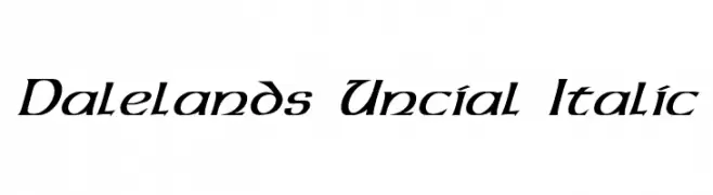
An italic font with a medieval, angular serif style and fluid strokes.
![Dalelands Uncial Italic Frei Schriftart Herunterladen]() Herunterladen 205 Downloads@WebFont
Herunterladen 205 Downloads@WebFont -
( Fonts by Manfred Klein - manfred-klein.ina-mar.com )
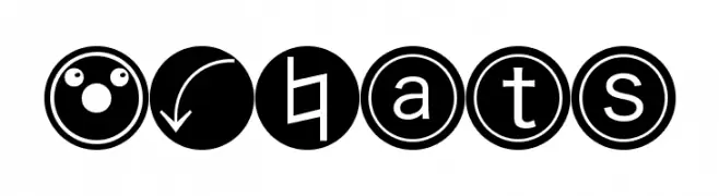
A modern, decorative font featuring symbols and encircled sans-serif letters.
![MKBats Frei Schriftart Herunterladen]() Herunterladen 205 Downloads@WebFont
Herunterladen 205 Downloads@WebFont


Welche Schriften sind gerade am populärsten?
Poppins, Roboto, Montserrat, Open Sans und Lato sind wegen ihrer klaren Formen und breiten Einsetzbarkeit sehr gefragt – von Markenauftritt über Landingpages bis hin zu Postern.
Welche Fonts eignen sich für Logos?
Geometrische Sans‑Serifs (z. B. Poppins, Familien im Gotham‑Stil) sind ein häufiger Griff für sauberes, skalierbares Branding. Für eine persönlichere Note bleiben Scripts und Handschrift‑Stile beliebt. Kombinieren Sie einen prägnanten Headline‑Font mit einer neutralen Brotschrift für Wiedererkennung und Harmonie.
Wie oft wird die Top‑Liste aktualisiert?
Regelmäßig – basierend auf realen Downloads und Interaktionen. Schauen Sie öfter vorbei, um aufstrebende Favoriten früh zu entdecken.
💡 Tipp: Seite bookmarken – Trends wechseln schnell, und heutige Top‑Schriften inspirieren morgen vielleicht das Rebranding.