Willkommen bei den Top‑Schriften – hier treffen Beliebtheit und Qualität aufeinander. Das sind die in diesem Jahr am häufigsten heruntergeladenen und genutzten Fonts. Wenn Sie sichere Optionen für Logo, Web oder Social suchen, starten Sie hier.
Jeder Top‑Font überzeugt durch Balance, Lesbarkeit und Vielseitigkeit. Sie finden moderne Sans‑Serifs, elegante Scripts, Vintage‑Serifs und minimalistische Displays.
-
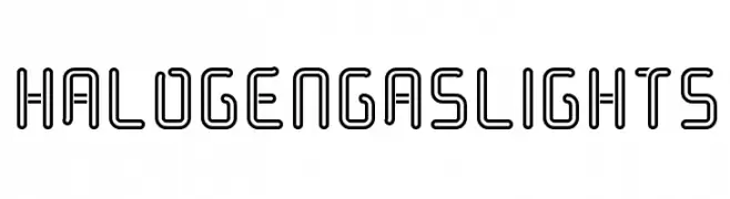
( Chequered Ink - chequered.ink/ )
A futuristic, geometric font with a double-line structure and rounded edges.
 Herunterladen 205 Downloads@WebFont
 -
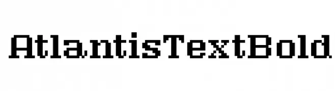
( Fonts by www.floodfonts.com )
A bold, pixelated font with a retro digital aesthetic.
![AtlantisTextBold Frei Schriftart Herunterladen]() Herunterladen 205 Downloads@WebFont
Herunterladen 205 Downloads@WebFont -
( Fonts by Yudi Pratama Chandra )
A playful, bold font with rounded edges and a friendly style.
![Lucky Boss Frei Schriftart Herunterladen]() Herunterladen 205 Downloads@WebFont
Herunterladen 205 Downloads@WebFont -
( Fonts by Daniel Zadorozny - www.iconian.com - Free for personal use )
Bold, italicized font with a college varsity style and outlined characters.
![Exedore College Italic Frei Schriftart Herunterladen]() Herunterladen 205 Downloads@WebFont
Herunterladen 205 Downloads@WebFont -
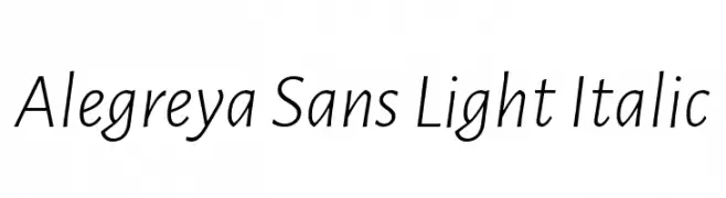
( Copyright 2013 The Alegreya Sans Project Authors (https://github.com/huertatipografica/Alegreya-Sans) )
A light, italic, sans-serif font with a modern and elegant style.
![Alegreya Sans Light Italic Frei Schriftart Herunterladen]() Herunterladen 205 Downloads@WebFont
Herunterladen 205 Downloads@WebFont -
-
( گالری فانت فارسی پژوهش آريانا - only compatible with Farsi and Arabic )
A futuristic font with geometric shapes and angular lines.
![Neutron Frei Schriftart Herunterladen]() Herunterladen 205 Downloads@WebFont
Herunterladen 205 Downloads@WebFont -
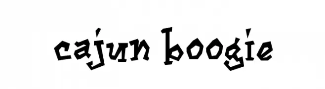
( Fonts by www.blambot.com )
A bold, angular font with a playful, hand-drawn style.
![Cajun Boogie Frei Schriftart Herunterladen]() Herunterladen 205 Downloads@WebFont
Herunterladen 205 Downloads@WebFont -
( Fonts by Maulana Creative )
A bold, angular font with a modern and edgy style.
![Converon Frei Schriftart Herunterladen]() Herunterladen 205 Downloads@WebFont
Herunterladen 205 Downloads@WebFont -
( Fonts by NDISCOVER )
A modern, rounded font with a clean and approachable style.
![ArimaMadurai-Medium Frei Schriftart Herunterladen]() Herunterladen 205 Downloads@WebFont
Herunterladen 205 Downloads@WebFont -
![CSAR Frei Schriftart Herunterladen]() Herunterladen 205 Downloads@WebFont
Herunterladen 205 Downloads@WebFont


Welche Schriften sind gerade am populärsten?
Poppins, Roboto, Montserrat, Open Sans und Lato sind wegen ihrer klaren Formen und breiten Einsetzbarkeit sehr gefragt – von Markenauftritt über Landingpages bis hin zu Postern.
Welche Fonts eignen sich für Logos?
Geometrische Sans‑Serifs (z. B. Poppins, Familien im Gotham‑Stil) sind ein häufiger Griff für sauberes, skalierbares Branding. Für eine persönlichere Note bleiben Scripts und Handschrift‑Stile beliebt. Kombinieren Sie einen prägnanten Headline‑Font mit einer neutralen Brotschrift für Wiedererkennung und Harmonie.
Wie oft wird die Top‑Liste aktualisiert?
Regelmäßig – basierend auf realen Downloads und Interaktionen. Schauen Sie öfter vorbei, um aufstrebende Favoriten früh zu entdecken.
💡 Tipp: Seite bookmarken – Trends wechseln schnell, und heutige Top‑Schriften inspirieren morgen vielleicht das Rebranding.