Willkommen bei den Top‑Schriften – hier treffen Beliebtheit und Qualität aufeinander. Das sind die in diesem Jahr am häufigsten heruntergeladenen und genutzten Fonts. Wenn Sie sichere Optionen für Logo, Web oder Social suchen, starten Sie hier.
Jeder Top‑Font überzeugt durch Balance, Lesbarkeit und Vielseitigkeit. Sie finden moderne Sans‑Serifs, elegante Scripts, Vintage‑Serifs und minimalistische Displays.
-
( Fonts by Typefar )
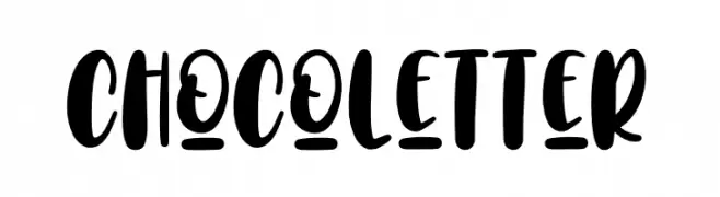
A playful, bold font with rounded, thick strokes and a hand-drawn feel.
 Herunterladen 205 Downloads@WebFont
 -
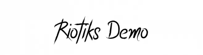
![Riotiks Demo Frei Schriftart Herunterladen]() Herunterladen 205 Downloads@WebFont
Herunterladen 205 Downloads@WebFont -
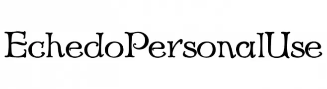
![Echedo PersonalUse Frei Schriftart Herunterladen]() Herunterladen 205 Downloads@WebFont
Herunterladen 205 Downloads@WebFont -
( Fonts by Fontfabric - Svetoslav Simov - Personal-use only. For commercial use please contact owner. )
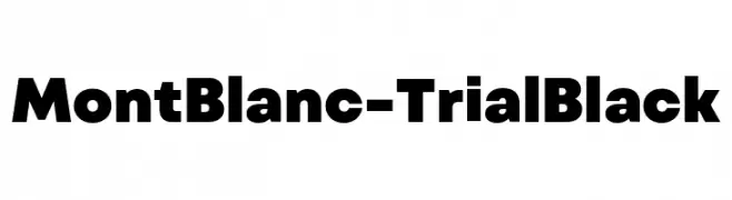
A bold, modern font with strong geometric shapes and consistent stroke widths.
![Mont Blanc-Trial Black Frei Schriftart Herunterladen]() Herunterladen 205 Downloads@WebFont
Herunterladen 205 Downloads@WebFont -
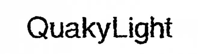
![QuakyLight Frei Schriftart Herunterladen]() Herunterladen 205 Downloads@WebFont
Herunterladen 205 Downloads@WebFont -
-
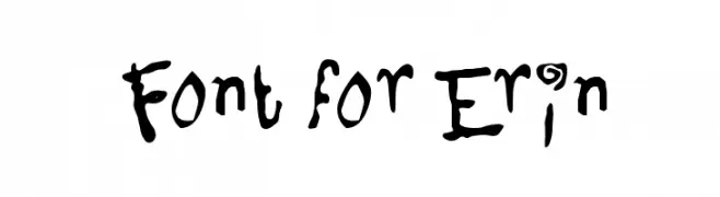
( Fonts by Utopia - www.daleharris.com )
A playful, hand-drawn font with whimsical and dynamic letterforms.
![Font for Erin Frei Schriftart Herunterladen]() Herunterladen 205 Downloads@WebFont
Herunterladen 205 Downloads@WebFont -
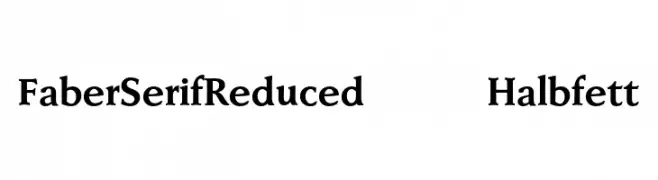
( Fonts by ingoFonts - Ingo Zimmermann - Personal-use only. For commercial use please contact owner. )
A bold, classic serif font with strong, authoritative strokes and elegant serifs.
![FaberSerifReduced-75Halbfett Frei Schriftart Herunterladen]() Herunterladen 205 Downloads@WebFont
Herunterladen 205 Downloads@WebFont -
( Fonts by Alex Tomlinson - Skyhaven Fonts - shfonts.com )
A playful, hand-drawn font with bold, uneven strokes and a whimsical style.
![NammySans Frei Schriftart Herunterladen]() Herunterladen 205 Downloads@WebFont
Herunterladen 205 Downloads@WebFont -
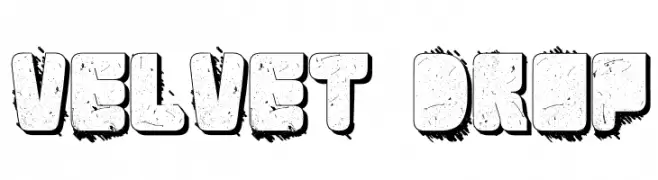
![Velvet Drop Frei Schriftart Herunterladen]() Herunterladen 205 Downloads@WebFont
Herunterladen 205 Downloads@WebFont -
( Fonts by Andi Moz )
A playful, rounded font with bold, smooth curves and a friendly appearance.
![Welcome Mandala Frei Schriftart Herunterladen]() Herunterladen 205 Downloads@WebFont
Herunterladen 205 Downloads@WebFont

Welche Schriften sind gerade am populärsten?
Poppins, Roboto, Montserrat, Open Sans und Lato sind wegen ihrer klaren Formen und breiten Einsetzbarkeit sehr gefragt – von Markenauftritt über Landingpages bis hin zu Postern.
Welche Fonts eignen sich für Logos?
Geometrische Sans‑Serifs (z. B. Poppins, Familien im Gotham‑Stil) sind ein häufiger Griff für sauberes, skalierbares Branding. Für eine persönlichere Note bleiben Scripts und Handschrift‑Stile beliebt. Kombinieren Sie einen prägnanten Headline‑Font mit einer neutralen Brotschrift für Wiedererkennung und Harmonie.
Wie oft wird die Top‑Liste aktualisiert?
Regelmäßig – basierend auf realen Downloads und Interaktionen. Schauen Sie öfter vorbei, um aufstrebende Favoriten früh zu entdecken.
💡 Tipp: Seite bookmarken – Trends wechseln schnell, und heutige Top‑Schriften inspirieren morgen vielleicht das Rebranding.