Willkommen bei den Top‑Schriften – hier treffen Beliebtheit und Qualität aufeinander. Das sind die in diesem Jahr am häufigsten heruntergeladenen und genutzten Fonts. Wenn Sie sichere Optionen für Logo, Web oder Social suchen, starten Sie hier.
Jeder Top‑Font überzeugt durch Balance, Lesbarkeit und Vielseitigkeit. Sie finden moderne Sans‑Serifs, elegante Scripts, Vintage‑Serifs und minimalistische Displays.
-
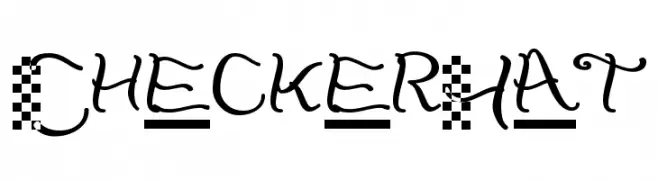
( Fonts by Glyphobet Font Foundry - Matt Chisholm - http://glyphobet.net/typography/ )
A playful and artistic font with checkerboard patterns and whimsical strokes.
 Herunterladen 204 Downloads@WebFont
 -
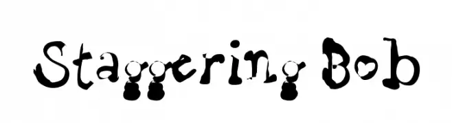
( Fonts by Uddi Uddi )
A playful, hand-drawn font with irregular strokes and a whimsical appearance.
![Staggering Bob Frei Schriftart Herunterladen]() Herunterladen 204 Downloads@WebFont
Herunterladen 204 Downloads@WebFont -
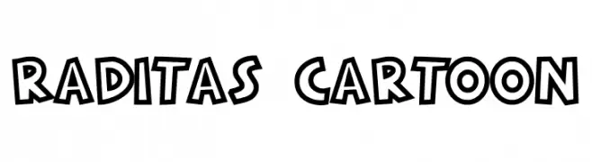
( Fonts by Docallisme HAS - Ryal - docallisme.blogspot.com - Personal-use only. For commercial use please contact owner. )
A bold, cartoonish font with thick outlines and playful character design.
![RADITAS CARTOON Frei Schriftart Herunterladen]() Herunterladen 204 Downloads@WebFont
Herunterladen 204 Downloads@WebFont -
( Fonts by wep - Wahyu Eka Prasetya - Personal-use only. For commercial use please contact owner. )
A bold, handwritten font with a playful and energetic style.
![Batesin Frei Schriftart Herunterladen]() Herunterladen 204 Downloads@WebFont
Herunterladen 204 Downloads@WebFont -
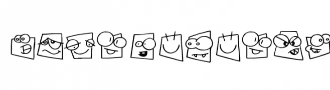
![lprabbits1 Frei Schriftart Herunterladen]() Herunterladen 204 Downloads@WebFont
Herunterladen 204 Downloads@WebFont -
-
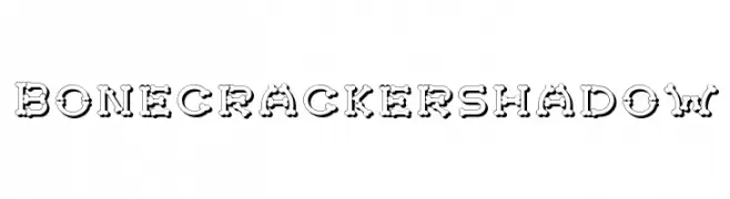
( Fonts by Otto Maurer Design )
A decorative bone-themed font with a shadow effect, perfect for spooky designs.
![Bonecrackershadow Frei Schriftart Herunterladen]() Herunterladen 204 Downloads@WebFont
Herunterladen 204 Downloads@WebFont -
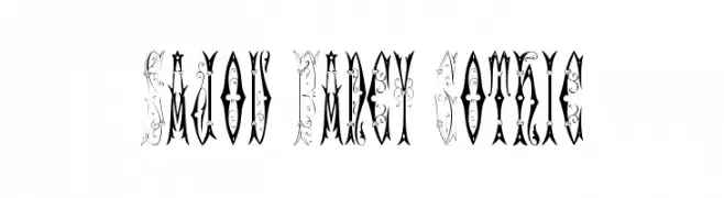
( Fonts by Toto )
An ornate and decorative Gothic-style font with intricate detailing.
![Sajou Fancy Gothic Frei Schriftart Herunterladen]() Herunterladen 204 Downloads@WebFont
Herunterladen 204 Downloads@WebFont -
( Fonts by LyonsType - Daniel Lyons - Personal-use only. For commercial use please contact owner. )
A classic serif font with elegant strokes and balanced proportions.
![LT Remark Frei Schriftart Herunterladen]() Herunterladen 204 Downloads@WebFont
Herunterladen 204 Downloads@WebFont -
( Fonts by Jacob Fisher - www.pizzadude.dk )
A whimsical, cartoon-style font with expressive square-shaped characters.
![Squareheads Frei Schriftart Herunterladen]() Herunterladen 204 Downloads@WebFont
Herunterladen 204 Downloads@WebFont -
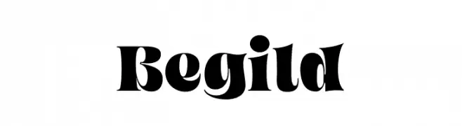
( Fonts by ReyreyBlue )
A bold, high-contrast font with dramatic curves and sharp edges.
![Begild Frei Schriftart Herunterladen]() Herunterladen 204 Downloads@WebFont
Herunterladen 204 Downloads@WebFont


Welche Schriften sind gerade am populärsten?
Poppins, Roboto, Montserrat, Open Sans und Lato sind wegen ihrer klaren Formen und breiten Einsetzbarkeit sehr gefragt – von Markenauftritt über Landingpages bis hin zu Postern.
Welche Fonts eignen sich für Logos?
Geometrische Sans‑Serifs (z. B. Poppins, Familien im Gotham‑Stil) sind ein häufiger Griff für sauberes, skalierbares Branding. Für eine persönlichere Note bleiben Scripts und Handschrift‑Stile beliebt. Kombinieren Sie einen prägnanten Headline‑Font mit einer neutralen Brotschrift für Wiedererkennung und Harmonie.
Wie oft wird die Top‑Liste aktualisiert?
Regelmäßig – basierend auf realen Downloads und Interaktionen. Schauen Sie öfter vorbei, um aufstrebende Favoriten früh zu entdecken.
💡 Tipp: Seite bookmarken – Trends wechseln schnell, und heutige Top‑Schriften inspirieren morgen vielleicht das Rebranding.