Willkommen bei den Top‑Schriften – hier treffen Beliebtheit und Qualität aufeinander. Das sind die in diesem Jahr am häufigsten heruntergeladenen und genutzten Fonts. Wenn Sie sichere Optionen für Logo, Web oder Social suchen, starten Sie hier.
Jeder Top‑Font überzeugt durch Balance, Lesbarkeit und Vielseitigkeit. Sie finden moderne Sans‑Serifs, elegante Scripts, Vintage‑Serifs und minimalistische Displays.
-
( bogstav - www.bogstav.com )
A bold, hand-painted style font with dynamic, uneven strokes.
 Herunterladen 843 Downloads@WebFont
 -
( Sizimon.id - creativemarket.com/sizimon )
A flowing, elegant script font with a handwritten charm.
![Monalisa Script Frei Schriftart Herunterladen]() Herunterladen 843 Downloads@WebFont
Herunterladen 843 Downloads@WebFont -
( Mas Anis Studio - Naufal Anis - creativemarket.com/naufalans?u=naufalans )
A decorative cursive font with elegant loops and consistent stroke width.
![Autery Frei Schriftart Herunterladen]() Herunterladen 843 Downloads@WebFont
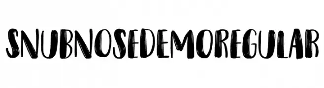
Herunterladen 843 Downloads@WebFont -
( Here Be Monsters - monsterswithin.com )
A bold, geometric font with a futuristic and angular design.
![Razed Bold Frei Schriftart Herunterladen]() Herunterladen 843 Downloads@WebFont
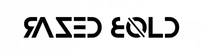
Herunterladen 843 Downloads@WebFont -
( Fonts by Dan P. Lyons - Personal-use only. For commercial use please contact owner. )
A modern, sans-serif typeface with clean lines and balanced proportions.
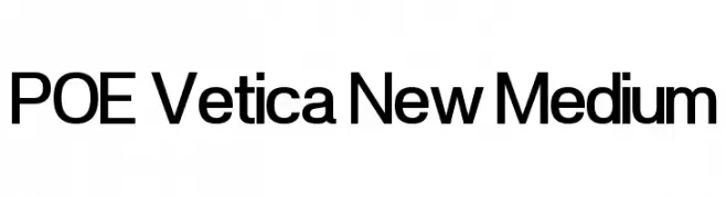
![POE Vetica New Medium Frei Schriftart Herunterladen]() Herunterladen 843 Downloads@WebFont
Herunterladen 843 Downloads@WebFont -
-
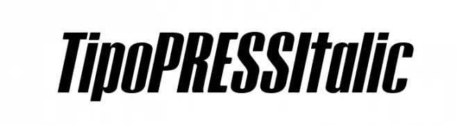
( Fonts by www.studiotypo.com - Personal-use only. For commercial use please contact owner. )
A bold, italic font with tight spacing and high contrast, ideal for dynamic designs.
![Tipo PRESS Italic Frei Schriftart Herunterladen]() Herunterladen 843 Downloads@WebFont
Herunterladen 843 Downloads@WebFont -
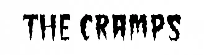
( Fonts by Bri'n St´ven Alborn'z )
A jagged, horror-inspired font with a distressed, edgy appearance.
![The Cramps Frei Schriftart Herunterladen]() Herunterladen 843 Downloads@WebFont
Herunterladen 843 Downloads@WebFont -
( Fonts by Aryel Filipe )
A playful, rounded font with irregular, bold characters.
![Round Irregularity Frei Schriftart Herunterladen]() Herunterladen 843 Downloads@WebFont
Herunterladen 843 Downloads@WebFont -
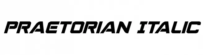
( Fonts by Daniel Zadorozny - www.iconian.com )
A bold, italic font with a futuristic and dynamic style.
![Praetorian Italic Frei Schriftart Herunterladen]() Herunterladen 843 Downloads@WebFont
Herunterladen 843 Downloads@WebFont -
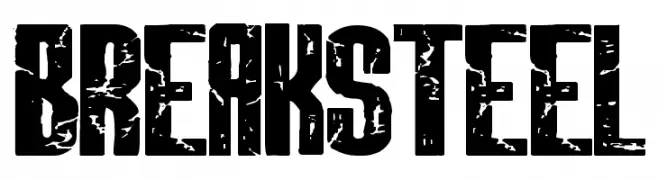
![BREAKSTEEL Frei Schriftart Herunterladen]() Herunterladen 843 Downloads@WebFont
Herunterladen 843 Downloads@WebFont -
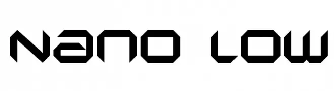
![Nano low Frei Schriftart Herunterladen]() Herunterladen 843 Downloads@WebFont
Herunterladen 843 Downloads@WebFont -
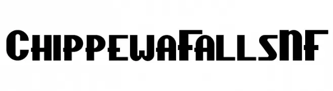
( Fonts by Nick Curtis - www.nicksfonts.com )
A bold, geometric font with Art Deco influences, ideal for impactful designs.
![ChippewaFallsNF Frei Schriftart Herunterladen]() Herunterladen 843 Downloads@WebFont
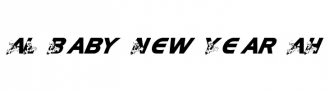
Herunterladen 843 Downloads@WebFont -
![AL Baby New Year AH Frei Schriftart Herunterladen]() Herunterladen 843 Downloads@WebFont
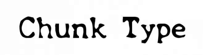
Herunterladen 843 Downloads@WebFont -
![Chunk Type Frei Schriftart Herunterladen]() Herunterladen 843 Downloads@WebFont
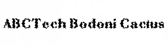
Herunterladen 843 Downloads@WebFont -
![ABCTech Bodoni Cactus Frei Schriftart Herunterladen]() Herunterladen 843 Downloads@WebFont
Herunterladen 843 Downloads@WebFont -
( Fonts by U.S. Web Design System )
A bold, italicized sans-serif font with a modern and clean design.
![Public Sans Bold Italic Frei Schriftart Herunterladen]() Herunterladen 842 Downloads@WebFont
Herunterladen 842 Downloads@WebFont -
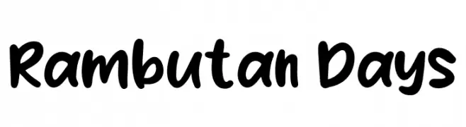
( Fonts by Khurasan )
A playful, bold handwritten font with a lively and energetic style.
![Rambutan Days Frei Schriftart Herunterladen]() Herunterladen 842 Downloads@WebFont
Herunterladen 842 Downloads@WebFont -
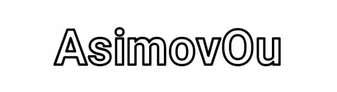
( Fonts by CannotIntoSpaceFonts - KineticPlasma Fonts - Personal-use only. For commercial use please contact owner. )
A bold, outlined font with a modern, geometric style.
![AsimovOu Frei Schriftart Herunterladen]() Herunterladen 842 Downloads@WebFont
Herunterladen 842 Downloads@WebFont -
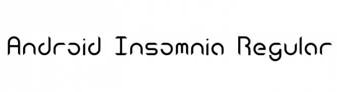
( Fonts by Michael Moss -whitespirals.com - Personal-use only. For commercial use please contact owner. )
A futuristic and geometric font with sharp angles and clean lines.
![Android Insomnia Regular Frei Schriftart Herunterladen]() Herunterladen 842 Downloads@WebFont
Herunterladen 842 Downloads@WebFont -
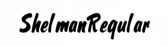
( Fonts by Grzegorz Klimczewski. Personal-use only. For commercial use please contact owner. )
A bold, dynamic script font with flowing, hand-drawn strokes.
![Shelman Regular Frei Schriftart Herunterladen]() Herunterladen 842 Downloads@WebFont
Herunterladen 842 Downloads@WebFont -
( Fonts by Azra Qaireen - http://creativemarket.com/aqr.typeface - Personal-use only. For commercial use please contact owner. )
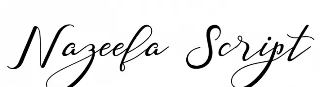
A graceful script font with flowing, elegant strokes and a handwritten style.
![Nazeefa Script Frei Schriftart Herunterladen]() Herunterladen 842 Downloads@WebFont
Herunterladen 842 Downloads@WebFont -
( Fonts by Noah Johnson )
A playful, bold, hand-drawn font with a casual and friendly appearance.
![noah Frei Schriftart Herunterladen]() Herunterladen 842 Downloads@WebFont
Herunterladen 842 Downloads@WebFont -
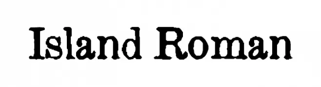
![Island Roman Frei Schriftart Herunterladen]() Herunterladen 842 Downloads@WebFont
Herunterladen 842 Downloads@WebFont -
( Download for Personal Use. For Commercial: http://www.k-type.com )
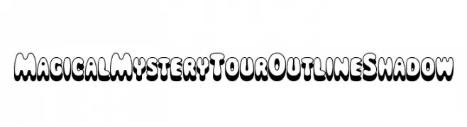
A bold, playful font with a three-dimensional outline and shadow effect.
![MagicalMysteryTourOutlineShadow Frei Schriftart Herunterladen]() Herunterladen 842 Downloads@WebFont
Herunterladen 842 Downloads@WebFont -
( Please visit www.fontsite.com before you use! )
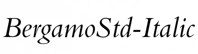
An elegant serif italic font with smooth, flowing curves and a classic appearance.
![BergamoStd-Italic Frei Schriftart Herunterladen]() Herunterladen 842 Downloads@WebFont
Herunterladen 842 Downloads@WebFont -
( Fonts by www.DigitalDreamDesign.net )
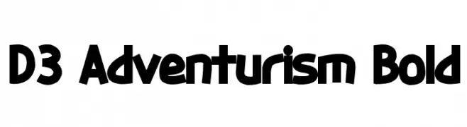
A bold, dynamic font with a playful and adventurous style.
![D3 Adventurism Bold Frei Schriftart Herunterladen]() Herunterladen 842 Downloads@WebFont
Herunterladen 842 Downloads@WebFont -
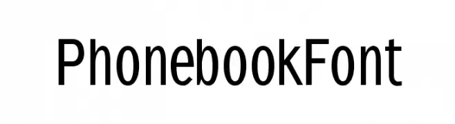
( Fonts by Manfred Klein. Free for private and charity use. Free for commercial with donation to organizations )
A clean, modern sans-serif font with excellent readability.
![PhonebookFont Frei Schriftart Herunterladen]() Herunterladen 842 Downloads@WebFont
Herunterladen 842 Downloads@WebFont -
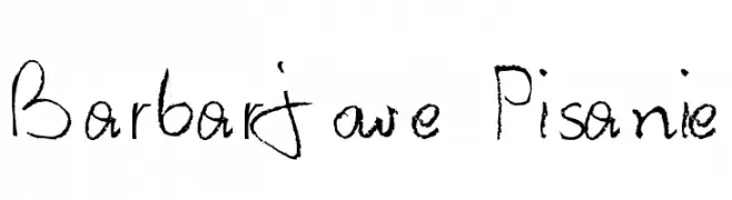
![Barbarjowe Pisanie Frei Schriftart Herunterladen]() Herunterladen 842 Downloads@WebFont
Herunterladen 842 Downloads@WebFont -
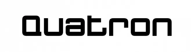
( Fonts by Bartek Nowak - www.nowak.tv/fontoholic/ )
A modern, geometric font with a futuristic and sleek design.
![Quatron Frei Schriftart Herunterladen]() Herunterladen 842 Downloads@WebFont
Herunterladen 842 Downloads@WebFont -
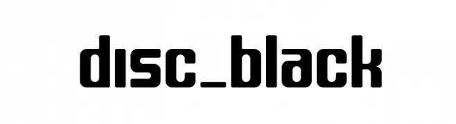
( Fonts by bridgeco.jp )
A bold, geometric font with rounded edges and a modern style.
![disc_black Frei Schriftart Herunterladen]() Herunterladen 842 Downloads@WebFont
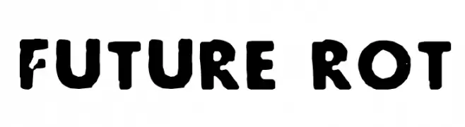
Herunterladen 842 Downloads@WebFont -
![Future Rot Frei Schriftart Herunterladen]() Herunterladen 842 Downloads@WebFont
Herunterladen 842 Downloads@WebFont -
![GurmukhiLys 010 Bold Italic Frei Schriftart Herunterladen]() Herunterladen 842 Downloads@WebFont
Herunterladen 842 Downloads@WebFont -
![Notice Frei Schriftart Herunterladen]() Herunterladen 842 Downloads
Herunterladen 842 Downloads -
( Fonts by Apostrophic Lab )
A modern, bold, and geometric font with a condensed style.
![Zillah Modern Frei Schriftart Herunterladen]() Herunterladen 842 Downloads@WebFont
Herunterladen 842 Downloads@WebFont -
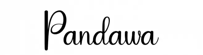
( Fonts by Andi Moz )
Decorative script font with a playful style.
![Pandawa Frei Schriftart Herunterladen]() Herunterladen 841 Downloads@WebFont
Herunterladen 841 Downloads@WebFont


Welche Schriften sind gerade am populärsten?
Poppins, Roboto, Montserrat, Open Sans und Lato sind wegen ihrer klaren Formen und breiten Einsetzbarkeit sehr gefragt – von Markenauftritt über Landingpages bis hin zu Postern.
Welche Fonts eignen sich für Logos?
Geometrische Sans‑Serifs (z. B. Poppins, Familien im Gotham‑Stil) sind ein häufiger Griff für sauberes, skalierbares Branding. Für eine persönlichere Note bleiben Scripts und Handschrift‑Stile beliebt. Kombinieren Sie einen prägnanten Headline‑Font mit einer neutralen Brotschrift für Wiedererkennung und Harmonie.
Wie oft wird die Top‑Liste aktualisiert?
Regelmäßig – basierend auf realen Downloads und Interaktionen. Schauen Sie öfter vorbei, um aufstrebende Favoriten früh zu entdecken.
💡 Tipp: Seite bookmarken – Trends wechseln schnell, und heutige Top‑Schriften inspirieren morgen vielleicht das Rebranding.