Willkommen bei den Top‑Schriften – hier treffen Beliebtheit und Qualität aufeinander. Das sind die in diesem Jahr am häufigsten heruntergeladenen und genutzten Fonts. Wenn Sie sichere Optionen für Logo, Web oder Social suchen, starten Sie hier.
Jeder Top‑Font überzeugt durch Balance, Lesbarkeit und Vielseitigkeit. Sie finden moderne Sans‑Serifs, elegante Scripts, Vintage‑Serifs und minimalistische Displays.
-
( Mas Anis Studio - Naufal Anis - creativemarket.com/naufalans?u=naufalans )
A decorative cursive font with elegant loops and consistent stroke width.
 Herunterladen 861 Downloads@WebFont
 -
( Fonts by Dan P. Lyons - Personal-use only. For commercial use please contact owner. )
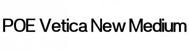
A modern, sans-serif typeface with clean lines and balanced proportions.
![POE Vetica New Medium Frei Schriftart Herunterladen]() Herunterladen 861 Downloads@WebFont
Herunterladen 861 Downloads@WebFont -
( Fonts by Billy Argel - www.billyargel.com - Personal-use only. For commercial use please contact owner. )
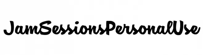
A playful, bold font with a handwritten, script-like style.
![Jam Sessions Personal Use Frei Schriftart Herunterladen]() Herunterladen 861 Downloads@WebFont
Herunterladen 861 Downloads@WebFont -
( Fonts by EvasUniqueFonts )
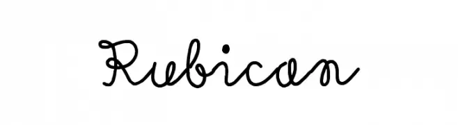
A playful, whimsical script font with interconnected, flowing letters.
![Rubican Frei Schriftart Herunterladen]() Herunterladen 861 Downloads@WebFont
Herunterladen 861 Downloads@WebFont -
( Fonts by Chris Vile )
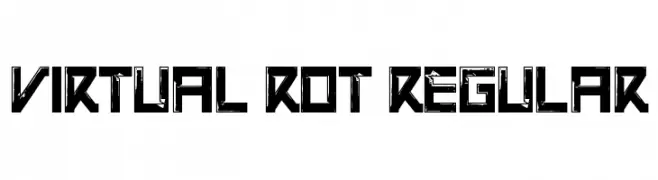
A bold, futuristic font with a distressed, grunge texture.
![Virtual Rot Regular Frei Schriftart Herunterladen]() Herunterladen 861 Downloads@WebFont
Herunterladen 861 Downloads@WebFont -
( Fonts by Daniel Zadorozny - www.iconian.com )
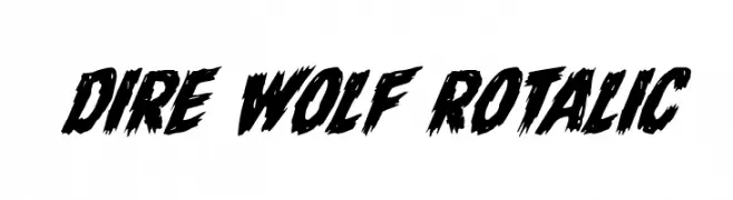
A bold, jagged font with a brush-like, aggressive style.
![Dire Wolf Rotalic Frei Schriftart Herunterladen]() Herunterladen 861 Downloads@WebFont
Herunterladen 861 Downloads@WebFont -
( Fonts by Daniel Zadorozny - www.iconian.com )
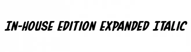
A bold, expanded italic font with a dynamic and energetic style.
![In-House Edition Expanded Italic Frei Schriftart Herunterladen]() Herunterladen 861 Downloads@WebFont
Herunterladen 861 Downloads@WebFont -
( Fonts by a Neale Davidson - www.pixelsagas.com. Personal-use only. For commercial use please contact owner. )
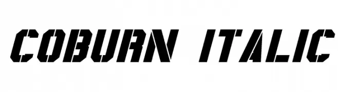
Bold, italicized font with angular, geometric design.
![Coburn Italic Frei Schriftart Herunterladen]() Herunterladen 861 Downloads@WebFont
Herunterladen 861 Downloads@WebFont -
( Fonts by www.omnibus-type.com )
A modern, narrow, bold italic font with a sleek and dynamic style.
![ArchivoNarrow-BoldItalic Frei Schriftart Herunterladen]() Herunterladen 861 Downloads@WebFont
Herunterladen 861 Downloads@WebFont -
![TeXGyreHerosCondensed-BoldItalic Frei Schriftart Herunterladen]() Herunterladen 861 Downloads@WebFont
Herunterladen 861 Downloads@WebFont -
( Download for Personal Use. For Commercial: http://www.k-type.com )
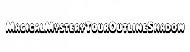
A bold, playful font with a three-dimensional outline and shadow effect.
![MagicalMysteryTourOutlineShadow Frei Schriftart Herunterladen]() Herunterladen 861 Downloads@WebFont
Herunterladen 861 Downloads@WebFont -
( SDFonts. http://www.angelfire.com/scifi2/sdfonts/index.html )
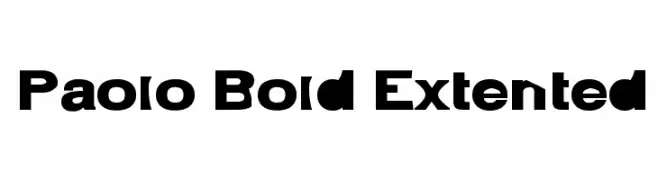
A bold, extended font with strong, geometric strokes for impactful design.
![Paolo Bold Extented Frei Schriftart Herunterladen]() Herunterladen 861 Downloads@WebFont
Herunterladen 861 Downloads@WebFont -
( Fonts by a Neale Davidson - www.pixelsagas.com. Personal-use only. For commercial use please contact owner. )
A bold, textured font with a rugged, hand-crafted appearance.
![Turtles Frei Schriftart Herunterladen]() Herunterladen 861 Downloads@WebFont
Herunterladen 861 Downloads@WebFont -
( Fonts by Manfred Klein. Free for private and charity use. Free for commercial with donation to organizations )
Whimsical cartoon character font with a playful, illustrated style.
![Lifestyle Frei Schriftart Herunterladen]() Herunterladen 861 Downloads@WebFont
Herunterladen 861 Downloads@WebFont -
( Fonts by www.peter-wiegel.de. Personal-use only. For commercial use please contact owner. )
A bold, geometric font with a modern, monospaced appearance.
![Makushka Frei Schriftart Herunterladen]() Herunterladen 861 Downloads@WebFont
Herunterladen 861 Downloads@WebFont -
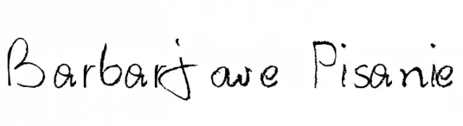
![Barbarjowe Pisanie Frei Schriftart Herunterladen]() Herunterladen 861 Downloads@WebFont
Herunterladen 861 Downloads@WebFont -
![Crystal Radio Kit Frei Schriftart Herunterladen]() Herunterladen 861 Downloads@WebFont
Herunterladen 861 Downloads@WebFont -
( Fonts by RaffaSyad Studio )
A playful, bold font with rounded, thick strokes and a hand-drawn feel.
![Kocheng Frei Schriftart Herunterladen]() Herunterladen 860 Downloads@WebFont
Herunterladen 860 Downloads@WebFont -
( Fonts by Alex Solis )
A bold, cartoonish font with thick outlines and playful character shapes.
![Super Mario 64 Frei Schriftart Herunterladen]() Herunterladen 860 Downloads@WebFont
Herunterladen 860 Downloads@WebFont -
( Fonts by Vladimir Nikolic - www.creativefabrica.com/designer/vladimirnikolic/ - Personal-use only. For commercial use please contact owner. )
A bold, geometric font with a modern, industrial style.
![Navigator Extended Frei Schriftart Herunterladen]() Herunterladen 860 Downloads@WebFont
Herunterladen 860 Downloads@WebFont -
( Fonts by Ivan Petrov - Personal-use only. For commercial use please contact owner. )
A refined serif typeface with high contrast and sharp serifs.
![Prata Regular Frei Schriftart Herunterladen]() Herunterladen 860 Downloads@WebFont
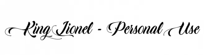
Herunterladen 860 Downloads@WebFont -
![King Lionel - Personal Use Frei Schriftart Herunterladen]() Herunterladen 860 Downloads@WebFont
Herunterladen 860 Downloads@WebFont -
( Sizimon.id - creativemarket.com/sizimon )
A flowing, elegant script font with a handwritten charm.
![Monalisa Script Frei Schriftart Herunterladen]() Herunterladen 860 Downloads@WebFont
Herunterladen 860 Downloads@WebFont -
Schriftart von danny91194. For commercial use please contact the owner.
( tricky )
A playful, dotted font with a unique and artistic style.
![Imaginer Frei Schriftart Herunterladen]() Herunterladen 860 Downloads@WebFont
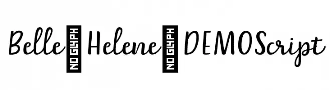
Herunterladen 860 Downloads@WebFont -
![Belle-Helene-DEMO Script Frei Schriftart Herunterladen]() Herunterladen 860 Downloads@WebFont
Herunterladen 860 Downloads@WebFont -
![Rough Sketch Frei Schriftart Herunterladen]() Herunterladen 860 Downloads@WebFont
Herunterladen 860 Downloads@WebFont -
( Copyright 2014 Adobe Systems Incorporated (http://www.adobe.com/), with Reserved Font Name 'Source'. All Rights Reserved. Source is a trademark of Adobe Systems Incorporated in the United States and/or other countries. )
A refined serif font with thin, elegant strokes and classic proportions.
![Source Serif Pro ExtraLight Frei Schriftart Herunterladen]() Herunterladen 860 Downloads@WebFont
Herunterladen 860 Downloads@WebFont -
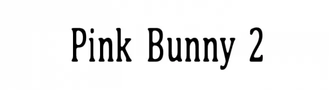
( Fonts by Juha Korhonen - www.junkohanhero.com. Personal-use only. For commercial use please contact owner )
A classic serif font with rounded edges and moderate contrast, offering elegance and readability.
![Pink Bunny 2 Frei Schriftart Herunterladen]() Herunterladen 860 Downloads@WebFont
Herunterladen 860 Downloads@WebFont -
( Fonts by Mr. Typeman )
A modern, cursive font with smooth, interconnected strokes and a handwritten feel.
![Albret Frei Schriftart Herunterladen]() Herunterladen 860 Downloads@WebFont
Herunterladen 860 Downloads@WebFont -
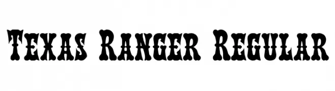
( Fonts by Daniel Zadorozny - www.iconian.com - Free for personal use )
A bold, vintage font with decorative serifs and a Wild West flair.
![Texas Ranger Regular Frei Schriftart Herunterladen]() Herunterladen 860 Downloads@WebFont
Herunterladen 860 Downloads@WebFont -
( Fonts by MuraKnockout Media + Design - muraknockout.com. Personal-use only. For commercial use please contact owner. )
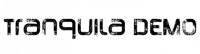
A bold, distressed font with a rugged, textured appearance.
![Tranquila DEMO Frei Schriftart Herunterladen]() Herunterladen 860 Downloads@WebFont
Herunterladen 860 Downloads@WebFont -
( Fonts by Castcraft Software - opti.netii.net - check the website before use )
A tall, narrow font with a modern, elegant design and minimal contrast.
![OPTIHuxley-Vertical Frei Schriftart Herunterladen]() Herunterladen 860 Downloads@WebFont
Herunterladen 860 Downloads@WebFont -
( Public domain / GPL / OFL - jlhfonts.blogspot.com/ )
Bold geometric arrow symbols in multiple directions and styles.
![Arrows Frei Schriftart Herunterladen]() Herunterladen 860 Downloads@WebFont
Herunterladen 860 Downloads@WebFont -
( Fonts by www.smeltery.net )
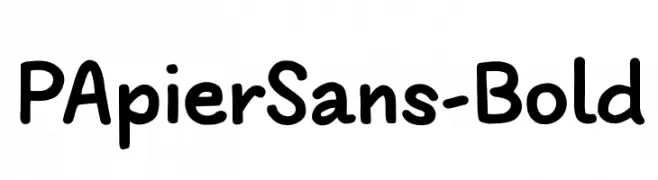
A playful, bold font with rounded edges and a hand-drawn feel.
![PApierSans-Bold Frei Schriftart Herunterladen]() Herunterladen 860 Downloads@WebFont
Herunterladen 860 Downloads@WebFont -
( Fonts by www.gust.org.pl )
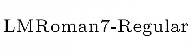
A classic serif font with elegant strokes and well-proportioned characters.
![LMRoman7-Regular Frei Schriftart Herunterladen]() Herunterladen 860 Downloads@WebFont
Herunterladen 860 Downloads@WebFont


Welche Schriften sind gerade am populärsten?
Poppins, Roboto, Montserrat, Open Sans und Lato sind wegen ihrer klaren Formen und breiten Einsetzbarkeit sehr gefragt – von Markenauftritt über Landingpages bis hin zu Postern.
Welche Fonts eignen sich für Logos?
Geometrische Sans‑Serifs (z. B. Poppins, Familien im Gotham‑Stil) sind ein häufiger Griff für sauberes, skalierbares Branding. Für eine persönlichere Note bleiben Scripts und Handschrift‑Stile beliebt. Kombinieren Sie einen prägnanten Headline‑Font mit einer neutralen Brotschrift für Wiedererkennung und Harmonie.
Wie oft wird die Top‑Liste aktualisiert?
Regelmäßig – basierend auf realen Downloads und Interaktionen. Schauen Sie öfter vorbei, um aufstrebende Favoriten früh zu entdecken.
💡 Tipp: Seite bookmarken – Trends wechseln schnell, und heutige Top‑Schriften inspirieren morgen vielleicht das Rebranding.