Willkommen bei den Top‑Schriften – hier treffen Beliebtheit und Qualität aufeinander. Das sind die in diesem Jahr am häufigsten heruntergeladenen und genutzten Fonts. Wenn Sie sichere Optionen für Logo, Web oder Social suchen, starten Sie hier.
Jeder Top‑Font überzeugt durch Balance, Lesbarkeit und Vielseitigkeit. Sie finden moderne Sans‑Serifs, elegante Scripts, Vintage‑Serifs und minimalistische Displays.
-
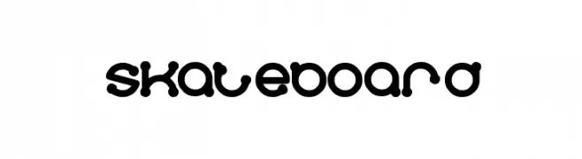
( Fonts by weknow - Wino S Kadir )
A playful, bubble-like font with a retro vibe and consistent boldness.
 Herunterladen 820 Downloads@WebFont
 -
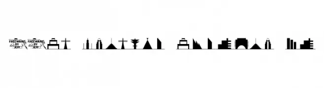
( Fonts by Jeff Levine. FREEWARE )
A font of modern skyline silhouettes with a futuristic touch.
![21st Century Skyline JL Frei Schriftart Herunterladen]() Herunterladen 820 Downloads@WebFont
Herunterladen 820 Downloads@WebFont -
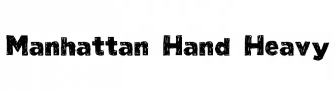
( Fonts by Taylor Baybutt - ikon3.com - Free for personal use only )
A bold, textured, hand-drawn font with a playful, artistic style.
![Manhattan Hand Heavy Frei Schriftart Herunterladen]() Herunterladen 820 Downloads@WebFont
Herunterladen 820 Downloads@WebFont -
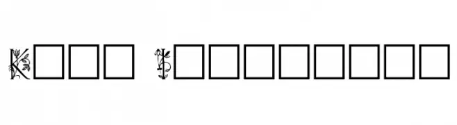
( Fonts by Dieter Steffmann )
An ornate, floral-themed decorative font with intricate botanical details.
![Koch Initialen Frei Schriftart Herunterladen]() Herunterladen 820 Downloads@WebFont
Herunterladen 820 Downloads@WebFont -
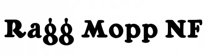
( Fonts by Nick Curtis - www.nicksfonts.com )
A bold, retro-inspired serif font with rounded characters and a playful vibe.
![Ragg Mopp NF Frei Schriftart Herunterladen]() Herunterladen 820 Downloads@WebFont
Herunterladen 820 Downloads@WebFont -
-
( Fonts by Apostrophic Lab )
A modern, italicized font with a sleek, futuristic style and consistent stroke thickness.
![Republikaps Italic Frei Schriftart Herunterladen]() Herunterladen 820 Downloads@WebFont
Herunterladen 820 Downloads@WebFont -
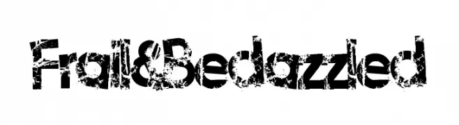
( Fonts by Lauren Thompson - www.nymfont.com )
A bold, distressed font with a grunge, textured style.
![Frail&Bedazzled Frei Schriftart Herunterladen]() Herunterladen 820 Downloads@WebFont
Herunterladen 820 Downloads@WebFont -
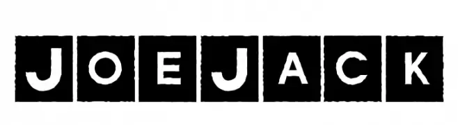
( Fonts by Daniel Gauthier )
Bold, stencil-like font with characters in white on black squares, offering a vintage, industrial feel.
![JoeJack Frei Schriftart Herunterladen]() Herunterladen 820 Downloads@WebFont
Herunterladen 820 Downloads@WebFont -
( Fonts by uatype.faithweb.com - UnAuthorized Type )
A playful, hand-drawn font with quirky, irregular letterforms.
![Anyway Frei Schriftart Herunterladen]() Herunterladen 820 Downloads@WebFont
Herunterladen 820 Downloads@WebFont -
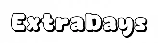
( Fonts by Khurasan )
A playful, bold font with bubble-like, outlined characters and a cartoonish style.
![Extra Days Frei Schriftart Herunterladen]() Herunterladen 819 Downloads@WebFont
Herunterladen 819 Downloads@WebFont -
( Fonts by Lafontype - Anugrah Pasau - Personal-use only. For commercial use please contact owner. )
A bold, modern sans-serif font with clean lines and strong presence.
![Cedora-Bold Frei Schriftart Herunterladen]() Herunterladen 819 Downloads@WebFont
Herunterladen 819 Downloads@WebFont -
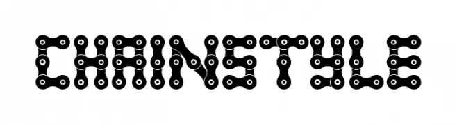
( Fonts by Woodcutter )
A decorative font styled like interconnected bicycle chains.
![Chain Style Frei Schriftart Herunterladen]() Herunterladen 819 Downloads@WebFont
Herunterladen 819 Downloads@WebFont -
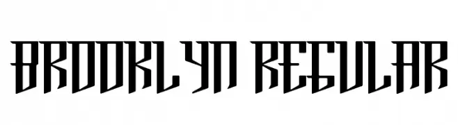
( Fonts by Paul Reis - Personal-use only. For commercial use please contact owner. )
A bold, angular font with a modern, geometric style.
![Brooklyn Regular Frei Schriftart Herunterladen]() Herunterladen 819 Downloads@WebFont
Herunterladen 819 Downloads@WebFont -
![UVN Dam Cuoi Hep Frei Schriftart Herunterladen]() Herunterladen 819 Downloads@WebFont
Herunterladen 819 Downloads@WebFont -
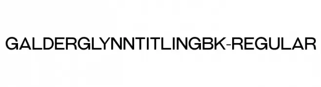
( Typodermic Fonts - Ray Larabie - www.typodermicfonts.com/ )
A modern, geometric sans-serif font with a clean and balanced design.
![GalderglynnTitlingBk-Regular Frei Schriftart Herunterladen]() Herunterladen 819 Downloads@WebFont
Herunterladen 819 Downloads@WebFont -
( Fonts by Agathe M.Joyce - www.foundmyfont.com - Personal-use only. For commercial use please contact owner. )
A sophisticated script font with elegant loops and flourishes.
![Motherland Frei Schriftart Herunterladen]() Herunterladen 819 Downloads@WebFont
Herunterladen 819 Downloads@WebFont -
![Abandon Frei Schriftart Herunterladen]() Herunterladen 819 Downloads@WebFont
Herunterladen 819 Downloads@WebFont -
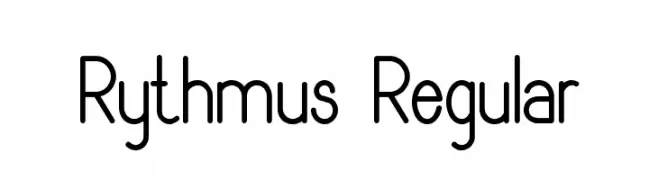
![Rythmus Regular Frei Schriftart Herunterladen]() Herunterladen 819 Downloads@WebFont
Herunterladen 819 Downloads@WebFont -
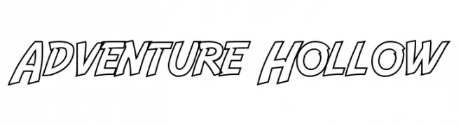
( Fonts by a Neale Davidson - www.pixelsagas.com. Personal-use only. For commercial use please contact owner. )
A bold, hollow font with a dynamic and adventurous style.
![Adventure Hollow Frei Schriftart Herunterladen]() Herunterladen 819 Downloads@WebFont
Herunterladen 819 Downloads@WebFont -
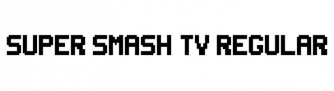
( Fonts by Diego Gonzalez )
A bold, pixelated font with a retro, arcade-inspired design.
![Super Smash TV Regular Frei Schriftart Herunterladen]() Herunterladen 819 Downloads@WebFont
Herunterladen 819 Downloads@WebFont -
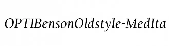
( Fonts by Castcraft Software - opti.netii.net - check the website before use )
A classic and elegant serif font with a slight italic slant and moderate contrast.
![OPTIBensonOldstyle-MedIta Frei Schriftart Herunterladen]() Herunterladen 819 Downloads@WebFont
Herunterladen 819 Downloads@WebFont -
![Mauryssel Bold Frei Schriftart Herunterladen]() Herunterladen 819 Downloads@WebFont
Herunterladen 819 Downloads@WebFont -
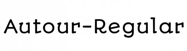
( Copyright (c) 2011 by Sorkin Type Co (www.sorkintype.com), with Reserved Font Name "Autour". )
A playful, rounded font with smooth curves and a friendly appearance.
![Autour-Regular Frei Schriftart Herunterladen]() Herunterladen 819 Downloads@WebFont
Herunterladen 819 Downloads@WebFont -
( Fonts by Koczman Balint - magiquefonts.gportal.hu )
A bold, distressed font with a textured, grunge appearance.
![District Frei Schriftart Herunterladen]() Herunterladen 819 Downloads@WebFont
Herunterladen 819 Downloads@WebFont -
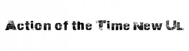
![Action of the Time New UL Frei Schriftart Herunterladen]() Herunterladen 819 Downloads@WebFont
Herunterladen 819 Downloads@WebFont -
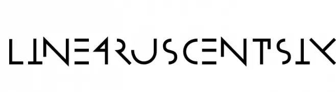
( Fonts by Manfred Klein. Free for private and charity use. Free for commercial with donation to organizations )
A geometric and futuristic font with sharp angles and clean lines.
![LinearusCentSix Frei Schriftart Herunterladen]() Herunterladen 819 Downloads@WebFont
Herunterladen 819 Downloads@WebFont -
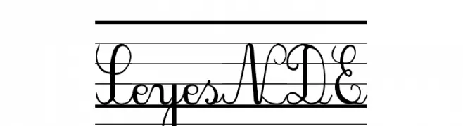
![SeyesNDE Frei Schriftart Herunterladen]() Herunterladen 819 Downloads@WebFont
Herunterladen 819 Downloads@WebFont -
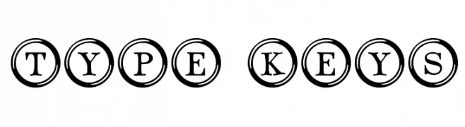
( Fonts by www.typadelic.com )
A vintage typewriter-inspired font with characters encased in circles, offering a bold and classic look.
![Type Keys Frei Schriftart Herunterladen]() Herunterladen 819 Downloads@WebFont
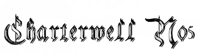
Herunterladen 819 Downloads@WebFont -
![Charterwell No5 Frei Schriftart Herunterladen]() Herunterladen 819 Downloads@WebFont
Herunterladen 819 Downloads@WebFont -
![Rabbit Regular Frei Schriftart Herunterladen]() Herunterladen 819 Downloads@WebFont
Herunterladen 819 Downloads@WebFont -
( Fonts by www.koenhachmang.com - Glitch )
A bold, modern font with a digital, Y2K-inspired aesthetic.
![Y2K Analog Legacy Frei Schriftart Herunterladen]() Herunterladen 819 Downloads@WebFont
Herunterladen 819 Downloads@WebFont -
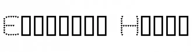
( Fonts by www.houseoflime.com )
A playful font composed entirely of small heart shapes, perfect for romantic and whimsical designs.
![Evelyn's Heart Frei Schriftart Herunterladen]() Herunterladen 819 Downloads@WebFont
Herunterladen 819 Downloads@WebFont -
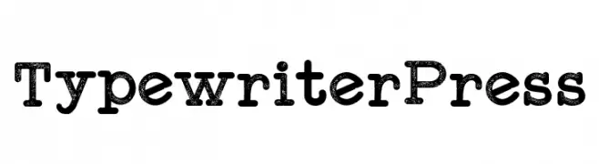
( Fonts by Galdino Otten Fonts - www.galdinootten.com - Personal-use only. For commercial use please contact owner. )
A vintage, monospaced slab serif font with a typewriter style and distressed texture.
![Typewriter Press Frei Schriftart Herunterladen]() Herunterladen 818 Downloads@WebFont
Herunterladen 818 Downloads@WebFont -
( Fonts by twinletter )
A playful, bold font with rounded, bubbly characters and a whimsical style.
![ShyestBold Frei Schriftart Herunterladen]() Herunterladen 818 Downloads@WebFont
Herunterladen 818 Downloads@WebFont -
( Fonts by Zetafonts - Personal-use only. For commercial use please contact owner. )
A bold, italicized font with a strong, modern presence.
![HeadingNow Trial 57 Extrabold Italic Frei Schriftart Herunterladen]() Herunterladen 818 Downloads@WebFont
Herunterladen 818 Downloads@WebFont


Welche Schriften sind gerade am populärsten?
Poppins, Roboto, Montserrat, Open Sans und Lato sind wegen ihrer klaren Formen und breiten Einsetzbarkeit sehr gefragt – von Markenauftritt über Landingpages bis hin zu Postern.
Welche Fonts eignen sich für Logos?
Geometrische Sans‑Serifs (z. B. Poppins, Familien im Gotham‑Stil) sind ein häufiger Griff für sauberes, skalierbares Branding. Für eine persönlichere Note bleiben Scripts und Handschrift‑Stile beliebt. Kombinieren Sie einen prägnanten Headline‑Font mit einer neutralen Brotschrift für Wiedererkennung und Harmonie.
Wie oft wird die Top‑Liste aktualisiert?
Regelmäßig – basierend auf realen Downloads und Interaktionen. Schauen Sie öfter vorbei, um aufstrebende Favoriten früh zu entdecken.
💡 Tipp: Seite bookmarken – Trends wechseln schnell, und heutige Top‑Schriften inspirieren morgen vielleicht das Rebranding.