Willkommen bei den Top‑Schriften – hier treffen Beliebtheit und Qualität aufeinander. Das sind die in diesem Jahr am häufigsten heruntergeladenen und genutzten Fonts. Wenn Sie sichere Optionen für Logo, Web oder Social suchen, starten Sie hier.
Jeder Top‑Font überzeugt durch Balance, Lesbarkeit und Vielseitigkeit. Sie finden moderne Sans‑Serifs, elegante Scripts, Vintage‑Serifs und minimalistische Displays.
-
( Fonts by MADType )
A bold, geometric font with strong, angular lines and a modern aesthetic.
 Herunterladen 196 Downloads@WebFont
 -
( Fonts by nomlimofont - Personal-use only. For commercial use please contact owner. )
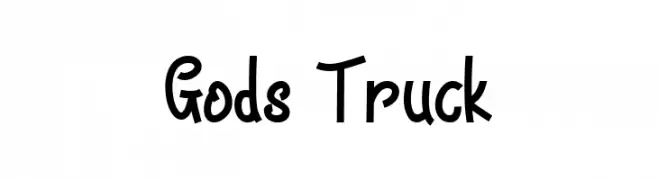
A bold, playful handwritten font with a dynamic and energetic style.
![Gods Truck Frei Schriftart Herunterladen]() Herunterladen 196 Downloads@WebFont
Herunterladen 196 Downloads@WebFont -
( Fonts by www.woodcutter.es - woodcutter Manero - Personal-use only. For commercial use please contact owner. )
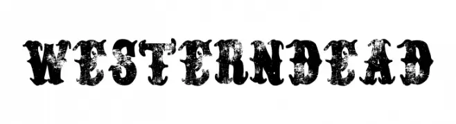
A rugged, distressed slab serif font with a bold, vintage Western aesthetic.
![Western Dead Frei Schriftart Herunterladen]() Herunterladen 196 Downloads@WebFont
Herunterladen 196 Downloads@WebFont -
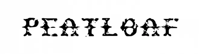
![Peatloaf Frei Schriftart Herunterladen]() Herunterladen 196 Downloads@WebFont
Herunterladen 196 Downloads@WebFont -
( Fonts by Daniel Zadorozny - www.iconian.com )
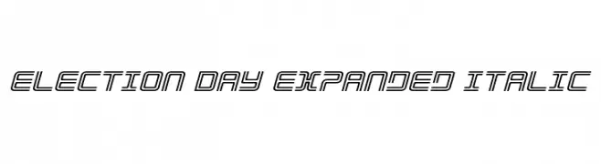
A futuristic, expanded italic font with outlined characters and geometric design.
![Election Day Expanded Italic Frei Schriftart Herunterladen]() Herunterladen 196 Downloads@WebFont
Herunterladen 196 Downloads@WebFont -
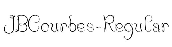
-
![JBCourbes-Regular Frei Schriftart Herunterladen]() Herunterladen 196 Downloads@WebFont
Herunterladen 196 Downloads@WebFont -
( Fonts by Wahyu Eka Prasetya - wepfont.com - Personal-use only. For commercial use please contact owner. )
A playful, hand-drawn font with bold, blob-like strokes.
![GATINK Frei Schriftart Herunterladen]() Herunterladen 196 Downloads@WebFont
Herunterladen 196 Downloads@WebFont -
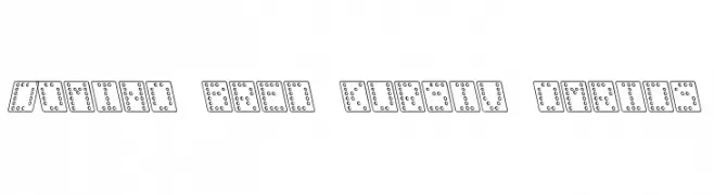
( Fonts by Klaus Johansen - www.listemageren.dK )
A playful, domino-themed font with italicized, outlined characters.
![Domino bred kursiv omrids Frei Schriftart Herunterladen]() Herunterladen 196 Downloads@WebFont
Herunterladen 196 Downloads@WebFont -
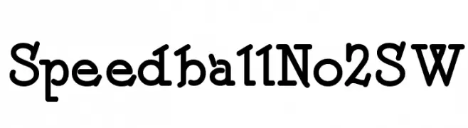
( Fonts by Nick Curtis - www.nicksfonts.com )
A playful, bold serif font with vintage-modern aesthetics and rounded serifs.
![SpeedballNo2SW Frei Schriftart Herunterladen]() Herunterladen 196 Downloads@WebFont
Herunterladen 196 Downloads@WebFont -
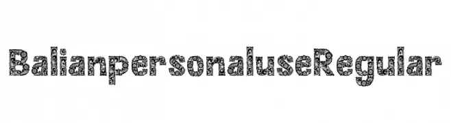
( Fonts by Alit Design )
An ornate, decorative font with intricate floral patterns on each character.
![Balian personal use Regular Frei Schriftart Herunterladen]() Herunterladen 196 Downloads@WebFont
Herunterladen 196 Downloads@WebFont

Welche Schriften sind gerade am populärsten?
Poppins, Roboto, Montserrat, Open Sans und Lato sind wegen ihrer klaren Formen und breiten Einsetzbarkeit sehr gefragt – von Markenauftritt über Landingpages bis hin zu Postern.
Welche Fonts eignen sich für Logos?
Geometrische Sans‑Serifs (z. B. Poppins, Familien im Gotham‑Stil) sind ein häufiger Griff für sauberes, skalierbares Branding. Für eine persönlichere Note bleiben Scripts und Handschrift‑Stile beliebt. Kombinieren Sie einen prägnanten Headline‑Font mit einer neutralen Brotschrift für Wiedererkennung und Harmonie.
Wie oft wird die Top‑Liste aktualisiert?
Regelmäßig – basierend auf realen Downloads und Interaktionen. Schauen Sie öfter vorbei, um aufstrebende Favoriten früh zu entdecken.
💡 Tipp: Seite bookmarken – Trends wechseln schnell, und heutige Top‑Schriften inspirieren morgen vielleicht das Rebranding.