Willkommen bei den Top‑Schriften – hier treffen Beliebtheit und Qualität aufeinander. Das sind die in diesem Jahr am häufigsten heruntergeladenen und genutzten Fonts. Wenn Sie sichere Optionen für Logo, Web oder Social suchen, starten Sie hier.
Jeder Top‑Font überzeugt durch Balance, Lesbarkeit und Vielseitigkeit. Sie finden moderne Sans‑Serifs, elegante Scripts, Vintage‑Serifs und minimalistische Displays.
-
 Herunterladen 194 Downloads
 -
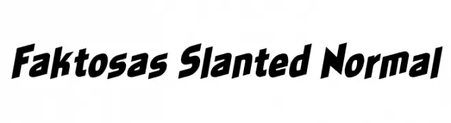
( Fonts by Khurasan )
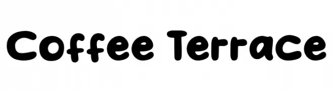
A playful, bold font with rounded, bubbly characters.
![Coffee Terrace Frei Schriftart Herunterladen]() Herunterladen 194 Downloads@WebFont
Herunterladen 194 Downloads@WebFont -
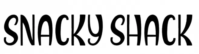
( Fonts by Jonathan S. Harris )
A playful and quirky font with bold strokes and unique curves.
![Snacky Shack Frei Schriftart Herunterladen]() Herunterladen 194 Downloads@WebFont
Herunterladen 194 Downloads@WebFont -
![Skeletor Stance Frei Schriftart Herunterladen]() Herunterladen 194 Downloads@WebFont
Herunterladen 194 Downloads@WebFont -
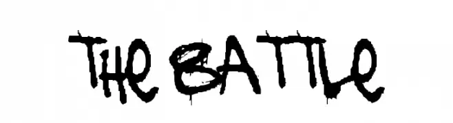
( Fonts by or from www.graffitifonts.net )
A bold, graffiti-inspired font with a rough, hand-drawn style.
![the battle Frei Schriftart Herunterladen]() Herunterladen 194 Downloads@WebFont
Herunterladen 194 Downloads@WebFont -
-
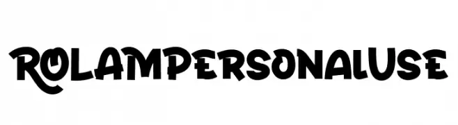
( Fonts by twinletter )
A bold, playful font with exaggerated strokes and a lively style.
![ROLAMPersonalUse Frei Schriftart Herunterladen]() Herunterladen 194 Downloads@WebFont
Herunterladen 194 Downloads@WebFont -
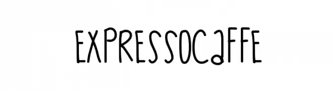
( Fonts by Des Gomez )
A playful, handwritten font with tall, narrow letters and rounded edges.
![ExpressoCaffe Frei Schriftart Herunterladen]() Herunterladen 194 Downloads@WebFont
Herunterladen 194 Downloads@WebFont -
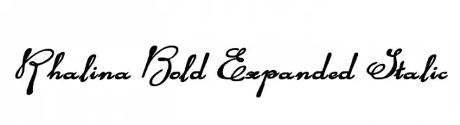
( Fonts by Daniel Zadorozny - www.iconian.com )
A bold, expanded, and italic script font with elegant curves and swashes.
![Rhalina Bold Expanded Italic Frei Schriftart Herunterladen]() Herunterladen 194 Downloads@WebFont
Herunterladen 194 Downloads@WebFont -
Schriftart von danny91194. For commercial use please contact the owner.
( tricky )
A modern, geometric font with clean lines and a dynamic slant.
![Kefei Frei Schriftart Herunterladen]() Herunterladen 194 Downloads@WebFont
Herunterladen 194 Downloads@WebFont -
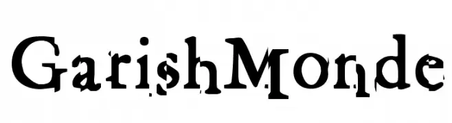
![GarishMonde Frei Schriftart Herunterladen]() Herunterladen 194 Downloads@WebFont
Herunterladen 194 Downloads@WebFont


Welche Schriften sind gerade am populärsten?
Poppins, Roboto, Montserrat, Open Sans und Lato sind wegen ihrer klaren Formen und breiten Einsetzbarkeit sehr gefragt – von Markenauftritt über Landingpages bis hin zu Postern.
Welche Fonts eignen sich für Logos?
Geometrische Sans‑Serifs (z. B. Poppins, Familien im Gotham‑Stil) sind ein häufiger Griff für sauberes, skalierbares Branding. Für eine persönlichere Note bleiben Scripts und Handschrift‑Stile beliebt. Kombinieren Sie einen prägnanten Headline‑Font mit einer neutralen Brotschrift für Wiedererkennung und Harmonie.
Wie oft wird die Top‑Liste aktualisiert?
Regelmäßig – basierend auf realen Downloads und Interaktionen. Schauen Sie öfter vorbei, um aufstrebende Favoriten früh zu entdecken.
💡 Tipp: Seite bookmarken – Trends wechseln schnell, und heutige Top‑Schriften inspirieren morgen vielleicht das Rebranding.