Willkommen bei den Top‑Schriften – hier treffen Beliebtheit und Qualität aufeinander. Das sind die in diesem Jahr am häufigsten heruntergeladenen und genutzten Fonts. Wenn Sie sichere Optionen für Logo, Web oder Social suchen, starten Sie hier.
Jeder Top‑Font überzeugt durch Balance, Lesbarkeit und Vielseitigkeit. Sie finden moderne Sans‑Serifs, elegante Scripts, Vintage‑Serifs und minimalistische Displays.
-
( www.pleine-page.fr )
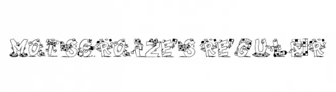
A whimsical, cartoon-like font with playful, animated characters and checkered patterns.
 Herunterladen 183 Downloads@WebFont
 -
( Fonts by Typhoon Type - Suthi Srisopha - www.typhoontype.net - Personal-use only. For commercial use please contact owner. )
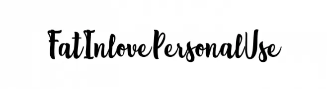
A playful, bold script font with a handwritten feel.
![FatInlovePersonalUse Frei Schriftart Herunterladen]() Herunterladen 183 Downloads@WebFont
Herunterladen 183 Downloads@WebFont -
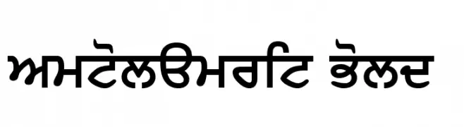
![SamtolAmrit Bold Frei Schriftart Herunterladen]() Herunterladen 183 Downloads@WebFont
Herunterladen 183 Downloads@WebFont -
( Fonts by Alexa )
A playful and quirky font with irregular, wavy letterforms.
![SKREEBLE Frei Schriftart Herunterladen]() Herunterladen 183 Downloads@WebFont
Herunterladen 183 Downloads@WebFont -
( Fonts by Si Panji )
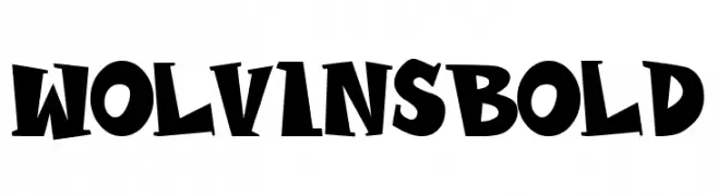
A bold, dynamic font with angular shapes and a playful style.
![WOLVINS Bold Frei Schriftart Herunterladen]() Herunterladen 183 Downloads@WebFont
Herunterladen 183 Downloads@WebFont -
-
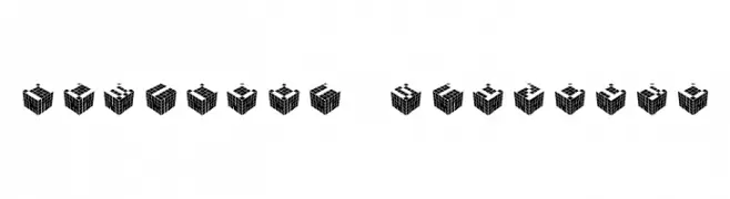
![CUBICdot standard Frei Schriftart Herunterladen]() Herunterladen 183 Downloads@WebFont
Herunterladen 183 Downloads@WebFont -
( Fonts by www.woodcutter.es - woodcutter Manero - Personal-use only. For commercial use please contact owner. )
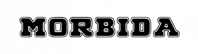
A bold, outlined decorative font with a vintage flair.
![MORBIDA Frei Schriftart Herunterladen]() Herunterladen 183 Downloads@WebFont
Herunterladen 183 Downloads@WebFont -
( Fonts by Spork Thug Typography - Josh Wilhelm - www.lifewithouttaffy.com/taffy/blog )
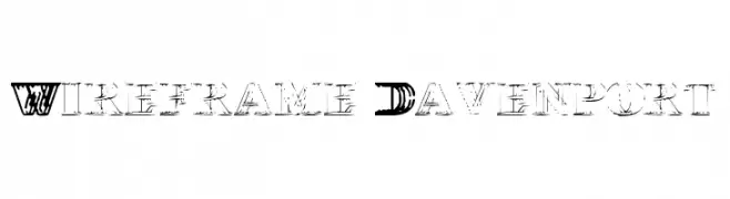
A bold, decorative font with a wireframe effect and high contrast strokes.
![Wireframe-Davenport Frei Schriftart Herunterladen]() Herunterladen 183 Downloads@WebFont
Herunterladen 183 Downloads@WebFont -
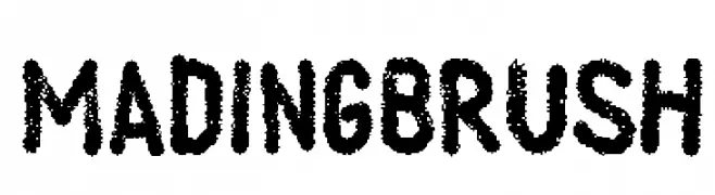
![Mading Brush Frei Schriftart Herunterladen]() Herunterladen 183 Downloads@WebFont
Herunterladen 183 Downloads@WebFont -
![MildHandJive Frei Schriftart Herunterladen]() Herunterladen 183 Downloads@WebFont
Herunterladen 183 Downloads@WebFont


Welche Schriften sind gerade am populärsten?
Poppins, Roboto, Montserrat, Open Sans und Lato sind wegen ihrer klaren Formen und breiten Einsetzbarkeit sehr gefragt – von Markenauftritt über Landingpages bis hin zu Postern.
Welche Fonts eignen sich für Logos?
Geometrische Sans‑Serifs (z. B. Poppins, Familien im Gotham‑Stil) sind ein häufiger Griff für sauberes, skalierbares Branding. Für eine persönlichere Note bleiben Scripts und Handschrift‑Stile beliebt. Kombinieren Sie einen prägnanten Headline‑Font mit einer neutralen Brotschrift für Wiedererkennung und Harmonie.
Wie oft wird die Top‑Liste aktualisiert?
Regelmäßig – basierend auf realen Downloads und Interaktionen. Schauen Sie öfter vorbei, um aufstrebende Favoriten früh zu entdecken.
💡 Tipp: Seite bookmarken – Trends wechseln schnell, und heutige Top‑Schriften inspirieren morgen vielleicht das Rebranding.