Willkommen bei den Top‑Schriften – hier treffen Beliebtheit und Qualität aufeinander. Das sind die in diesem Jahr am häufigsten heruntergeladenen und genutzten Fonts. Wenn Sie sichere Optionen für Logo, Web oder Social suchen, starten Sie hier.
Jeder Top‑Font überzeugt durch Balance, Lesbarkeit und Vielseitigkeit. Sie finden moderne Sans‑Serifs, elegante Scripts, Vintage‑Serifs und minimalistische Displays.
-
 Herunterladen 183 Downloads@WebFont
 -
( Typefar - Farul Arjianto - fontbundles.net/typefar )
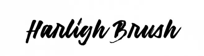
A bold and dynamic brush script font with fluid, hand-painted strokes.
![Harligh Brush Frei Schriftart Herunterladen]() Herunterladen 183 Downloads@WebFont
Herunterladen 183 Downloads@WebFont -
( Fonts by Scott Dieznyik - Kejak (formerly Cheops) )
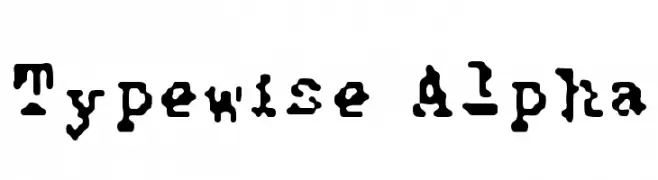
A bold, rugged font with a stencil-like, handcrafted appearance.
![Typewise Alpha Frei Schriftart Herunterladen]() Herunterladen 183 Downloads@WebFont
Herunterladen 183 Downloads@WebFont -
( Richard Khuptong - khuptong.com )
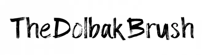
A dynamic brushstroke font with bold, expressive characters.
![The Dolbak Brush Frei Schriftart Herunterladen]() Herunterladen 183 Downloads@WebFont
Herunterladen 183 Downloads@WebFont -
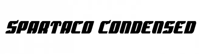
![Spartaco Condensed Frei Schriftart Herunterladen]() Herunterladen 183 Downloads@WebFont
Herunterladen 183 Downloads@WebFont -
-
( Fonts by GorillaBlu - Personal-use only. For commercial use please contact owner. )
A playful, block-style font with bold, uppercase letters in 3D blocks.
![Blu's Blocks Frei Schriftart Herunterladen]() Herunterladen 183 Downloads@WebFont
Herunterladen 183 Downloads@WebFont -
( Fonts by www.selawetype.com - Personal-use only. FOR DONATION https://www.paypal.me/selawe . For commercial use please contact owner. )
A modern, geometric sans-serif font with rounded edges and uniform stroke width.
![FREELAH Frei Schriftart Herunterladen]() Herunterladen 183 Downloads@WebFont
Herunterladen 183 Downloads@WebFont -
( Fonts by a Neale Davidson - www.pixelsagas.com. Personal-use only. For commercial use please contact owner. )
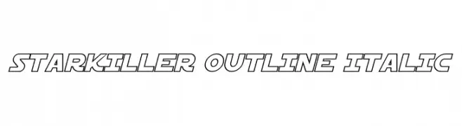
A bold, outlined, italic font with a futuristic and dynamic style.
![Starkiller Outline Italic Frei Schriftart Herunterladen]() Herunterladen 183 Downloads@WebFont
Herunterladen 183 Downloads@WebFont -
( Fonts by createshaa - Personal-use only. For commercial use please contact owner. )
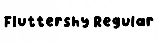
A playful, rounded font with a bold, uniform thickness and soft edges.
![Fluttershy Regular Frei Schriftart Herunterladen]() Herunterladen 183 Downloads@WebFont
Herunterladen 183 Downloads@WebFont -
( Fonts by a Neale Davidson - www.pixelsagas.com. Personal-use only. For commercial use please contact owner. )
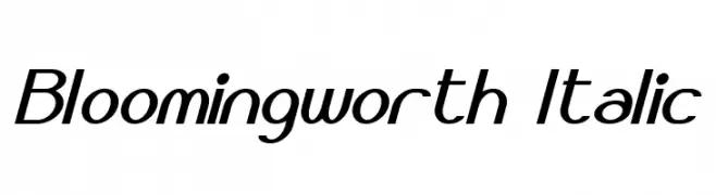
A modern, italicized font with sleek, elongated characters and smooth curves.
![Bloomingworth Italic Frei Schriftart Herunterladen]() Herunterladen 183 Downloads@WebFont
Herunterladen 183 Downloads@WebFont


Welche Schriften sind gerade am populärsten?
Poppins, Roboto, Montserrat, Open Sans und Lato sind wegen ihrer klaren Formen und breiten Einsetzbarkeit sehr gefragt – von Markenauftritt über Landingpages bis hin zu Postern.
Welche Fonts eignen sich für Logos?
Geometrische Sans‑Serifs (z. B. Poppins, Familien im Gotham‑Stil) sind ein häufiger Griff für sauberes, skalierbares Branding. Für eine persönlichere Note bleiben Scripts und Handschrift‑Stile beliebt. Kombinieren Sie einen prägnanten Headline‑Font mit einer neutralen Brotschrift für Wiedererkennung und Harmonie.
Wie oft wird die Top‑Liste aktualisiert?
Regelmäßig – basierend auf realen Downloads und Interaktionen. Schauen Sie öfter vorbei, um aufstrebende Favoriten früh zu entdecken.
💡 Tipp: Seite bookmarken – Trends wechseln schnell, und heutige Top‑Schriften inspirieren morgen vielleicht das Rebranding.