Willkommen bei den Top‑Schriften – hier treffen Beliebtheit und Qualität aufeinander. Das sind die in diesem Jahr am häufigsten heruntergeladenen und genutzten Fonts. Wenn Sie sichere Optionen für Logo, Web oder Social suchen, starten Sie hier.
Jeder Top‑Font überzeugt durch Balance, Lesbarkeit und Vielseitigkeit. Sie finden moderne Sans‑Serifs, elegante Scripts, Vintage‑Serifs und minimalistische Displays.
-
( Fonts by Alpaprana - Personal-use only. For commercial use please contact owner. )
A bold, expressive handwritten font with dynamic brush-like strokes.
 Herunterladen 182 Downloads@WebFont
 -
( Fonts by Kat`s Fun Fonts - Personal-use only. For commercial use please contact owner. )
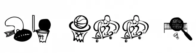
A decorative sports icon font with hand-drawn pictograms for each character.
![KR All Sport Frei Schriftart Herunterladen]() Herunterladen 182 Downloads@WebFont
Herunterladen 182 Downloads@WebFont -
![Bhoochoo Frei Schriftart Herunterladen]() Herunterladen 182 Downloads@WebFont
Herunterladen 182 Downloads@WebFont -
![Salmiak Shadow Frei Schriftart Herunterladen]() Herunterladen 182 Downloads@WebFont
Herunterladen 182 Downloads@WebFont -
![Satire Frei Schriftart Herunterladen]() Herunterladen 182 Downloads@WebFont
Herunterladen 182 Downloads@WebFont -
-
( OutsideInside Fonts )
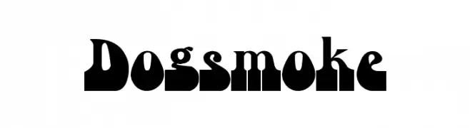
A bold, geometric font with playful curves and high contrast.
![Dogsmoke Frei Schriftart Herunterladen]() Herunterladen 182 Downloads@WebFont
Herunterladen 182 Downloads@WebFont -
( Fonts by Peax Webdesign - www.peax-webdesign.com. Personal-use only. For commercial use please contact owner. )
A lively and dynamic handwritten font with fluid, connected strokes.
![PW01Script Frei Schriftart Herunterladen]() Herunterladen 182 Downloads@WebFont
Herunterladen 182 Downloads@WebFont -
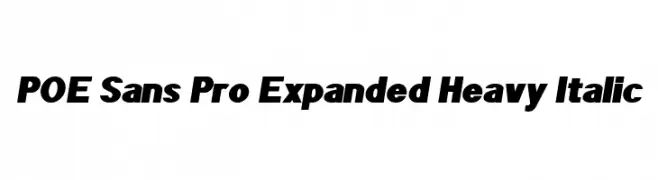
( Fonts by Dan P. Lyons - Personal-use only. For commercial use please contact owner. )
A bold, expanded, heavy italic sans-serif font with a modern and dynamic style.
![POE Sans Pro Expanded Heavy Italic Frei Schriftart Herunterladen]() Herunterladen 182 Downloads@WebFont
Herunterladen 182 Downloads@WebFont -
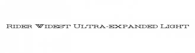
( Fonts by Mans Greback - www.mawns.com )
An ultra-expanded, light serif font with a modern and bold aesthetic.
![Rider Widest Ultra-expanded Light Frei Schriftart Herunterladen]() Herunterladen 182 Downloads@WebFont
Herunterladen 182 Downloads@WebFont -
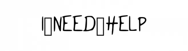
( Fonts by Kristian Immonen )
A playful, casual handwritten font with a relaxed and informal appearance.
![I_NEED_HELP Frei Schriftart Herunterladen]() Herunterladen 182 Downloads@WebFont
Herunterladen 182 Downloads@WebFont


Welche Schriften sind gerade am populärsten?
Poppins, Roboto, Montserrat, Open Sans und Lato sind wegen ihrer klaren Formen und breiten Einsetzbarkeit sehr gefragt – von Markenauftritt über Landingpages bis hin zu Postern.
Welche Fonts eignen sich für Logos?
Geometrische Sans‑Serifs (z. B. Poppins, Familien im Gotham‑Stil) sind ein häufiger Griff für sauberes, skalierbares Branding. Für eine persönlichere Note bleiben Scripts und Handschrift‑Stile beliebt. Kombinieren Sie einen prägnanten Headline‑Font mit einer neutralen Brotschrift für Wiedererkennung und Harmonie.
Wie oft wird die Top‑Liste aktualisiert?
Regelmäßig – basierend auf realen Downloads und Interaktionen. Schauen Sie öfter vorbei, um aufstrebende Favoriten früh zu entdecken.
💡 Tipp: Seite bookmarken – Trends wechseln schnell, und heutige Top‑Schriften inspirieren morgen vielleicht das Rebranding.