Willkommen bei den Top‑Schriften – hier treffen Beliebtheit und Qualität aufeinander. Das sind die in diesem Jahr am häufigsten heruntergeladenen und genutzten Fonts. Wenn Sie sichere Optionen für Logo, Web oder Social suchen, starten Sie hier.
Jeder Top‑Font überzeugt durch Balance, Lesbarkeit und Vielseitigkeit. Sie finden moderne Sans‑Serifs, elegante Scripts, Vintage‑Serifs und minimalistische Displays.
-
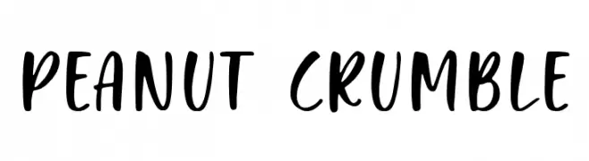
( Fonts by Balpirick Studio - Personal-use only. For commercial use please contact owner. )
A playful, handwritten-style font with bold, rounded strokes.
 Herunterladen 181 Downloads@WebFont
 -
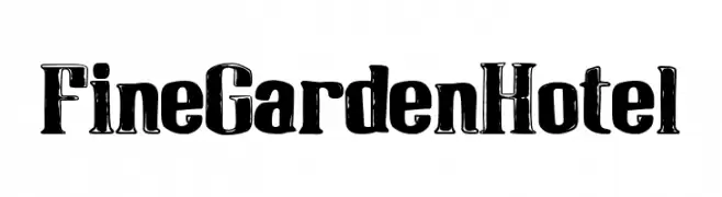
( Fonts by Woodcutter )
A bold, distressed font with a vintage, handcrafted appearance.
![Fine Garden Hotel Frei Schriftart Herunterladen]() Herunterladen 181 Downloads@WebFont
Herunterladen 181 Downloads@WebFont -
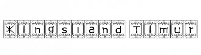
( Fonts by Imran Nasution )
A decorative font with ornate borders and a vintage, elegant style.
![Kingsland Timur Frei Schriftart Herunterladen]() Herunterladen 181 Downloads@WebFont
Herunterladen 181 Downloads@WebFont -
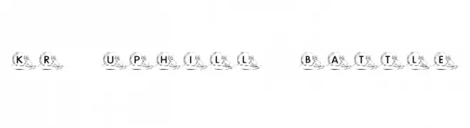
![KR Uphill Battle Frei Schriftart Herunterladen]() Herunterladen 181 Downloads@WebFont
Herunterladen 181 Downloads@WebFont -
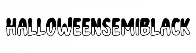
( Fonts by NJ Studio - Personal-use only. For commercial use please contact owner. )
A playful, bold font with a hand-drawn, cartoon-like style.
![Halloween semi black Frei Schriftart Herunterladen]() Herunterladen 181 Downloads@WebFont
Herunterladen 181 Downloads@WebFont -
-
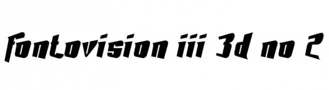
( Fonts by Dieter Schumacher )
A bold, angular font with a dynamic 3D effect and slanted orientation.
![Fontovision III 3D no 2 Frei Schriftart Herunterladen]() Herunterladen 181 Downloads@WebFont
Herunterladen 181 Downloads@WebFont -
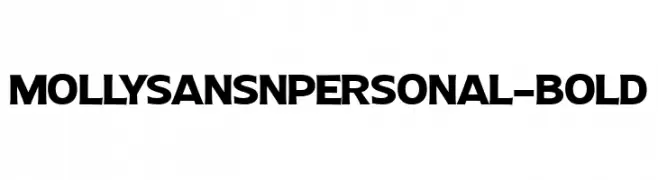
( Fonts by Mans Greback - Personal-use only. For commercial use please contact owner. )
A bold, high-contrast font with a dynamic and impactful style.
![MollySansNPERSONAL-Bold Frei Schriftart Herunterladen]() Herunterladen 181 Downloads@WebFont
Herunterladen 181 Downloads@WebFont -
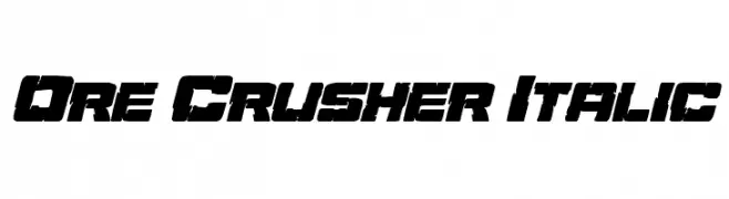
( Fonts by Daniel Zadorozny - www.iconian.com )
A bold, italicized font with a rugged, industrial style and high contrast.
![Ore Crusher Italic Frei Schriftart Herunterladen]() Herunterladen 181 Downloads@WebFont
Herunterladen 181 Downloads@WebFont -
![Mischstab Umbrella Patina Frei Schriftart Herunterladen]() Herunterladen 181 Downloads@WebFont
Herunterladen 181 Downloads@WebFont -
( Fonts by Kat`s Fun Fonts - Personal-use only. For commercial use please contact owner. )
A decorative font with Christmas-themed illustrations.
![KR Christmas Jewels 2005 Frei Schriftart Herunterladen]() Herunterladen 181 Downloads@WebFont
Herunterladen 181 Downloads@WebFont

Welche Schriften sind gerade am populärsten?
Poppins, Roboto, Montserrat, Open Sans und Lato sind wegen ihrer klaren Formen und breiten Einsetzbarkeit sehr gefragt – von Markenauftritt über Landingpages bis hin zu Postern.
Welche Fonts eignen sich für Logos?
Geometrische Sans‑Serifs (z. B. Poppins, Familien im Gotham‑Stil) sind ein häufiger Griff für sauberes, skalierbares Branding. Für eine persönlichere Note bleiben Scripts und Handschrift‑Stile beliebt. Kombinieren Sie einen prägnanten Headline‑Font mit einer neutralen Brotschrift für Wiedererkennung und Harmonie.
Wie oft wird die Top‑Liste aktualisiert?
Regelmäßig – basierend auf realen Downloads und Interaktionen. Schauen Sie öfter vorbei, um aufstrebende Favoriten früh zu entdecken.
💡 Tipp: Seite bookmarken – Trends wechseln schnell, und heutige Top‑Schriften inspirieren morgen vielleicht das Rebranding.