Willkommen bei den Top‑Schriften – hier treffen Beliebtheit und Qualität aufeinander. Das sind die in diesem Jahr am häufigsten heruntergeladenen und genutzten Fonts. Wenn Sie sichere Optionen für Logo, Web oder Social suchen, starten Sie hier.
Jeder Top‑Font überzeugt durch Balance, Lesbarkeit und Vielseitigkeit. Sie finden moderne Sans‑Serifs, elegante Scripts, Vintage‑Serifs und minimalistische Displays.
-
( Fonts by Jeff Levine. FREEWARE )
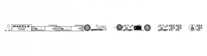
A playful collection of game-themed symbols for decorative use.
 Herunterladen 181 Downloads@WebFont
 -
( Fonts by wepfont - Wahyu Eka Prasetya - Personal-use only. For commercial use please contact owner. )
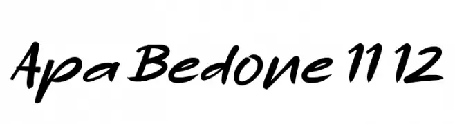
A dynamic, cursive script font with bold, fluid strokes and a lively, handwritten style.
![Apa Bedone 11 12 Frei Schriftart Herunterladen]() Herunterladen 181 Downloads@WebFont
Herunterladen 181 Downloads@WebFont -
![The Go Font Frei Schriftart Herunterladen]() Herunterladen 181 Downloads@WebFont
Herunterladen 181 Downloads@WebFont -
( Free for a personal use. For a commercial use please visit www.kevinandamanda.com )
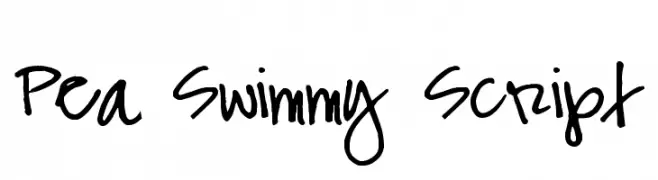
A bold, handwritten script font with a playful and dynamic style.
![Pea Swimmy Script Frei Schriftart Herunterladen]() Herunterladen 181 Downloads@WebFont
Herunterladen 181 Downloads@WebFont -
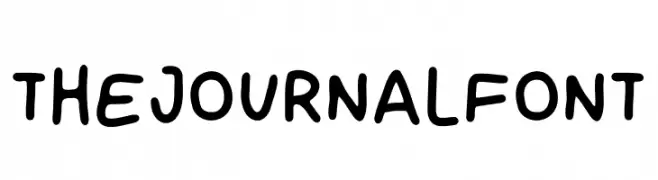
( Fonts by Sven Pels )
Playful handwritten font with rounded edges.
![THE JOURNAL FONT Frei Schriftart Herunterladen]() Herunterladen 181 Downloads@WebFont
Herunterladen 181 Downloads@WebFont -
-
( Fonts by Omnibus Type )
A modern, semi-condensed, bold italic font with high contrast and tight spacing.
![Saira SemiCondensed Bold Italic Frei Schriftart Herunterladen]() Herunterladen 181 Downloads@WebFont
Herunterladen 181 Downloads@WebFont -
( austiebost.net )
An elegant, flowing script font with ornate uppercase and smooth lowercase letters.
![Austie Bost Rest of Our Lives Frei Schriftart Herunterladen]() Herunterladen 181 Downloads@WebFont
Herunterladen 181 Downloads@WebFont -
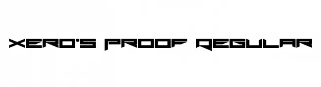
( Fonts by Andrew McCluskey - nalgames.com )
A futuristic, angular font with sharp edges and geometric shapes.
![Xero's Proof Regular Frei Schriftart Herunterladen]() Herunterladen 181 Downloads@WebFont
Herunterladen 181 Downloads@WebFont -
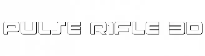
( Fonts by Daniel Zadorozny - www.iconian.com )
A futuristic, geometric font with bold, outlined characters and a three-dimensional effect.
![Pulse Rifle 3D Frei Schriftart Herunterladen]() Herunterladen 181 Downloads@WebFont
Herunterladen 181 Downloads@WebFont -
![KBTrueBeliever Frei Schriftart Herunterladen]() Herunterladen 181 Downloads@WebFont
Herunterladen 181 Downloads@WebFont


Welche Schriften sind gerade am populärsten?
Poppins, Roboto, Montserrat, Open Sans und Lato sind wegen ihrer klaren Formen und breiten Einsetzbarkeit sehr gefragt – von Markenauftritt über Landingpages bis hin zu Postern.
Welche Fonts eignen sich für Logos?
Geometrische Sans‑Serifs (z. B. Poppins, Familien im Gotham‑Stil) sind ein häufiger Griff für sauberes, skalierbares Branding. Für eine persönlichere Note bleiben Scripts und Handschrift‑Stile beliebt. Kombinieren Sie einen prägnanten Headline‑Font mit einer neutralen Brotschrift für Wiedererkennung und Harmonie.
Wie oft wird die Top‑Liste aktualisiert?
Regelmäßig – basierend auf realen Downloads und Interaktionen. Schauen Sie öfter vorbei, um aufstrebende Favoriten früh zu entdecken.
💡 Tipp: Seite bookmarken – Trends wechseln schnell, und heutige Top‑Schriften inspirieren morgen vielleicht das Rebranding.