Willkommen bei den Top‑Schriften – hier treffen Beliebtheit und Qualität aufeinander. Das sind die in diesem Jahr am häufigsten heruntergeladenen und genutzten Fonts. Wenn Sie sichere Optionen für Logo, Web oder Social suchen, starten Sie hier.
Jeder Top‑Font überzeugt durch Balance, Lesbarkeit und Vielseitigkeit. Sie finden moderne Sans‑Serifs, elegante Scripts, Vintage‑Serifs und minimalistische Displays.
-
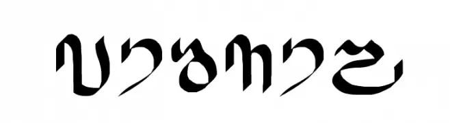
( Fonts by www.omniglot.com )
A bold, calligraphic font with high contrast and artistic flair.
 Herunterladen 181 Downloads@WebFont
 -
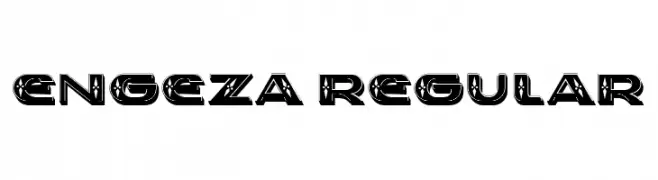
( Fonts by Vladimir Nikolic )
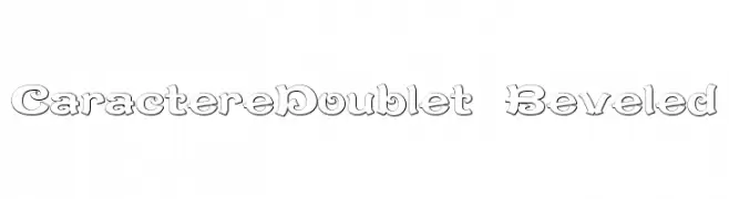
A bold, modern font with a decorative, layered design and consistent spacing.
![Engeza Regular Frei Schriftart Herunterladen]() Herunterladen 181 Downloads@WebFont
Herunterladen 181 Downloads@WebFont -
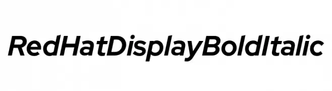
( Fonts by MCKL )
A bold, italicized font with a modern and dynamic style.
![Red Hat Display Bold Italic Frei Schriftart Herunterladen]() Herunterladen 181 Downloads@WebFont
Herunterladen 181 Downloads@WebFont -
![Shymal01 Frei Schriftart Herunterladen]() Herunterladen 181 Downloads@WebFont
Herunterladen 181 Downloads@WebFont -
![CaractereDoublet Beveled Frei Schriftart Herunterladen]() Herunterladen 181 Downloads@WebFont
Herunterladen 181 Downloads@WebFont -
-
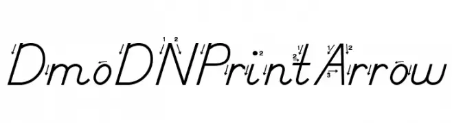
( Demo font. To purchase the full version, you can order it online at www.schoolhousefonts.com )
A modern font with arrow-like serifs and angular strokes, offering elegance and sophistication.
![DmoDNPrintArrow Frei Schriftart Herunterladen]() Herunterladen 181 Downloads@WebFont
Herunterladen 181 Downloads@WebFont -
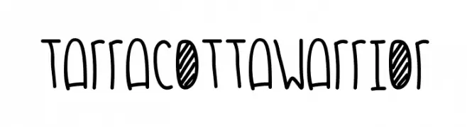
( Fonts by Des Gomez )
A playful, hand-drawn font with tall, narrow characters and a whimsical style.
![TarracottaWarrior Frei Schriftart Herunterladen]() Herunterladen 181 Downloads@WebFont
Herunterladen 181 Downloads@WebFont -
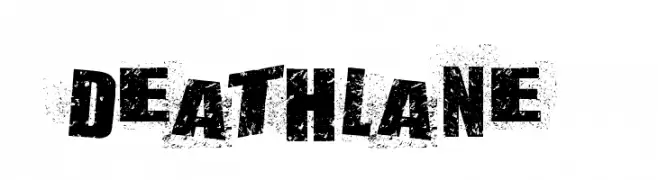
( Fonts by Aly K. Salazar )
A bold, distressed font with a grunge texture and rugged appearance.
![DEATHLANE Frei Schriftart Herunterladen]() Herunterladen 181 Downloads@WebFont
Herunterladen 181 Downloads@WebFont -
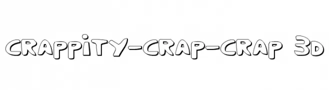
( Fonts by Daniel Zadorozny - www.iconian.com - Free for personal use )
A playful, 3D-effect font with bold outlines and a whimsical style.
![Crappity-Crap-Crap 3D Frei Schriftart Herunterladen]() Herunterladen 181 Downloads@WebFont
Herunterladen 181 Downloads@WebFont -
( Fonts by Billy Argel Fonts ® )
A bold, playful handwritten font with semi-expanded width and rounded edges.
![VEGgY PERSONAL USE Semi-expanded Medium Frei Schriftart Herunterladen]() Herunterladen 181 Downloads@WebFont
Herunterladen 181 Downloads@WebFont

Welche Schriften sind gerade am populärsten?
Poppins, Roboto, Montserrat, Open Sans und Lato sind wegen ihrer klaren Formen und breiten Einsetzbarkeit sehr gefragt – von Markenauftritt über Landingpages bis hin zu Postern.
Welche Fonts eignen sich für Logos?
Geometrische Sans‑Serifs (z. B. Poppins, Familien im Gotham‑Stil) sind ein häufiger Griff für sauberes, skalierbares Branding. Für eine persönlichere Note bleiben Scripts und Handschrift‑Stile beliebt. Kombinieren Sie einen prägnanten Headline‑Font mit einer neutralen Brotschrift für Wiedererkennung und Harmonie.
Wie oft wird die Top‑Liste aktualisiert?
Regelmäßig – basierend auf realen Downloads und Interaktionen. Schauen Sie öfter vorbei, um aufstrebende Favoriten früh zu entdecken.
💡 Tipp: Seite bookmarken – Trends wechseln schnell, und heutige Top‑Schriften inspirieren morgen vielleicht das Rebranding.