Willkommen bei den Top‑Schriften – hier treffen Beliebtheit und Qualität aufeinander. Das sind die in diesem Jahr am häufigsten heruntergeladenen und genutzten Fonts. Wenn Sie sichere Optionen für Logo, Web oder Social suchen, starten Sie hier.
Jeder Top‑Font überzeugt durch Balance, Lesbarkeit und Vielseitigkeit. Sie finden moderne Sans‑Serifs, elegante Scripts, Vintage‑Serifs und minimalistische Displays.
-
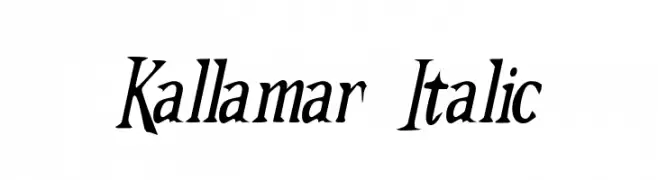
( Fonts by Omega Font Labs )
An elegant italic font with dynamic curves and sharp serifs.
 Herunterladen 180 Downloads@WebFont
 -
( Fonts by Omnibus Type )
A modern, semi-condensed, bold italic font with high contrast and tight spacing.
![Saira SemiCondensed Bold Italic Frei Schriftart Herunterladen]() Herunterladen 180 Downloads@WebFont
Herunterladen 180 Downloads@WebFont -
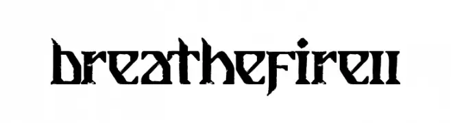
![Breathe Fire II Frei Schriftart Herunterladen]() Herunterladen 180 Downloads@WebFont
Herunterladen 180 Downloads@WebFont -
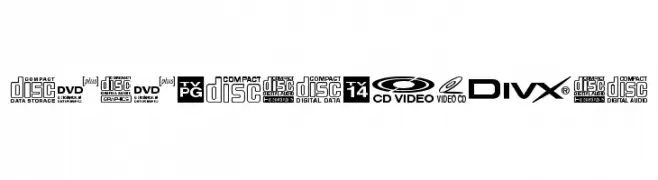
![DigitalSymbols Frei Schriftart Herunterladen]() Herunterladen 180 Downloads@WebFont
Herunterladen 180 Downloads@WebFont -
( Free for personal use - austiebost.net )
A bold, playful font with chunky, rounded characters for a whimsical look.
![Austie Bost Chunkilicious Frei Schriftart Herunterladen]() Herunterladen 180 Downloads@WebFont
Herunterladen 180 Downloads@WebFont -
-
( Fonts by a fontgrill.com. Personal-use only. For commercial use please contact owner. )
A modern, geometric sans-serif font with uniform strokes and excellent readability.
![Font13 Frei Schriftart Herunterladen]() Herunterladen 180 Downloads@WebFont
Herunterladen 180 Downloads@WebFont -
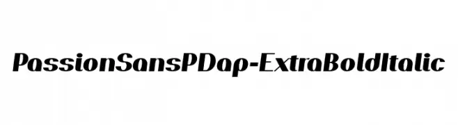
( Fonts by prescottdesignshop.com - Personal-use only. For commercial use please contact owner. )
A bold, italicized font with a dynamic and modern style.
![PassionSansPDap-ExtraBoldItalic Frei Schriftart Herunterladen]() Herunterladen 180 Downloads@WebFont
Herunterladen 180 Downloads@WebFont -
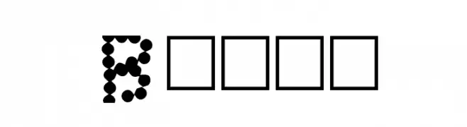
![Beady Frei Schriftart Herunterladen]() Herunterladen 180 Downloads@WebFont
Herunterladen 180 Downloads@WebFont -
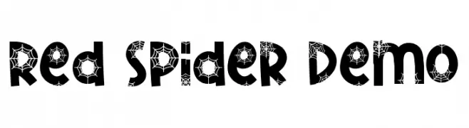
( Fonts by RaisProject )
A decorative font with a spider web motif, perfect for spooky themes.
![Red Spider Demo Frei Schriftart Herunterladen]() Herunterladen 180 Downloads@WebFont
Herunterladen 180 Downloads@WebFont -
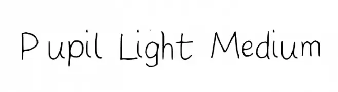
![Pupil Light Medium Frei Schriftart Herunterladen]() Herunterladen 180 Downloads@WebFont
Herunterladen 180 Downloads@WebFont


Welche Schriften sind gerade am populärsten?
Poppins, Roboto, Montserrat, Open Sans und Lato sind wegen ihrer klaren Formen und breiten Einsetzbarkeit sehr gefragt – von Markenauftritt über Landingpages bis hin zu Postern.
Welche Fonts eignen sich für Logos?
Geometrische Sans‑Serifs (z. B. Poppins, Familien im Gotham‑Stil) sind ein häufiger Griff für sauberes, skalierbares Branding. Für eine persönlichere Note bleiben Scripts und Handschrift‑Stile beliebt. Kombinieren Sie einen prägnanten Headline‑Font mit einer neutralen Brotschrift für Wiedererkennung und Harmonie.
Wie oft wird die Top‑Liste aktualisiert?
Regelmäßig – basierend auf realen Downloads und Interaktionen. Schauen Sie öfter vorbei, um aufstrebende Favoriten früh zu entdecken.
💡 Tipp: Seite bookmarken – Trends wechseln schnell, und heutige Top‑Schriften inspirieren morgen vielleicht das Rebranding.