Willkommen bei den Top‑Schriften – hier treffen Beliebtheit und Qualität aufeinander. Das sind die in diesem Jahr am häufigsten heruntergeladenen und genutzten Fonts. Wenn Sie sichere Optionen für Logo, Web oder Social suchen, starten Sie hier.
Jeder Top‑Font überzeugt durch Balance, Lesbarkeit und Vielseitigkeit. Sie finden moderne Sans‑Serifs, elegante Scripts, Vintage‑Serifs und minimalistische Displays.
-
Schriftart von defharo. For commercial use please contact the owner.
 Herunterladen 179 Downloads@WebFont
 -
( Fonts by Manfred Klein - manfred-klein.ina-mar.com )
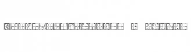
A geometric, square-based decorative font with intricate line work.
![XperimentypoThree-B-Square Frei Schriftart Herunterladen]() Herunterladen 179 Downloads@WebFont
Herunterladen 179 Downloads@WebFont -
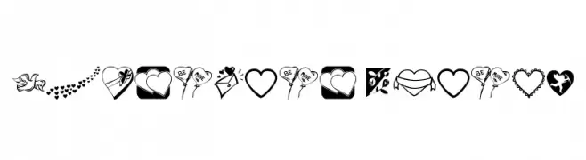
![Valentine Things Frei Schriftart Herunterladen]() Herunterladen 179 Downloads@WebFont
Herunterladen 179 Downloads@WebFont -
( Iconian Fonts - Daniel Zadorozny - www.iconian.com )
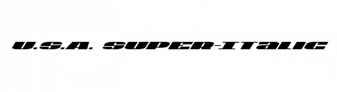
A bold, italic font with a dynamic, modern style and high contrast strokes.
![U.S.A. Super-Italic Frei Schriftart Herunterladen]() Herunterladen 179 Downloads@WebFont
Herunterladen 179 Downloads@WebFont -
( John Alexander - www.amanindesign.com )
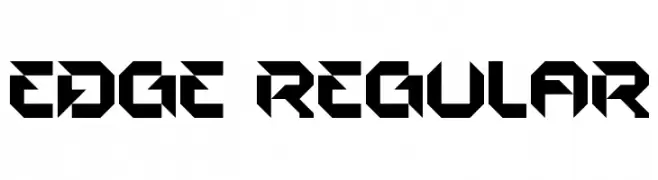
A bold, geometric font with sharp angles and a futuristic style.
![EDGE Regular Frei Schriftart Herunterladen]() Herunterladen 179 Downloads@WebFont
Herunterladen 179 Downloads@WebFont -
-
( Fonts by Zeenesia Studio )
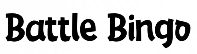
A playful, bold font with a hand-drawn, friendly appearance.
![Battle Bingo Frei Schriftart Herunterladen]() Herunterladen 179 Downloads@WebFont
Herunterladen 179 Downloads@WebFont -
( Fonts by Daniel Zadorozny - www.iconian.com - Free for personal use )
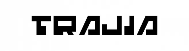
A bold, geometric font with a futuristic and digital style.
![Trajia Frei Schriftart Herunterladen]() Herunterladen 179 Downloads@WebFont
Herunterladen 179 Downloads@WebFont -
![MF Dings Frei Schriftart Herunterladen]() Herunterladen 179 Downloads@WebFont
Herunterladen 179 Downloads@WebFont -
( Fonts by PiPi Creative )
A playful, hand-drawn sans-serif with rounded, informal shapes.
![BARBERA Frei Schriftart Herunterladen]() Herunterladen 179 Downloads@WebFont
Herunterladen 179 Downloads@WebFont -
( Fonts by Font Environment - fontenvironment.com )
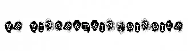
A bold, fingerprint-themed font with a modern and artistic style.
![FE-FingerprintsInside Frei Schriftart Herunterladen]() Herunterladen 179 Downloads@WebFont
Herunterladen 179 Downloads@WebFont

Welche Schriften sind gerade am populärsten?
Poppins, Roboto, Montserrat, Open Sans und Lato sind wegen ihrer klaren Formen und breiten Einsetzbarkeit sehr gefragt – von Markenauftritt über Landingpages bis hin zu Postern.
Welche Fonts eignen sich für Logos?
Geometrische Sans‑Serifs (z. B. Poppins, Familien im Gotham‑Stil) sind ein häufiger Griff für sauberes, skalierbares Branding. Für eine persönlichere Note bleiben Scripts und Handschrift‑Stile beliebt. Kombinieren Sie einen prägnanten Headline‑Font mit einer neutralen Brotschrift für Wiedererkennung und Harmonie.
Wie oft wird die Top‑Liste aktualisiert?
Regelmäßig – basierend auf realen Downloads und Interaktionen. Schauen Sie öfter vorbei, um aufstrebende Favoriten früh zu entdecken.
💡 Tipp: Seite bookmarken – Trends wechseln schnell, und heutige Top‑Schriften inspirieren morgen vielleicht das Rebranding.