Willkommen bei den Top‑Schriften – hier treffen Beliebtheit und Qualität aufeinander. Das sind die in diesem Jahr am häufigsten heruntergeladenen und genutzten Fonts. Wenn Sie sichere Optionen für Logo, Web oder Social suchen, starten Sie hier.
Jeder Top‑Font überzeugt durch Balance, Lesbarkeit und Vielseitigkeit. Sie finden moderne Sans‑Serifs, elegante Scripts, Vintage‑Serifs und minimalistische Displays.
-
( Fonts by www.fontalicious.com )
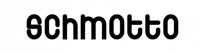
A bold, rounded font with a playful and modern aesthetic.
 Herunterladen 179 Downloads@WebFont
 -
( Fonts by Iconian Fonts )
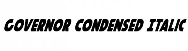
A bold, condensed, and italic font with a dynamic and energetic style.
![Governor Condensed Italic Frei Schriftart Herunterladen]() Herunterladen 179 Downloads@WebFont
Herunterladen 179 Downloads@WebFont -
( Fonts by MCKL )
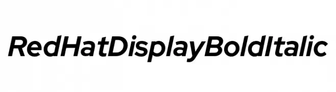
A bold, italicized font with a modern and dynamic style.
![Red Hat Display Bold Italic Frei Schriftart Herunterladen]() Herunterladen 179 Downloads@WebFont
Herunterladen 179 Downloads@WebFont -
Schriftart von Qbotype. For commercial use please contact the owner.
( Fonts by www.phuxerdesigns.com.ar - Non-commercial use of any typeface free version, only buying the full version )
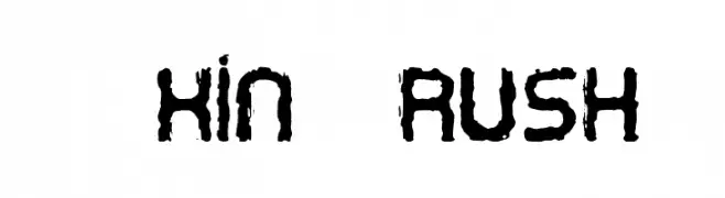
A bold, textured brush-style font with an artistic, hand-drawn appearance.
![Oxin Brush Frei Schriftart Herunterladen]() Herunterladen 179 Downloads@WebFont
Herunterladen 179 Downloads@WebFont -
![Fedyral Frei Schriftart Herunterladen]() Herunterladen 179 Downloads
Herunterladen 179 Downloads -
-
( Fonts by Divide By Zero! - fonts.tom7.com )
A bold, decorative font with a unique outline style and high contrast.
![Technetium Frei Schriftart Herunterladen]() Herunterladen 179 Downloads@WebFont
Herunterladen 179 Downloads@WebFont -
( 7NTypes - Situjuh Nazara - 7ntypes.com )
A modern, bold, and italicized font with a sleek and dynamic appearance.
![LearnShareColaborate-BoldItalic Frei Schriftart Herunterladen]() Herunterladen 179 Downloads@WebFont
Herunterladen 179 Downloads@WebFont -
( Måns Grebäck - www.mansgreback.com )
A bold, modern sans-serif font with smooth, rounded edges and consistent character spacing.
![Kandira PERSONAL Bold Frei Schriftart Herunterladen]() Herunterladen 179 Downloads@WebFont
Herunterladen 179 Downloads@WebFont -
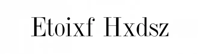
( Fonts by David Rakowski )
A classic serif font with high contrast and elegant, sharp serifs.
![Jumble Plain Frei Schriftart Herunterladen]() Herunterladen 179 Downloads@WebFont
Herunterladen 179 Downloads@WebFont -
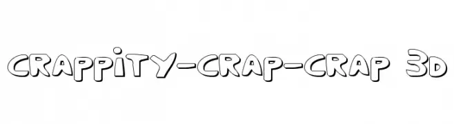
( Fonts by Daniel Zadorozny - www.iconian.com - Free for personal use )
A playful, 3D-effect font with bold outlines and a whimsical style.
![Crappity-Crap-Crap 3D Frei Schriftart Herunterladen]() Herunterladen 179 Downloads@WebFont
Herunterladen 179 Downloads@WebFont


Welche Schriften sind gerade am populärsten?
Poppins, Roboto, Montserrat, Open Sans und Lato sind wegen ihrer klaren Formen und breiten Einsetzbarkeit sehr gefragt – von Markenauftritt über Landingpages bis hin zu Postern.
Welche Fonts eignen sich für Logos?
Geometrische Sans‑Serifs (z. B. Poppins, Familien im Gotham‑Stil) sind ein häufiger Griff für sauberes, skalierbares Branding. Für eine persönlichere Note bleiben Scripts und Handschrift‑Stile beliebt. Kombinieren Sie einen prägnanten Headline‑Font mit einer neutralen Brotschrift für Wiedererkennung und Harmonie.
Wie oft wird die Top‑Liste aktualisiert?
Regelmäßig – basierend auf realen Downloads und Interaktionen. Schauen Sie öfter vorbei, um aufstrebende Favoriten früh zu entdecken.
💡 Tipp: Seite bookmarken – Trends wechseln schnell, und heutige Top‑Schriften inspirieren morgen vielleicht das Rebranding.