Willkommen bei den Top‑Schriften – hier treffen Beliebtheit und Qualität aufeinander. Das sind die in diesem Jahr am häufigsten heruntergeladenen und genutzten Fonts. Wenn Sie sichere Optionen für Logo, Web oder Social suchen, starten Sie hier.
Jeder Top‑Font überzeugt durch Balance, Lesbarkeit und Vielseitigkeit. Sie finden moderne Sans‑Serifs, elegante Scripts, Vintage‑Serifs und minimalistische Displays.
-
( Iconian Fonts - Daniel Zadorozny - www.iconian.com )
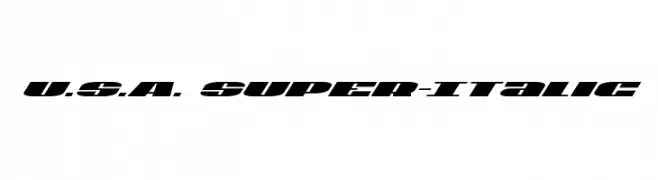
A bold, italic font with a dynamic, modern style and high contrast strokes.
 Herunterladen 178 Downloads@WebFont
 -
( John Alexander - www.amanindesign.com )
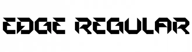
A bold, geometric font with sharp angles and a futuristic style.
![EDGE Regular Frei Schriftart Herunterladen]() Herunterladen 178 Downloads@WebFont
Herunterladen 178 Downloads@WebFont -
( Fonts by Rodrigo German - RASDESIGN )
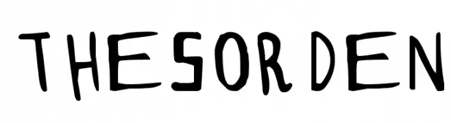
A playful, hand-drawn font with a whimsical and informal style.
![THESORDEN Frei Schriftart Herunterladen]() Herunterladen 178 Downloads@WebFont
Herunterladen 178 Downloads@WebFont -
( Fonts by Manfred Klein. Free for private and charity use. Free for commercial with donation to organizations )
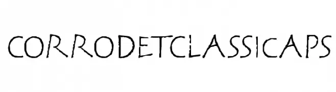
A rugged, hand-drawn font with an ancient, distressed appearance.
![CorrodetClassicaps Frei Schriftart Herunterladen]() Herunterladen 178 Downloads@WebFont
Herunterladen 178 Downloads@WebFont -
( Fonts by Iconian Fonts )
A segmented, digital-style font inspired by LED displays.
![LED Sled Straight Frei Schriftart Herunterladen]() Herunterladen 178 Downloads@WebFont
Herunterladen 178 Downloads@WebFont -
-
![Glooper Frei Schriftart Herunterladen]() Herunterladen 178 Downloads@WebFont
Herunterladen 178 Downloads@WebFont -
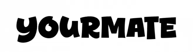
( Fonts by Khurasan™ )
A bold, playful font with a cartoonish and exaggerated style.
![Yourmate Frei Schriftart Herunterladen]() Herunterladen 178 Downloads@WebFont
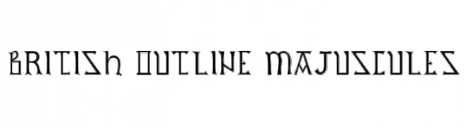
Herunterladen 178 Downloads@WebFont -
![British Outline Majuscules Frei Schriftart Herunterladen]() Herunterladen 178 Downloads@WebFont
Herunterladen 178 Downloads@WebFont -
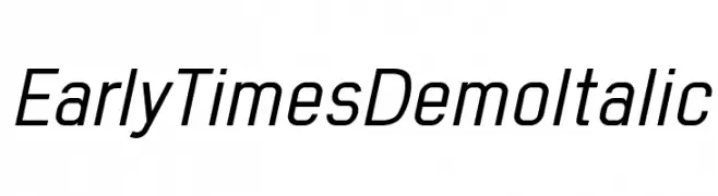
( Fonts by www.studiotypo.com - Personal-use only. For commercial use please contact owner. )
A modern, italicized font with clean lines and medium contrast.
![Early Times Demo Italic Frei Schriftart Herunterladen]() Herunterladen 178 Downloads@WebFont
Herunterladen 178 Downloads@WebFont -
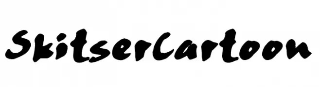
( Fonts by www.fontpanda.com. Personal-use only. For commercial use please contact owner. )
A bold, cartoonish font with thick, uneven strokes and a playful style.
![SkitserCartoon Frei Schriftart Herunterladen]() Herunterladen 178 Downloads@WebFont
Herunterladen 178 Downloads@WebFont


Welche Schriften sind gerade am populärsten?
Poppins, Roboto, Montserrat, Open Sans und Lato sind wegen ihrer klaren Formen und breiten Einsetzbarkeit sehr gefragt – von Markenauftritt über Landingpages bis hin zu Postern.
Welche Fonts eignen sich für Logos?
Geometrische Sans‑Serifs (z. B. Poppins, Familien im Gotham‑Stil) sind ein häufiger Griff für sauberes, skalierbares Branding. Für eine persönlichere Note bleiben Scripts und Handschrift‑Stile beliebt. Kombinieren Sie einen prägnanten Headline‑Font mit einer neutralen Brotschrift für Wiedererkennung und Harmonie.
Wie oft wird die Top‑Liste aktualisiert?
Regelmäßig – basierend auf realen Downloads und Interaktionen. Schauen Sie öfter vorbei, um aufstrebende Favoriten früh zu entdecken.
💡 Tipp: Seite bookmarken – Trends wechseln schnell, und heutige Top‑Schriften inspirieren morgen vielleicht das Rebranding.