Willkommen bei den Top‑Schriften – hier treffen Beliebtheit und Qualität aufeinander. Das sind die in diesem Jahr am häufigsten heruntergeladenen und genutzten Fonts. Wenn Sie sichere Optionen für Logo, Web oder Social suchen, starten Sie hier.
Jeder Top‑Font überzeugt durch Balance, Lesbarkeit und Vielseitigkeit. Sie finden moderne Sans‑Serifs, elegante Scripts, Vintage‑Serifs und minimalistische Displays.
-
( Fonts by Kong Font - fontkong.com - Personal-use only. For commercial use please contact owner. )
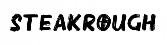
A bold, brushstroke font with a rough, textured appearance.
 Herunterladen 165 Downloads@WebFont
 -
( Fonts by a Max Infeld - XEROGRAPHER FONTS - xerographer.blogspot.com . Personal-use only. For commercial use please contact owner. )
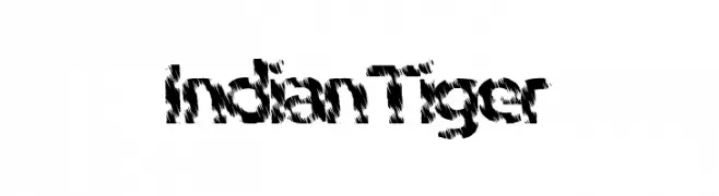
A bold, textured font with a wild, tiger-stripe appearance.
![IndianTiger Frei Schriftart Herunterladen]() Herunterladen 165 Downloads@WebFont
Herunterladen 165 Downloads@WebFont -
![FrailSansLight Frei Schriftart Herunterladen]() Herunterladen 165 Downloads@WebFont
Herunterladen 165 Downloads@WebFont -
( Fonts by Daniel Zadorozny - www.iconian.com )
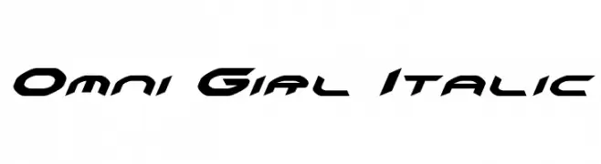
A futuristic, italicized font with angular and dynamic letterforms.
![Omni Girl Italic Frei Schriftart Herunterladen]() Herunterladen 165 Downloads@WebFont
Herunterladen 165 Downloads@WebFont -
![ModernPictograms Frei Schriftart Herunterladen]() Herunterladen 165 Downloads@WebFont
Herunterladen 165 Downloads@WebFont -
-
( Fonts by Andrew Hart - dirt2.com )
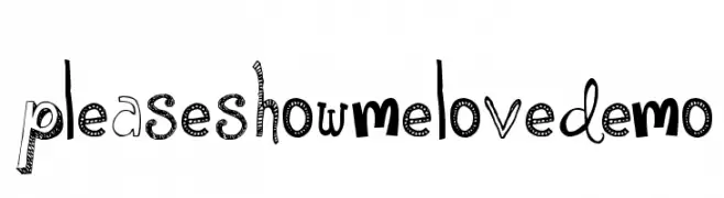
A playful, eclectic font with varied decorative characters.
![PleaseShowMeLoveDEMO Frei Schriftart Herunterladen]() Herunterladen 165 Downloads@WebFont
Herunterladen 165 Downloads@WebFont -
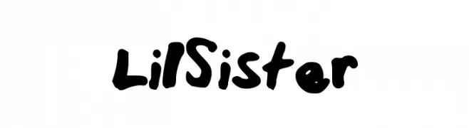
![LilSister Frei Schriftart Herunterladen]() Herunterladen 165 Downloads@WebFont
Herunterladen 165 Downloads@WebFont -
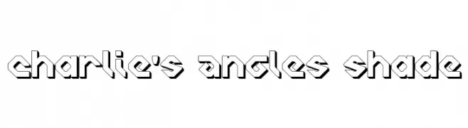
![Charlie's Angles Shade Frei Schriftart Herunterladen]() Herunterladen 165 Downloads
Herunterladen 165 Downloads -
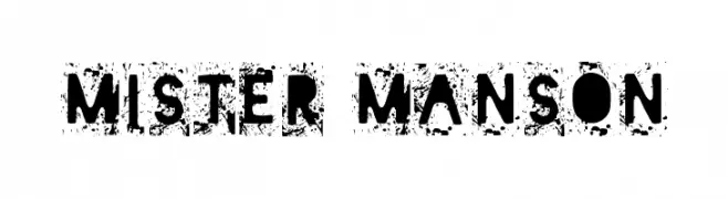
( Fonts by Woodcutter )
A bold, distressed font with a grunge texture and rugged appearance.
![Mister Manson Frei Schriftart Herunterladen]() Herunterladen 165 Downloads@WebFont
Herunterladen 165 Downloads@WebFont -
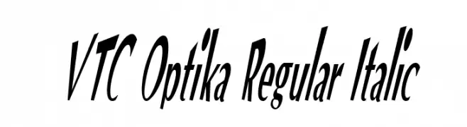
![VTC Optika Regular Italic Frei Schriftart Herunterladen]() Herunterladen 165 Downloads@WebFont
Herunterladen 165 Downloads@WebFont
Welche Schriften sind gerade am populärsten?
Poppins, Roboto, Montserrat, Open Sans und Lato sind wegen ihrer klaren Formen und breiten Einsetzbarkeit sehr gefragt – von Markenauftritt über Landingpages bis hin zu Postern.
Welche Fonts eignen sich für Logos?
Geometrische Sans‑Serifs (z. B. Poppins, Familien im Gotham‑Stil) sind ein häufiger Griff für sauberes, skalierbares Branding. Für eine persönlichere Note bleiben Scripts und Handschrift‑Stile beliebt. Kombinieren Sie einen prägnanten Headline‑Font mit einer neutralen Brotschrift für Wiedererkennung und Harmonie.
Wie oft wird die Top‑Liste aktualisiert?
Regelmäßig – basierend auf realen Downloads und Interaktionen. Schauen Sie öfter vorbei, um aufstrebende Favoriten früh zu entdecken.
💡 Tipp: Seite bookmarken – Trends wechseln schnell, und heutige Top‑Schriften inspirieren morgen vielleicht das Rebranding.