Willkommen bei den Top‑Schriften – hier treffen Beliebtheit und Qualität aufeinander. Das sind die in diesem Jahr am häufigsten heruntergeladenen und genutzten Fonts. Wenn Sie sichere Optionen für Logo, Web oder Social suchen, starten Sie hier.
Jeder Top‑Font überzeugt durch Balance, Lesbarkeit und Vielseitigkeit. Sie finden moderne Sans‑Serifs, elegante Scripts, Vintage‑Serifs und minimalistische Displays.
-
( Fonts by zone108.main.jp - Personal-use only. For commercial use please contact owner. )
A dynamic, sports-themed font featuring baseball player silhouettes.
 Herunterladen 165 Downloads@WebFont
 -
![Starjump Frei Schriftart Herunterladen]() Herunterladen 165 Downloads@WebFont
Herunterladen 165 Downloads@WebFont -
( Mr. Typeman - creativemarket.com/mr.typeman )
A dynamic script font with fluid, connected letterforms and moderate contrast.
![Tadworth Frei Schriftart Herunterladen]() Herunterladen 165 Downloads@WebFont
Herunterladen 165 Downloads@WebFont -
( Free for a personal use. For a commercial use please visit www.kevinandamanda.com )
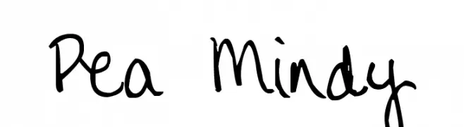
A playful, casual handwritten font with flowing strokes and a whimsical feel.
![Pea Mindy Frei Schriftart Herunterladen]() Herunterladen 165 Downloads@WebFont
Herunterladen 165 Downloads@WebFont -
( Fonts by a Max Infeld - XEROGRAPHER FONTS - xerographer.blogspot.com . Personal-use only. For commercial use please contact owner. )
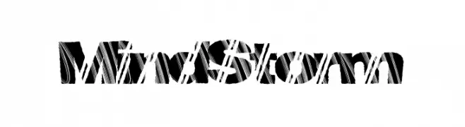
A bold, dynamic font with diagonal line patterns for a modern, energetic look.
![MindStorm Frei Schriftart Herunterladen]() Herunterladen 165 Downloads@WebFont
Herunterladen 165 Downloads@WebFont -
-
( Fonts by Linecreative - ARI JUANDA - Personal-use only. For commercial use please contact owner. )
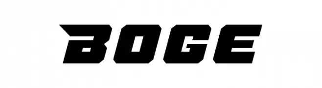
A bold, angular font with a futuristic and dynamic style.
![Boge Frei Schriftart Herunterladen]() Herunterladen 165 Downloads@WebFont
Herunterladen 165 Downloads@WebFont -
( Fonts by www.studiotypo.com - Personal-use only. For commercial use please contact owner. )
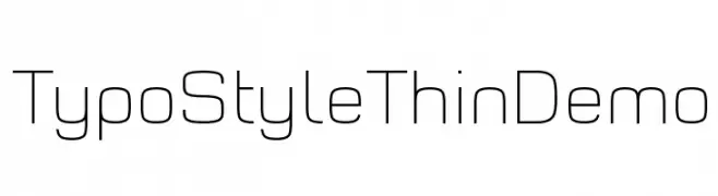
A sleek, modern font with thin, geometric strokes for a minimalist look.
![Typo Style Thin Demo Frei Schriftart Herunterladen]() Herunterladen 165 Downloads@WebFont
Herunterladen 165 Downloads@WebFont -
( Levi Szekeres - www.loremipsum.ro )
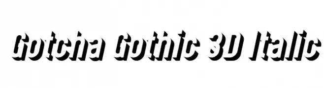
A bold, 3D italic font with a dynamic and impactful style.
![Gotcha Gothic 3D Italic Frei Schriftart Herunterladen]() Herunterladen 165 Downloads@WebFont
Herunterladen 165 Downloads@WebFont -
( Fonts by Peter Wiegel - www.peter-wiegel.de - Personal-use only. For commercial use please contact owner. )
A classic blackletter font with ornate, intricate letterforms and a historical aesthetic.
![PopplFrakturCAT Frei Schriftart Herunterladen]() Herunterladen 165 Downloads@WebFont
Herunterladen 165 Downloads@WebFont -
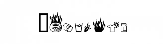
![Pyrobats Frei Schriftart Herunterladen]() Herunterladen 165 Downloads@WebFont
Herunterladen 165 Downloads@WebFont


Welche Schriften sind gerade am populärsten?
Poppins, Roboto, Montserrat, Open Sans und Lato sind wegen ihrer klaren Formen und breiten Einsetzbarkeit sehr gefragt – von Markenauftritt über Landingpages bis hin zu Postern.
Welche Fonts eignen sich für Logos?
Geometrische Sans‑Serifs (z. B. Poppins, Familien im Gotham‑Stil) sind ein häufiger Griff für sauberes, skalierbares Branding. Für eine persönlichere Note bleiben Scripts und Handschrift‑Stile beliebt. Kombinieren Sie einen prägnanten Headline‑Font mit einer neutralen Brotschrift für Wiedererkennung und Harmonie.
Wie oft wird die Top‑Liste aktualisiert?
Regelmäßig – basierend auf realen Downloads und Interaktionen. Schauen Sie öfter vorbei, um aufstrebende Favoriten früh zu entdecken.
💡 Tipp: Seite bookmarken – Trends wechseln schnell, und heutige Top‑Schriften inspirieren morgen vielleicht das Rebranding.