Willkommen bei den Top‑Schriften – hier treffen Beliebtheit und Qualität aufeinander. Das sind die in diesem Jahr am häufigsten heruntergeladenen und genutzten Fonts. Wenn Sie sichere Optionen für Logo, Web oder Social suchen, starten Sie hier.
Jeder Top‑Font überzeugt durch Balance, Lesbarkeit und Vielseitigkeit. Sie finden moderne Sans‑Serifs, elegante Scripts, Vintage‑Serifs und minimalistische Displays.
-
 Herunterladen 724 Downloads@WebFont
 -
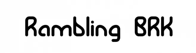
![Rambling BRK Frei Schriftart Herunterladen]() Herunterladen 724 Downloads@WebFont
Herunterladen 724 Downloads@WebFont -
( Fonts by Khurasan )
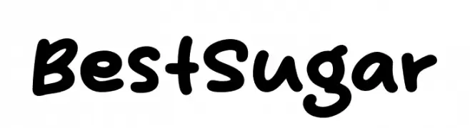
A playful, rounded font with a hand-drawn, friendly style.
![Best Sugar Frei Schriftart Herunterladen]() Herunterladen 723 Downloads@WebFont
Herunterladen 723 Downloads@WebFont -
( Fonts by alphArtype - Agung Rohmat - Personal-use only. For commercial use please contact owner. )
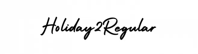
A casual, elegant handwritten font with smooth, flowing lines.
![Holiday2 Regular Frei Schriftart Herunterladen]() Herunterladen 723 Downloads@WebFont
Herunterladen 723 Downloads@WebFont -
( Fonts by Letternun - Saeful Bahri - Personal-use only. For commercial use please contact owner. )
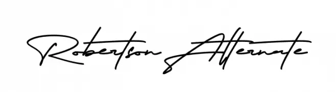
A fluid and elegant script font with a natural handwriting style.
![Robertson Alternate Frei Schriftart Herunterladen]() Herunterladen 723 Downloads@WebFont
Herunterladen 723 Downloads@WebFont -
( Fonts by Vladimir Nikolic )
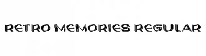
A bold, retro-inspired font with a three-dimensional effect and vintage appeal.
![Retro Memories Regular Frei Schriftart Herunterladen]() Herunterladen 723 Downloads@WebFont
Herunterladen 723 Downloads@WebFont -
( Fonts by Khurasan )
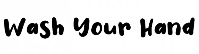
A bold, playful handwritten font with rounded strokes and a casual feel.
![Wash Your Hand Frei Schriftart Herunterladen]() Herunterladen 723 Downloads@WebFont
Herunterladen 723 Downloads@WebFont -
( Lollibomb - www.lollibomb.com/ )
A bold, classic serif font with moderate contrast and excellent legibility.
![Centabel Bold Frei Schriftart Herunterladen]() Herunterladen 723 Downloads@WebFont
Herunterladen 723 Downloads@WebFont -
( Wacaksara Co - www.wacaksara.co )
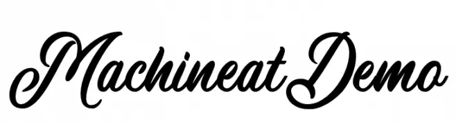
An elegant and flowing script font with classic cursive letterforms.
![MachineatDemo Frei Schriftart Herunterladen]() Herunterladen 723 Downloads@WebFont
Herunterladen 723 Downloads@WebFont -
( Typodermic Fonts - Ray Larabie - www.typodermicfonts.com/ )
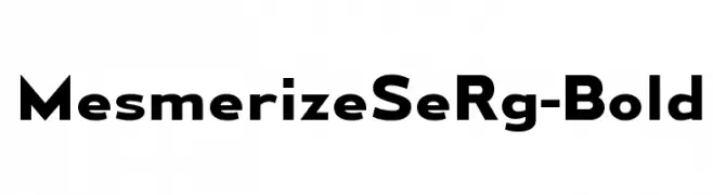
A bold, modern sans-serif font with geometric letterforms and consistent stroke widths.
![MesmerizeSeRg-Bold Frei Schriftart Herunterladen]() Herunterladen 723 Downloads@WebFont
Herunterladen 723 Downloads@WebFont -
( 7NTypes - Situjuh Nazara - 7ntypes.com )
A playful, handwritten font with smooth, rounded edges and a casual flow.
![Milloyste Frei Schriftart Herunterladen]() Herunterladen 723 Downloads@WebFont
Herunterladen 723 Downloads@WebFont -
( Copyright (c) 2015, Cadson Demak (info@cadsondemak.com) )
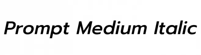
A modern, medium-weight italic sans-serif font with clean lines and balanced proportions.
![Prompt Medium Italic Frei Schriftart Herunterladen]() Herunterladen 723 Downloads@WebFont
Herunterladen 723 Downloads@WebFont -
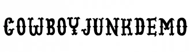
![CowboyJunkDEMO Frei Schriftart Herunterladen]() Herunterladen 723 Downloads@WebFont
Herunterladen 723 Downloads@WebFont -
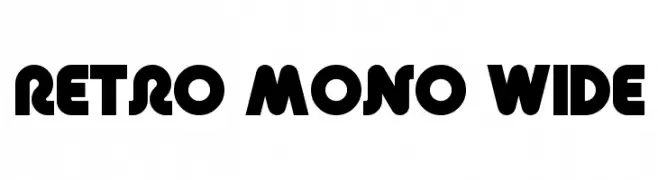
![Retro Mono Wide Frei Schriftart Herunterladen]() Herunterladen 723 Downloads@WebFont
Herunterladen 723 Downloads@WebFont -
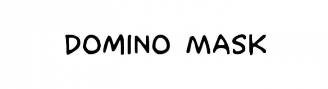
( Fonts by Iconian Fonts )
A playful, handwritten-style font with rounded edges and a casual appearance.
![Domino Mask Frei Schriftart Herunterladen]() Herunterladen 723 Downloads@WebFont
Herunterladen 723 Downloads@WebFont -
( Fonts by a Max Infeld - XEROGRAPHER FONTS - xerographer.blogspot.com . Personal-use only. For commercial use please contact owner. )
A bold, textured font with a hand-drawn, sketch-like appearance.
![SuperFreak Frei Schriftart Herunterladen]() Herunterladen 723 Downloads@WebFont
Herunterladen 723 Downloads@WebFont -
( Fonts by www.fontpanda.com. Personal-use only. For commercial use please contact owner. )
A casual, handwritten font with uneven, dynamic strokes.
![Chicken Scratch Frei Schriftart Herunterladen]() Herunterladen 723 Downloads@WebFont
Herunterladen 723 Downloads@WebFont -
( Fonts by Jonathan S. Harris - www.tattoowoo.com. Personal-use only. For commercial use please contact owner. )
An elegant, intricate script font with flowing cursive letters and elaborate swashes.
![Everything Holiday Frei Schriftart Herunterladen]() Herunterladen 723 Downloads@WebFont
Herunterladen 723 Downloads@WebFont -
![DPCutie Frei Schriftart Herunterladen]() Herunterladen 723 Downloads@WebFont
Herunterladen 723 Downloads@WebFont -
( Fonts by Galdino Otten - galdinootten.com )
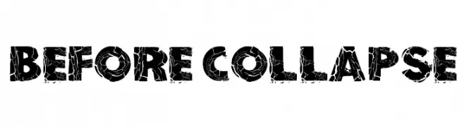
A bold, distressed font with a cracked texture, perfect for gritty designs.
![Before Collapse Frei Schriftart Herunterladen]() Herunterladen 723 Downloads@WebFont
Herunterladen 723 Downloads@WebFont -
( Fonts by Luedecke Design Font Co. - ldfonts.weebly.com )
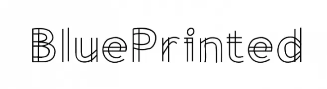
A geometric, blueprint-inspired font with overlapping linear elements.
![BluePrinted Frei Schriftart Herunterladen]() Herunterladen 723 Downloads@WebFont
Herunterladen 723 Downloads@WebFont -
( Fonts by www.aka-acid.com )
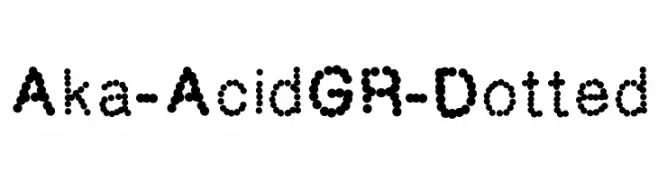
A modern, dotted font with a playful and decorative style.
![Aka-AcidGR-Dotted Frei Schriftart Herunterladen]() Herunterladen 723 Downloads@WebFont
Herunterladen 723 Downloads@WebFont -
( Fonts by Arkandis Digital Foundry )
A modern, condensed sans-serif font with a clean and professional look.
![GilliusADF-Cond Frei Schriftart Herunterladen]() Herunterladen 723 Downloads@WebFont
Herunterladen 723 Downloads@WebFont -
( Fonts by Toto )
A bold, wide serif font with dramatic, angular serifs and high contrast.
![K22 Athenian Wide Frei Schriftart Herunterladen]() Herunterladen 723 Downloads@WebFont
Herunterladen 723 Downloads@WebFont -
( Fonts by www.impallari.com )
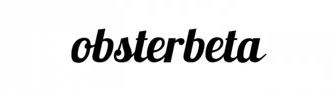
A bold, flowing script font with a modern and elegant style.
![Lobsterbeta13 Frei Schriftart Herunterladen]() Herunterladen 723 Downloads@WebFont
Herunterladen 723 Downloads@WebFont -
( Free for a personal use. For a commercial use please visit www.kevinandamanda.com )
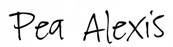
A playful, casual handwritten font with dynamic strokes.
![Pea Alexis Frei Schriftart Herunterladen]() Herunterladen 723 Downloads@WebFont
Herunterladen 723 Downloads@WebFont -
( Fonts by Kevin Christopher - www.kcfonts.com )
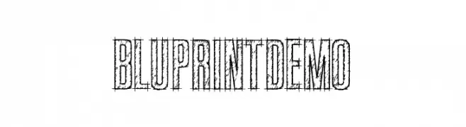
A sketch-like, blueprint-inspired font with a hand-drawn, textured appearance.
![BluprintDEMO Frei Schriftart Herunterladen]() Herunterladen 723 Downloads@WebFont
Herunterladen 723 Downloads@WebFont -
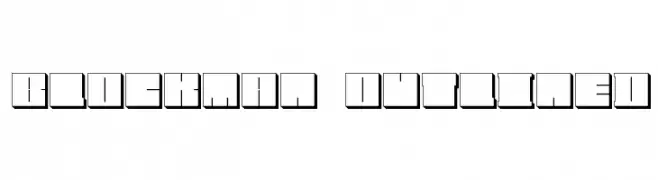
![Blockman-outlined Frei Schriftart Herunterladen]() Herunterladen 723 Downloads@WebFont
Herunterladen 723 Downloads@WebFont -
( Fonts by Manfred Klein. Free for private and charity use. Free for commercial with donation to organizations )
A bold, dramatic font with sharp, angular edges and a gothic flair.
![Newspaper Frei Schriftart Herunterladen]() Herunterladen 723 Downloads@WebFont
Herunterladen 723 Downloads@WebFont -
( Fonts by Carolina Mejia - mitiendadescrapbook.com )
A playful, handwritten font with bold, rounded characters and a friendly appearance.
![yelly Frei Schriftart Herunterladen]() Herunterladen 723 Downloads@WebFont
Herunterladen 723 Downloads@WebFont -
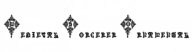
![Medieval Sorcerer Ornamental Frei Schriftart Herunterladen]() Herunterladen 723 Downloads@WebFont
Herunterladen 723 Downloads@WebFont -
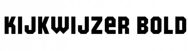
![Kijkwijzer Bold Frei Schriftart Herunterladen]() Herunterladen 723 Downloads@WebFont
Herunterladen 723 Downloads@WebFont -
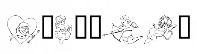
( Fonts by Kat`s Fun Fonts - Personal-use only. For commercial use please contact owner. )
A decorative collection of cupid-themed illustrations with playful and romantic motifs.
![KR Cupids Frei Schriftart Herunterladen]() Herunterladen 723 Downloads@WebFont
Herunterladen 723 Downloads@WebFont -
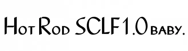
![Hot Rod SCLF1.0 baby. Frei Schriftart Herunterladen]() Herunterladen 723 Downloads@WebFont
Herunterladen 723 Downloads@WebFont -
( Fonts by Wahyu Eka Prasetya - wepfont.com - Personal-use only. For commercial use please contact owner. )
A bold, textured handwritten font with a dynamic and playful style.
![Gerak Frei Schriftart Herunterladen]() Herunterladen 722 Downloads@WebFont
Herunterladen 722 Downloads@WebFont


Welche Schriften sind gerade am populärsten?
Poppins, Roboto, Montserrat, Open Sans und Lato sind wegen ihrer klaren Formen und breiten Einsetzbarkeit sehr gefragt – von Markenauftritt über Landingpages bis hin zu Postern.
Welche Fonts eignen sich für Logos?
Geometrische Sans‑Serifs (z. B. Poppins, Familien im Gotham‑Stil) sind ein häufiger Griff für sauberes, skalierbares Branding. Für eine persönlichere Note bleiben Scripts und Handschrift‑Stile beliebt. Kombinieren Sie einen prägnanten Headline‑Font mit einer neutralen Brotschrift für Wiedererkennung und Harmonie.
Wie oft wird die Top‑Liste aktualisiert?
Regelmäßig – basierend auf realen Downloads und Interaktionen. Schauen Sie öfter vorbei, um aufstrebende Favoriten früh zu entdecken.
💡 Tipp: Seite bookmarken – Trends wechseln schnell, und heutige Top‑Schriften inspirieren morgen vielleicht das Rebranding.