Willkommen bei den Top‑Schriften – hier treffen Beliebtheit und Qualität aufeinander. Das sind die in diesem Jahr am häufigsten heruntergeladenen und genutzten Fonts. Wenn Sie sichere Optionen für Logo, Web oder Social suchen, starten Sie hier.
Jeder Top‑Font überzeugt durch Balance, Lesbarkeit und Vielseitigkeit. Sie finden moderne Sans‑Serifs, elegante Scripts, Vintage‑Serifs und minimalistische Displays.
-
 Herunterladen 159 Downloads@WebFont
 -
( Fonts by pOPdOG fONTS - Dimitris Kolyris - popdog_fonts.tripod.com OFF SITE )
A distressed, grungy font with a bold, textured appearance.
![Tom Violence [AUTOSPACED] Frei Schriftart Herunterladen]() Herunterladen 159 Downloads
Herunterladen 159 Downloads -
( Fonts by Kreative Korporation - www.kreativekorp.com )
A pixelated, monospaced font with a retro digital aesthetic.
![LisaTerminal Paper Small Raw Frei Schriftart Herunterladen]() Herunterladen 159 Downloads@WebFont
Herunterladen 159 Downloads@WebFont -
( Paul Lloyd Fonts )
A wide, italicized font with a modern and sleek appearance.
![NewStyleWide Italic Frei Schriftart Herunterladen]() Herunterladen 159 Downloads@WebFont
Herunterladen 159 Downloads@WebFont -
( Fonts by Woodcutter Manero - www.woodcutter.es - Personal-use only. For commercial use please contact owner. )
A chaotic, graffiti-inspired font with jagged, hand-drawn strokes.
![Hysterical Frei Schriftart Herunterladen]() Herunterladen 159 Downloads@WebFont
Herunterladen 159 Downloads@WebFont -
-
![BM_Pixel Frei Schriftart Herunterladen]() Herunterladen 159 Downloads@WebFont
Herunterladen 159 Downloads@WebFont -
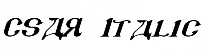
![CSAR Italic Frei Schriftart Herunterladen]() Herunterladen 159 Downloads@WebFont
Herunterladen 159 Downloads@WebFont -
( Fonts by Mans Greback - www.mawns.com )
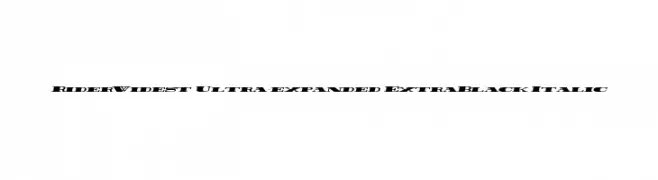
A bold, ultra-expanded italic font with a powerful and dynamic presence.
![Rider Widest Ultra-expanded ExtraBlack Italic Frei Schriftart Herunterladen]() Herunterladen 159 Downloads@WebFont
Herunterladen 159 Downloads@WebFont -
( Fonts by a Neale Davidson - www.pixelsagas.com. Personal-use only. For commercial use please contact owner. )
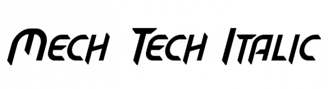
A futuristic, italic font with sharp angles and a mechanical style.
![Mech Tech Italic Frei Schriftart Herunterladen]() Herunterladen 159 Downloads@WebFont
Herunterladen 159 Downloads@WebFont -
( Fonts by Woodcutter Manero - www.woodcutter.es - Personal-use only. For commercial use please contact owner. )
A modern, dotted font with a digital and geometric aesthetic.
![Estreno Frei Schriftart Herunterladen]() Herunterladen 159 Downloads@WebFont
Herunterladen 159 Downloads@WebFont
![Tom Violence [AUTOSPACED] Frei Schriftart Herunterladen](https://d144mzi0q5mijx.cloudfront.net/img/T/O/Tom-Violence-AUTOSPACED.webp)


Welche Schriften sind gerade am populärsten?
Poppins, Roboto, Montserrat, Open Sans und Lato sind wegen ihrer klaren Formen und breiten Einsetzbarkeit sehr gefragt – von Markenauftritt über Landingpages bis hin zu Postern.
Welche Fonts eignen sich für Logos?
Geometrische Sans‑Serifs (z. B. Poppins, Familien im Gotham‑Stil) sind ein häufiger Griff für sauberes, skalierbares Branding. Für eine persönlichere Note bleiben Scripts und Handschrift‑Stile beliebt. Kombinieren Sie einen prägnanten Headline‑Font mit einer neutralen Brotschrift für Wiedererkennung und Harmonie.
Wie oft wird die Top‑Liste aktualisiert?
Regelmäßig – basierend auf realen Downloads und Interaktionen. Schauen Sie öfter vorbei, um aufstrebende Favoriten früh zu entdecken.
💡 Tipp: Seite bookmarken – Trends wechseln schnell, und heutige Top‑Schriften inspirieren morgen vielleicht das Rebranding.