Willkommen bei den Top‑Schriften – hier treffen Beliebtheit und Qualität aufeinander. Das sind die in diesem Jahr am häufigsten heruntergeladenen und genutzten Fonts. Wenn Sie sichere Optionen für Logo, Web oder Social suchen, starten Sie hier.
Jeder Top‑Font überzeugt durch Balance, Lesbarkeit und Vielseitigkeit. Sie finden moderne Sans‑Serifs, elegante Scripts, Vintage‑Serifs und minimalistische Displays.
-
( Fonts by www.fontpanda.com. Personal-use only. For commercial use please contact owner. )
A playful, handwritten font with irregular strokes and a casual feel.
 Herunterladen 159 Downloads@WebFont
 -
( Fonts by Xerographer Fonts )
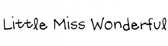
An elegant and artistic script font with flowing, interconnected letterforms.
![Distinguished Frei Schriftart Herunterladen]() Herunterladen 159 Downloads@WebFont
Herunterladen 159 Downloads@WebFont -
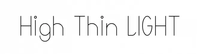
![High Thin LIGHT Frei Schriftart Herunterladen]() Herunterladen 159 Downloads@WebFont
Herunterladen 159 Downloads@WebFont -
( Fonts by www.aenigmafonts.com )
A bold, pixelated font with a rough, hand-drawn outline.
![Pixel Krud [BRK] Frei Schriftart Herunterladen]() Herunterladen 159 Downloads@WebFont
Herunterladen 159 Downloads@WebFont -
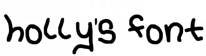
![holly's font Frei Schriftart Herunterladen]() Herunterladen 159 Downloads@WebFont
Herunterladen 159 Downloads@WebFont -
-
( Fonts by Bad Kollektiv - Personal-use only. For commercial use please contact owner. )
A decorative dot-matrix font with a retro digital aesthetic.
![Rund Frei Schriftart Herunterladen]() Herunterladen 159 Downloads@WebFont
Herunterladen 159 Downloads@WebFont -
( Fonts by Daniel Zadorozny - www.iconian.com )
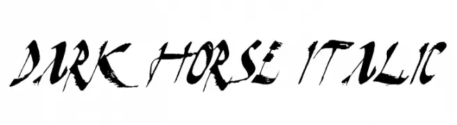
A bold, italicized font with brush-like strokes and high contrast, perfect for dramatic and modern designs.
![Dark Horse Italic Frei Schriftart Herunterladen]() Herunterladen 159 Downloads@WebFont
Herunterladen 159 Downloads@WebFont -
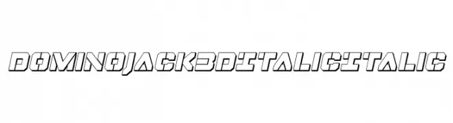
( Fonts by Iconian Fonts )
A bold, 3D italic font with a modern, geometric style.
![Domino Jack 3D Italic Italic Frei Schriftart Herunterladen]() Herunterladen 159 Downloads@WebFont
Herunterladen 159 Downloads@WebFont -
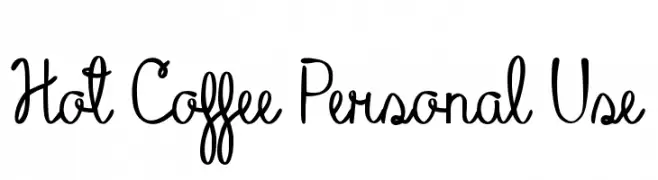
( Jaime Rangel Castro )
A playful, handwritten script font with decorative elements and moderate stroke contrast.
![Hot Coffee Personal Use Frei Schriftart Herunterladen]() Herunterladen 159 Downloads@WebFont
Herunterladen 159 Downloads@WebFont -
( Lollibomb - www.lollibomb.com/ )
A classic serif font with a playful, tilted design.
![Timesturn Frei Schriftart Herunterladen]() Herunterladen 159 Downloads@WebFont
Herunterladen 159 Downloads@WebFont


Welche Schriften sind gerade am populärsten?
Poppins, Roboto, Montserrat, Open Sans und Lato sind wegen ihrer klaren Formen und breiten Einsetzbarkeit sehr gefragt – von Markenauftritt über Landingpages bis hin zu Postern.
Welche Fonts eignen sich für Logos?
Geometrische Sans‑Serifs (z. B. Poppins, Familien im Gotham‑Stil) sind ein häufiger Griff für sauberes, skalierbares Branding. Für eine persönlichere Note bleiben Scripts und Handschrift‑Stile beliebt. Kombinieren Sie einen prägnanten Headline‑Font mit einer neutralen Brotschrift für Wiedererkennung und Harmonie.
Wie oft wird die Top‑Liste aktualisiert?
Regelmäßig – basierend auf realen Downloads und Interaktionen. Schauen Sie öfter vorbei, um aufstrebende Favoriten früh zu entdecken.
💡 Tipp: Seite bookmarken – Trends wechseln schnell, und heutige Top‑Schriften inspirieren morgen vielleicht das Rebranding.