Willkommen bei den Top‑Schriften – hier treffen Beliebtheit und Qualität aufeinander. Das sind die in diesem Jahr am häufigsten heruntergeladenen und genutzten Fonts. Wenn Sie sichere Optionen für Logo, Web oder Social suchen, starten Sie hier.
Jeder Top‑Font überzeugt durch Balance, Lesbarkeit und Vielseitigkeit. Sie finden moderne Sans‑Serifs, elegante Scripts, Vintage‑Serifs und minimalistische Displays.
-
( Fonts by )
Bold, marker-style handwritten font with rounded, playful forms.
 Herunterladen 145 Downloads@WebFont
 -
( Fonts by Eko Bimantara - Personal-use only. For commercial use please contact owner. )
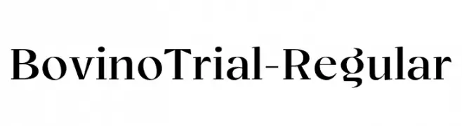
A modern serif font with elegant, refined letterforms and sharp serifs.
![BovinoTrial-Regular Frei Schriftart Herunterladen]() Herunterladen 145 Downloads@WebFont
Herunterladen 145 Downloads@WebFont -
( weknow - Wino S Kadir - www.creativefabrica.com/designer/weknow/ )
A playful, bubbly font with thick, rounded characters ideal for creative projects.
![The Brain Frei Schriftart Herunterladen]() Herunterladen 145 Downloads@WebFont
Herunterladen 145 Downloads@WebFont -
( Fonts by gomarice - Personal-use only. For commercial use please contact owner. )
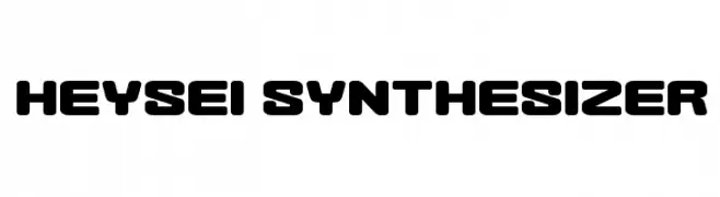
A bold, futuristic font with rounded edges and a geometric structure.
![Heysei Synthesizer Frei Schriftart Herunterladen]() Herunterladen 145 Downloads@WebFont
Herunterladen 145 Downloads@WebFont -
( Fonts by Kong Font - https://fontkong.com/ - Personal-use only. For commercial use please contact owner. )
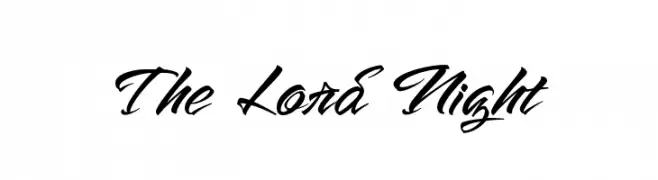
A bold, dynamic script font with fluid, cursive strokes and elegant flair.
![The Lord Night Frei Schriftart Herunterladen]() Herunterladen 145 Downloads@WebFont
Herunterladen 145 Downloads@WebFont -
-
( Fonts by Kylie Morris. Personal-use only. For commercial use please contact owner. )
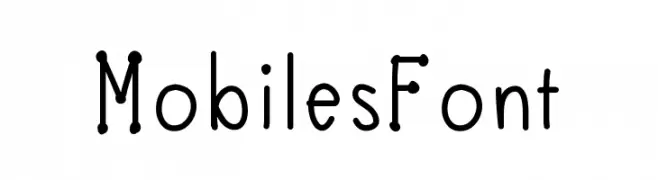
A playful, hand-drawn font with rounded, bubbly characters.
![MobilesFont Frei Schriftart Herunterladen]() Herunterladen 145 Downloads@WebFont
Herunterladen 145 Downloads@WebFont -
( Fonts by Manfred Klein. Free for private and charity use. Free for commercial with donation to organizations )
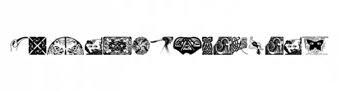
A decorative font featuring intricate Celtic-inspired designs and motifs.
![CelticOrnamBats Frei Schriftart Herunterladen]() Herunterladen 145 Downloads@WebFont
Herunterladen 145 Downloads@WebFont -
( Fonts by www.junkohanhero.com )
A bold, graffiti-inspired font with dynamic, angular characters.
![Aikasiirtyma Frei Schriftart Herunterladen]() Herunterladen 145 Downloads@WebFont
Herunterladen 145 Downloads@WebFont -
( Fonts by Daniel Zadorozny - www.iconian.com - Personal-use only. For commercial use please contact owner. )
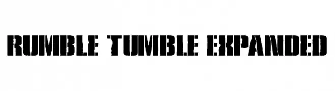
A bold, rugged stencil font with an industrial and modern flair.
![Rumble Tumble Expanded Frei Schriftart Herunterladen]() Herunterladen 145 Downloads@WebFont
Herunterladen 145 Downloads@WebFont -
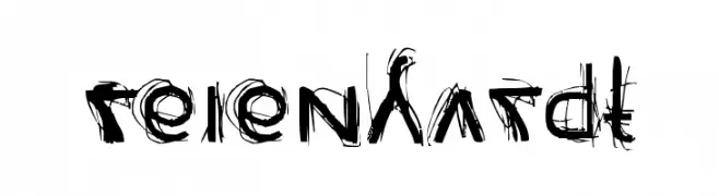
![Reienhardt Frei Schriftart Herunterladen]() Herunterladen 145 Downloads@WebFont
Herunterladen 145 Downloads@WebFont


Welche Schriften sind gerade am populärsten?
Poppins, Roboto, Montserrat, Open Sans und Lato sind wegen ihrer klaren Formen und breiten Einsetzbarkeit sehr gefragt – von Markenauftritt über Landingpages bis hin zu Postern.
Welche Fonts eignen sich für Logos?
Geometrische Sans‑Serifs (z. B. Poppins, Familien im Gotham‑Stil) sind ein häufiger Griff für sauberes, skalierbares Branding. Für eine persönlichere Note bleiben Scripts und Handschrift‑Stile beliebt. Kombinieren Sie einen prägnanten Headline‑Font mit einer neutralen Brotschrift für Wiedererkennung und Harmonie.
Wie oft wird die Top‑Liste aktualisiert?
Regelmäßig – basierend auf realen Downloads und Interaktionen. Schauen Sie öfter vorbei, um aufstrebende Favoriten früh zu entdecken.
💡 Tipp: Seite bookmarken – Trends wechseln schnell, und heutige Top‑Schriften inspirieren morgen vielleicht das Rebranding.