Willkommen bei den Top‑Schriften – hier treffen Beliebtheit und Qualität aufeinander. Das sind die in diesem Jahr am häufigsten heruntergeladenen und genutzten Fonts. Wenn Sie sichere Optionen für Logo, Web oder Social suchen, starten Sie hier.
Jeder Top‑Font überzeugt durch Balance, Lesbarkeit und Vielseitigkeit. Sie finden moderne Sans‑Serifs, elegante Scripts, Vintage‑Serifs und minimalistische Displays.
-
( Fonts by Woodcutter Manero - www.woodcutter.es - Personal-use only. For commercial use please contact owner. )
A bold, intricate blackletter font with sharp, angular strokes.
 Herunterladen 145 Downloads@WebFont
 -
( Fonts by Fikry Alif - Fikryal studio - https://www.creativefabrica.com/designer/mfikryalif/ref/222304/ - Personal-use only. For commercial use please contact owner. )
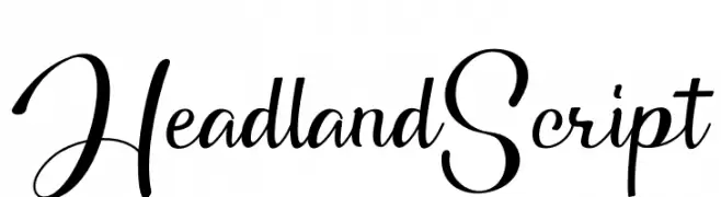
A graceful, cursive script font with elegant loops and swirls.
![Headland Script Frei Schriftart Herunterladen]() Herunterladen 145 Downloads@WebFont
Herunterladen 145 Downloads@WebFont -
( Fonts by Peter Wiegel - www.peter-wiegel.de - Personal-use only. For commercial use please contact owner. )
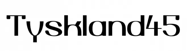
A modern, geometric font with bold lines and subtle curves.
![Tyskland45 Frei Schriftart Herunterladen]() Herunterladen 145 Downloads@WebFont
Herunterladen 145 Downloads@WebFont -
![Display Gothic E Regular Frei Schriftart Herunterladen]() Herunterladen 145 Downloads@WebFont
Herunterladen 145 Downloads@WebFont -
![TobyFont Empty Frei Schriftart Herunterladen]() Herunterladen 145 Downloads@WebFont
Herunterladen 145 Downloads@WebFont -
-
![COLTFONT Frei Schriftart Herunterladen]() Herunterladen 145 Downloads@WebFont
Herunterladen 145 Downloads@WebFont -
( imagex - www.imagex-fonts.com )
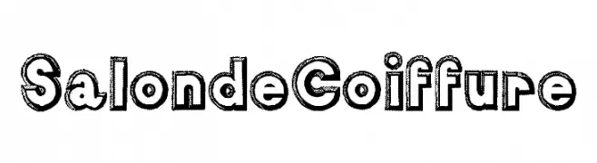
A bold, decorative font with a textured outline and vintage appeal.
![Salon de Coiffure Frei Schriftart Herunterladen]() Herunterladen 145 Downloads@WebFont
Herunterladen 145 Downloads@WebFont -
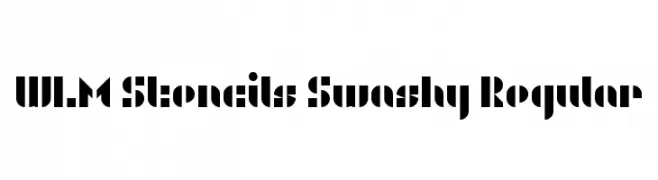
![WLM Stencils Swashy Regular Frei Schriftart Herunterladen]() Herunterladen 145 Downloads@WebFont
Herunterladen 145 Downloads@WebFont -
( Iconian Fonts - Daniel Zadorozny - www.iconian.com )
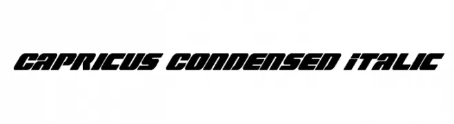
A bold, condensed italic font with a futuristic and dynamic style.
![Capricus Condensed Italic Frei Schriftart Herunterladen]() Herunterladen 145 Downloads@WebFont
Herunterladen 145 Downloads@WebFont -
( Fonts by Manfred Klein. Free for private and charity use. Free for commercial with donation to organizations )
Abstract geometric and illustrative display font with intricate linework.
![GeometricWanderlust Frei Schriftart Herunterladen]() Herunterladen 145 Downloads@WebFont
Herunterladen 145 Downloads@WebFont


Welche Schriften sind gerade am populärsten?
Poppins, Roboto, Montserrat, Open Sans und Lato sind wegen ihrer klaren Formen und breiten Einsetzbarkeit sehr gefragt – von Markenauftritt über Landingpages bis hin zu Postern.
Welche Fonts eignen sich für Logos?
Geometrische Sans‑Serifs (z. B. Poppins, Familien im Gotham‑Stil) sind ein häufiger Griff für sauberes, skalierbares Branding. Für eine persönlichere Note bleiben Scripts und Handschrift‑Stile beliebt. Kombinieren Sie einen prägnanten Headline‑Font mit einer neutralen Brotschrift für Wiedererkennung und Harmonie.
Wie oft wird die Top‑Liste aktualisiert?
Regelmäßig – basierend auf realen Downloads und Interaktionen. Schauen Sie öfter vorbei, um aufstrebende Favoriten früh zu entdecken.
💡 Tipp: Seite bookmarken – Trends wechseln schnell, und heutige Top‑Schriften inspirieren morgen vielleicht das Rebranding.