Willkommen bei den Top‑Schriften – hier treffen Beliebtheit und Qualität aufeinander. Das sind die in diesem Jahr am häufigsten heruntergeladenen und genutzten Fonts. Wenn Sie sichere Optionen für Logo, Web oder Social suchen, starten Sie hier.
Jeder Top‑Font überzeugt durch Balance, Lesbarkeit und Vielseitigkeit. Sie finden moderne Sans‑Serifs, elegante Scripts, Vintage‑Serifs und minimalistische Displays.
-
( Fonts by Dan P. Lyons - Personal-use only. For commercial use please contact owner. )
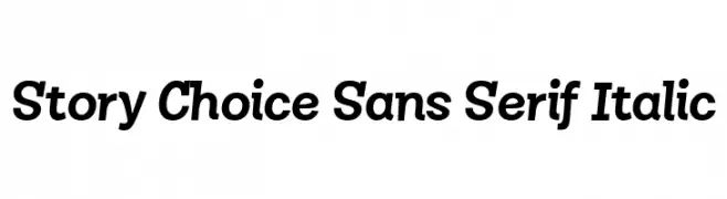
A bold, italic sans-serif font with a modern and dynamic style.
 Herunterladen 146 Downloads@WebFont
 -
( Fonts by Dickof Zapatista - Personal-use only. For commercial use please contact owner. )
A modern serif font with decorative star cutouts and elegant strokes.
![Carlo Frei Schriftart Herunterladen]() Herunterladen 146 Downloads@WebFont
Herunterladen 146 Downloads@WebFont -
( Fonts by zatari - TARY meutia - Personal-use only. For commercial use please contact owner. )
A modern, geometric font with a futuristic and sleek design.
![MOBOTO Frei Schriftart Herunterladen]() Herunterladen 146 Downloads@WebFont
Herunterladen 146 Downloads@WebFont -
( Fonts by Nirmala Creative - Personal-use only. For commercial use please contact owner. )
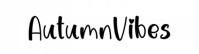
Playful handwritten font with a whimsical style.
![Autumn Vibes Frei Schriftart Herunterladen]() Herunterladen 146 Downloads@WebFont
Herunterladen 146 Downloads@WebFont -
( Fonts by The Docallisme )
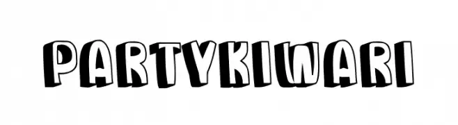
A playful, bold font with a 3D effect, ideal for eye-catching designs.
![Party Kiwari Frei Schriftart Herunterladen]() Herunterladen 146 Downloads@WebFont
Herunterladen 146 Downloads@WebFont -
-
![Kimpet Bold Frei Schriftart Herunterladen]() Herunterladen 146 Downloads@WebFont
Herunterladen 146 Downloads@WebFont -
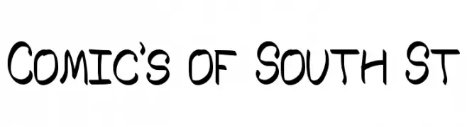
( Fonts by Southype )
A playful, hand-drawn font with bold, irregular strokes and a comic book feel.
![Comic's of South St Frei Schriftart Herunterladen]() Herunterladen 146 Downloads@WebFont
Herunterladen 146 Downloads@WebFont -
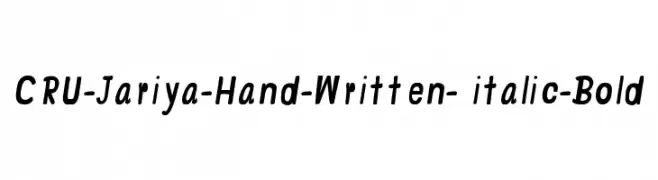
![CRU-Jariya-Hand-Written- italic-Bold Frei Schriftart Herunterladen]() Herunterladen 146 Downloads@WebFont
Herunterladen 146 Downloads@WebFont -
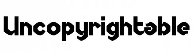
( Fonts by Chequered Ink )
A bold, geometric font with angular shapes and a modern aesthetic.
![Uncopyrightable Frei Schriftart Herunterladen]() Herunterladen 146 Downloads@WebFont
Herunterladen 146 Downloads@WebFont -
( Fonts by Apostrophic Lab )
A bold, geometric font with angular cuts and a dynamic style.
![Plastic No.25 Frei Schriftart Herunterladen]() Herunterladen 146 Downloads@WebFont
Herunterladen 146 Downloads@WebFont


Welche Schriften sind gerade am populärsten?
Poppins, Roboto, Montserrat, Open Sans und Lato sind wegen ihrer klaren Formen und breiten Einsetzbarkeit sehr gefragt – von Markenauftritt über Landingpages bis hin zu Postern.
Welche Fonts eignen sich für Logos?
Geometrische Sans‑Serifs (z. B. Poppins, Familien im Gotham‑Stil) sind ein häufiger Griff für sauberes, skalierbares Branding. Für eine persönlichere Note bleiben Scripts und Handschrift‑Stile beliebt. Kombinieren Sie einen prägnanten Headline‑Font mit einer neutralen Brotschrift für Wiedererkennung und Harmonie.
Wie oft wird die Top‑Liste aktualisiert?
Regelmäßig – basierend auf realen Downloads und Interaktionen. Schauen Sie öfter vorbei, um aufstrebende Favoriten früh zu entdecken.
💡 Tipp: Seite bookmarken – Trends wechseln schnell, und heutige Top‑Schriften inspirieren morgen vielleicht das Rebranding.