Willkommen bei den Top‑Schriften – hier treffen Beliebtheit und Qualität aufeinander. Das sind die in diesem Jahr am häufigsten heruntergeladenen und genutzten Fonts. Wenn Sie sichere Optionen für Logo, Web oder Social suchen, starten Sie hier.
Jeder Top‑Font überzeugt durch Balance, Lesbarkeit und Vielseitigkeit. Sie finden moderne Sans‑Serifs, elegante Scripts, Vintage‑Serifs und minimalistische Displays.
-
( Fonts by www.tipometar.org )
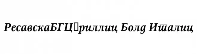
A bold, italicized serif font with a classic and elegant style.
 Herunterladen 145 Downloads@WebFont
 -
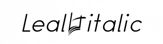
![Leal italic Frei Schriftart Herunterladen]() Herunterladen 145 Downloads@WebFont
Herunterladen 145 Downloads@WebFont -
( Fonts by Mr.Soon Design )
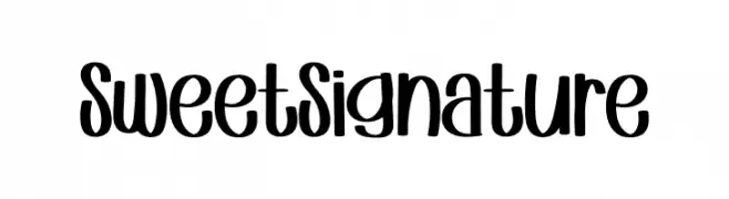
A playful, bold handwritten font with rounded, smooth curves.
![Sweet Signature Frei Schriftart Herunterladen]() Herunterladen 145 Downloads@WebFont
Herunterladen 145 Downloads@WebFont -
( Fonts by gluk )
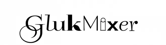
A unique blend of serif and sans-serif styles with decorative and script-like elements.
![GlukMixer Frei Schriftart Herunterladen]() Herunterladen 145 Downloads@WebFont
Herunterladen 145 Downloads@WebFont -
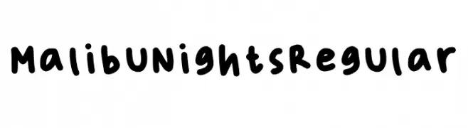
( Fonts by Sahara Varisia )
Casual handwritten font with rounded edges.
![Malibu Nights Regular Frei Schriftart Herunterladen]() Herunterladen 145 Downloads@WebFont
Herunterladen 145 Downloads@WebFont -
-
( Fonts by Skinny Deli )
A playful, handwritten font with a casual and friendly style.
![Mfooont Frei Schriftart Herunterladen]() Herunterladen 145 Downloads@WebFont
Herunterladen 145 Downloads@WebFont -
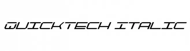
( Fonts by Daniel Zadorozny - www.iconian.com )
A futuristic, angular italic font with a sleek, modern design.
![QuickTech Italic Frei Schriftart Herunterladen]() Herunterladen 145 Downloads@WebFont
Herunterladen 145 Downloads@WebFont -
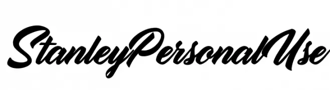
( Fonts by Billy Argel Fonts - www.billyargel.com - Personal-use only. For commercial use please contact owner. )
A bold, dynamic script font with fluid, cursive connections and dramatic flourishes.
![Stanley Personal Use Frei Schriftart Herunterladen]() Herunterladen 145 Downloads@WebFont
Herunterladen 145 Downloads@WebFont -
( Fonts by Vasily Klyukin )
A modern, architectural font resembling skyscrapers with intricate detailing.
![Skyscraper Frei Schriftart Herunterladen]() Herunterladen 145 Downloads@WebFont
Herunterladen 145 Downloads@WebFont -
![Blanket Light Oblique Frei Schriftart Herunterladen]() Herunterladen 145 Downloads@WebFont
Herunterladen 145 Downloads@WebFont


Welche Schriften sind gerade am populärsten?
Poppins, Roboto, Montserrat, Open Sans und Lato sind wegen ihrer klaren Formen und breiten Einsetzbarkeit sehr gefragt – von Markenauftritt über Landingpages bis hin zu Postern.
Welche Fonts eignen sich für Logos?
Geometrische Sans‑Serifs (z. B. Poppins, Familien im Gotham‑Stil) sind ein häufiger Griff für sauberes, skalierbares Branding. Für eine persönlichere Note bleiben Scripts und Handschrift‑Stile beliebt. Kombinieren Sie einen prägnanten Headline‑Font mit einer neutralen Brotschrift für Wiedererkennung und Harmonie.
Wie oft wird die Top‑Liste aktualisiert?
Regelmäßig – basierend auf realen Downloads und Interaktionen. Schauen Sie öfter vorbei, um aufstrebende Favoriten früh zu entdecken.
💡 Tipp: Seite bookmarken – Trends wechseln schnell, und heutige Top‑Schriften inspirieren morgen vielleicht das Rebranding.