Willkommen bei den Top‑Schriften – hier treffen Beliebtheit und Qualität aufeinander. Das sind die in diesem Jahr am häufigsten heruntergeladenen und genutzten Fonts. Wenn Sie sichere Optionen für Logo, Web oder Social suchen, starten Sie hier.
Jeder Top‑Font überzeugt durch Balance, Lesbarkeit und Vielseitigkeit. Sie finden moderne Sans‑Serifs, elegante Scripts, Vintage‑Serifs und minimalistische Displays.
-
 Herunterladen 625 Downloads@WebFont
 -
![Fat Free Solid Frei Schriftart Herunterladen]() Herunterladen 625 Downloads@WebFont
Herunterladen 625 Downloads@WebFont -
![DIST Inking Regular Frei Schriftart Herunterladen]() Herunterladen 625 Downloads@WebFont
Herunterladen 625 Downloads@WebFont -
( Fonts by David Kerkhoff - www.hanodedphotography.com )
An artistic, ink-splattered handwritten font with dynamic flair.
![Leakage Frei Schriftart Herunterladen]() Herunterladen 625 Downloads@WebFont
Herunterladen 625 Downloads@WebFont -
![CHAINS Color Fill Frei Schriftart Herunterladen]() Herunterladen 625 Downloads@WebFont
Herunterladen 625 Downloads@WebFont -
-
![defatted milk Condensed Frei Schriftart Herunterladen]() Herunterladen 625 Downloads@WebFont
Herunterladen 625 Downloads@WebFont -
( Fonts by Darrell Flood )
A bold, playful italic font with rounded, flowing characters.
![Daydreamers Italic Frei Schriftart Herunterladen]() Herunterladen 625 Downloads@WebFont
Herunterladen 625 Downloads@WebFont -
( Fonts by FreshtypeINK )
A bold, playful font with rounded strokes and a friendly appearance.
![Daily Love Frei Schriftart Herunterladen]() Herunterladen 625 Downloads@WebFont
Herunterladen 625 Downloads@WebFont -
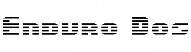
( Fonts by Daniel Zadorozny - www.iconian.com - Free for personal use )
A futuristic, striped font with a digital and high-tech appearance.
![Enduro Dos Frei Schriftart Herunterladen]() Herunterladen 625 Downloads
Herunterladen 625 Downloads -
( Fonts by Fontfabric - Svetoslav Simov - Personal-use only. For commercial use please contact owner. )
A modern, geometric sans-serif font with a clean and professional look.
![Uni Neue-Trial Regular Frei Schriftart Herunterladen]() Herunterladen 625 Downloads@WebFont
Herunterladen 625 Downloads@WebFont -
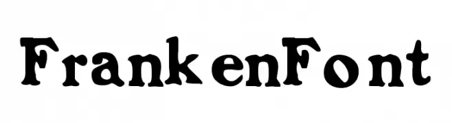
![FrankenFont Frei Schriftart Herunterladen]() Herunterladen 625 Downloads
Herunterladen 625 Downloads -
( Fonts by Michael Felch Jr. )
A bold, playful font with exaggerated curves and a whimsical style.
![Dapa Frei Schriftart Herunterladen]() Herunterladen 625 Downloads@WebFont
Herunterladen 625 Downloads@WebFont -
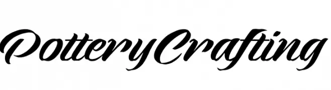
( Fonts by www.movefont .com - Personal-use only. For commercial use please contact owner. )
A cursive font with elegant, flowing strokes and a sophisticated style.
![Pottery Crafting Frei Schriftart Herunterladen]() Herunterladen 625 Downloads@WebFont
Herunterladen 625 Downloads@WebFont -
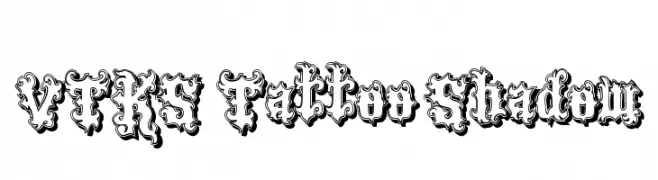
( Fonts by Douglas Vitkauskas - www.vtksdesign.com. Personal-use only. For commercial use please contact owner. )
An ornate, tattoo-inspired font with elaborate flourishes and shadow effects.
![VTKS Tattoo Shadow Frei Schriftart Herunterladen]() Herunterladen 624 Downloads@WebFont
Herunterladen 624 Downloads@WebFont -
( Fonts by Geronimo Fonts - Personal-use only. For commercial use please contact owner. )
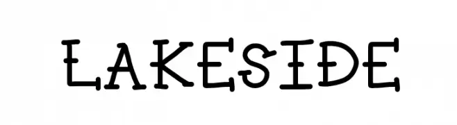
A playful, hand-drawn font with rounded strokes and small serifs.
![LAKESIDE Frei Schriftart Herunterladen]() Herunterladen 624 Downloads@WebFont
Herunterladen 624 Downloads@WebFont -
( Fonts by Dieter Steffmann )
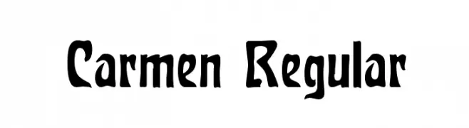
A bold, artistic font with a hand-crafted appearance, perfect for creative projects.
![Carmen Regular Frei Schriftart Herunterladen]() Herunterladen 624 Downloads@WebFont
Herunterladen 624 Downloads@WebFont -
( Fonts by a Neale Davidson - www.pixelsagas.com. Personal-use only. For commercial use please contact owner. )
A sleek, geometric font with thin, uniform strokes and a modern aesthetic.
![Majoram Frei Schriftart Herunterladen]() Herunterladen 624 Downloads@WebFont
Herunterladen 624 Downloads@WebFont -
![Coptic Eyes Coptic Frei Schriftart Herunterladen]() Herunterladen 624 Downloads@WebFont
Herunterladen 624 Downloads@WebFont -
![Valdero Regular Frei Schriftart Herunterladen]() Herunterladen 624 Downloads@WebFont
Herunterladen 624 Downloads@WebFont -
( Copyright (c) 2009, 2010, 2011 Daniel Johnson (
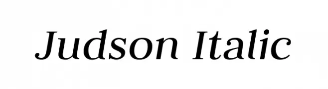
An elegant serif italic typeface with graceful curves and refined strokes.
![Judson Italic Frei Schriftart Herunterladen]() Herunterladen 624 Downloads@WebFont
Herunterladen 624 Downloads@WebFont -
( Fonts by Castcraft Software - opti.netii.net - check the website before use )
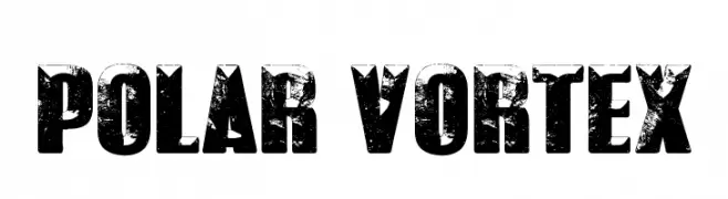
A bold, distressed font with a rugged, vintage texture.
![POLAR VORTEX Frei Schriftart Herunterladen]() Herunterladen 624 Downloads@WebFont
Herunterladen 624 Downloads@WebFont -
![Led Bus Frei Schriftart Herunterladen]() Herunterladen 624 Downloads@WebFont
Herunterladen 624 Downloads@WebFont -
![Onciale PhF Frei Schriftart Herunterladen]() Herunterladen 624 Downloads@WebFont
Herunterladen 624 Downloads@WebFont -
( Fonts by Hendra Pratama - HPTypework - https://hptypework.com - Personal-use only. For commercial use please contact owner. )
A bold, retro script font with elegant curves and dramatic flourishes.
![RetrofunkScriptPersonalUse Frei Schriftart Herunterladen]() Herunterladen 624 Downloads@WebFont
Herunterladen 624 Downloads@WebFont -
( Fonts by David Rakowski )
A distressed, vintage serif font with a textured, weathered look.
![McGarey Regular Frei Schriftart Herunterladen]() Herunterladen 624 Downloads@WebFont
Herunterladen 624 Downloads@WebFont -
![Zipper Regular Frei Schriftart Herunterladen]() Herunterladen 624 Downloads@WebFont
Herunterladen 624 Downloads@WebFont -
( Fonts by or from www.graffitifonts.net )
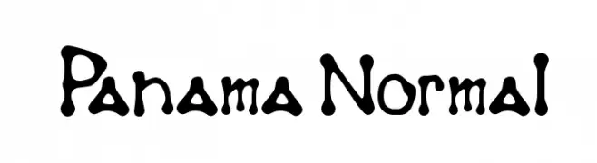
A playful, bold font with a hand-drawn, whimsical style.
![Panama Normal Frei Schriftart Herunterladen]() Herunterladen 624 Downloads@WebFont
Herunterladen 624 Downloads@WebFont -
( Fonts by RaffaSyad Studio - www.creativefabrica.com/designer/r-studio/ - Personal-use only. For commercial use please contact owner. )
A modern, cursive font with a handwritten style.
![Estele Frei Schriftart Herunterladen]() Herunterladen 624 Downloads@WebFont
Herunterladen 624 Downloads@WebFont -
( Fonts by Thomas Ledin - tomledin.com )
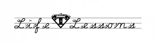
A classic cursive script font with elegant, flowing lines and connected letters.
![Life-Lessons Frei Schriftart Herunterladen]() Herunterladen 624 Downloads@WebFont
Herunterladen 624 Downloads@WebFont -
( Fonts by www.kimberlygeswein.com - Kimberly Geswein )
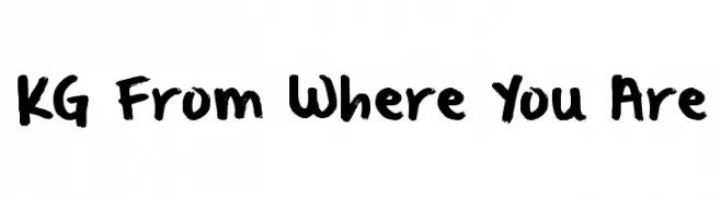
A bold, expressive handwritten font with brush-like strokes and a playful style.
![KG From Where You Are Frei Schriftart Herunterladen]() Herunterladen 624 Downloads@WebFont
Herunterladen 624 Downloads@WebFont -
( Fonts by Toto )
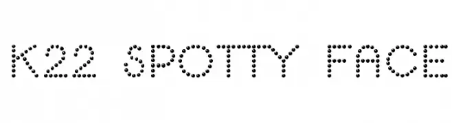
A playful, dotted font perfect for creative and modern designs.
![K22 Spotty Face Frei Schriftart Herunterladen]() Herunterladen 624 Downloads@WebFont
Herunterladen 624 Downloads@WebFont -
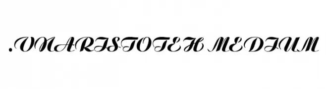
![.VnAristoteH Medium Frei Schriftart Herunterladen]() Herunterladen 624 Downloads
Herunterladen 624 Downloads -
( Fonts by Khurasan )
A playful, bold font with rounded edges and a bubbly appearance.
![Talkco Frei Schriftart Herunterladen]() Herunterladen 624 Downloads@WebFont
Herunterladen 624 Downloads@WebFont -
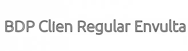
![BDP Clien Regular Envulta Frei Schriftart Herunterladen]() Herunterladen 624 Downloads@WebFont
Herunterladen 624 Downloads@WebFont -
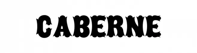
( Fonts by www.gliphmaker.com. Personal-use only. For commercial use please contact owner. )
A bold, decorative font with a vintage, western-inspired style.
![Caberne Frei Schriftart Herunterladen]() Herunterladen 624 Downloads@WebFont
Herunterladen 624 Downloads@WebFont


Welche Schriften sind gerade am populärsten?
Poppins, Roboto, Montserrat, Open Sans und Lato sind wegen ihrer klaren Formen und breiten Einsetzbarkeit sehr gefragt – von Markenauftritt über Landingpages bis hin zu Postern.
Welche Fonts eignen sich für Logos?
Geometrische Sans‑Serifs (z. B. Poppins, Familien im Gotham‑Stil) sind ein häufiger Griff für sauberes, skalierbares Branding. Für eine persönlichere Note bleiben Scripts und Handschrift‑Stile beliebt. Kombinieren Sie einen prägnanten Headline‑Font mit einer neutralen Brotschrift für Wiedererkennung und Harmonie.
Wie oft wird die Top‑Liste aktualisiert?
Regelmäßig – basierend auf realen Downloads und Interaktionen. Schauen Sie öfter vorbei, um aufstrebende Favoriten früh zu entdecken.
💡 Tipp: Seite bookmarken – Trends wechseln schnell, und heutige Top‑Schriften inspirieren morgen vielleicht das Rebranding.