Willkommen bei den Top‑Schriften – hier treffen Beliebtheit und Qualität aufeinander. Das sind die in diesem Jahr am häufigsten heruntergeladenen und genutzten Fonts. Wenn Sie sichere Optionen für Logo, Web oder Social suchen, starten Sie hier.
Jeder Top‑Font überzeugt durch Balance, Lesbarkeit und Vielseitigkeit. Sie finden moderne Sans‑Serifs, elegante Scripts, Vintage‑Serifs und minimalistische Displays.
-
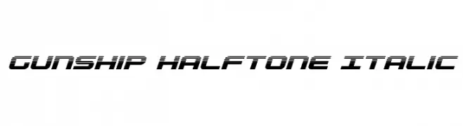
( Fonts by Daniel Zadorozny - www.iconian.com )
A bold, futuristic italic font with a halftone effect and dynamic style.
 Herunterladen 130 Downloads@WebFont
 -
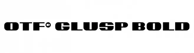
( Fonts by OBYS_AGENCY - Personal-use only. For commercial use please contact owner. )
A bold, geometric font with angular cuts and a modern industrial feel.
![OTF® Glusp Bold Frei Schriftart Herunterladen]() Herunterladen 130 Downloads@WebFont
Herunterladen 130 Downloads@WebFont -
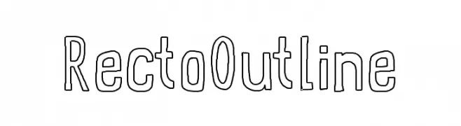
( Free for personal use )
A modern outline font with bold, geometric characters and a playful style.
![RectoOutline Frei Schriftart Herunterladen]() Herunterladen 130 Downloads@WebFont
Herunterladen 130 Downloads@WebFont -
![HYBRID Font Frei Schriftart Herunterladen]() Herunterladen 130 Downloads@WebFont
Herunterladen 130 Downloads@WebFont -
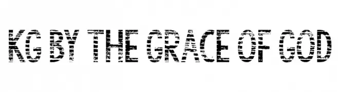
( Fonts by www.kimberlygeswein.com - Kimberly Geswein )
A bold, distressed font with a grunge aesthetic and high contrast.
![KG By the Grace of God Frei Schriftart Herunterladen]() Herunterladen 130 Downloads@WebFont
Herunterladen 130 Downloads@WebFont -
-
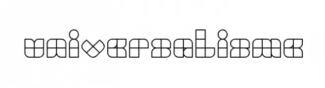
( Fonts by weknow - Wino S Kadir )
A geometric, modular font with a bold, modern design.
![UNIVERSALISME Frei Schriftart Herunterladen]() Herunterladen 130 Downloads@WebFont
Herunterladen 130 Downloads@WebFont -
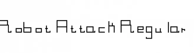
![Robot Attack Regular Frei Schriftart Herunterladen]() Herunterladen 130 Downloads@WebFont
Herunterladen 130 Downloads@WebFont -
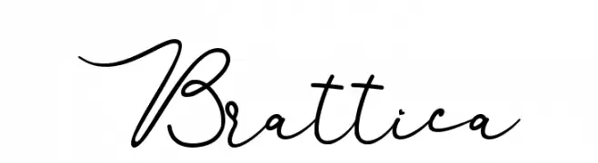
( Fonts by Alde Saputro - aldedesign - https://www.creativefabrica.com/product/the-crafty-holiday-font-bundle/ref/125925/ - Personal-use only. For commercial use please contact owner. )
An elegant, cursive font with flowing lines and sophisticated style.
![Brattica Frei Schriftart Herunterladen]() Herunterladen 130 Downloads@WebFont
Herunterladen 130 Downloads@WebFont -
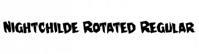
( Fonts by Daniel Zadorozny - www.iconian.com )
A bold, playful font with a hand-drawn, graffiti-like style.
![Nightchilde Rotated Regular Frei Schriftart Herunterladen]() Herunterladen 130 Downloads@WebFont
Herunterladen 130 Downloads@WebFont -
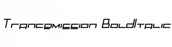
![Trancemission BoldItalic Frei Schriftart Herunterladen]() Herunterladen 130 Downloads@WebFont
Herunterladen 130 Downloads@WebFont
Welche Schriften sind gerade am populärsten?
Poppins, Roboto, Montserrat, Open Sans und Lato sind wegen ihrer klaren Formen und breiten Einsetzbarkeit sehr gefragt – von Markenauftritt über Landingpages bis hin zu Postern.
Welche Fonts eignen sich für Logos?
Geometrische Sans‑Serifs (z. B. Poppins, Familien im Gotham‑Stil) sind ein häufiger Griff für sauberes, skalierbares Branding. Für eine persönlichere Note bleiben Scripts und Handschrift‑Stile beliebt. Kombinieren Sie einen prägnanten Headline‑Font mit einer neutralen Brotschrift für Wiedererkennung und Harmonie.
Wie oft wird die Top‑Liste aktualisiert?
Regelmäßig – basierend auf realen Downloads und Interaktionen. Schauen Sie öfter vorbei, um aufstrebende Favoriten früh zu entdecken.
💡 Tipp: Seite bookmarken – Trends wechseln schnell, und heutige Top‑Schriften inspirieren morgen vielleicht das Rebranding.