Willkommen bei den Top‑Schriften – hier treffen Beliebtheit und Qualität aufeinander. Das sind die in diesem Jahr am häufigsten heruntergeladenen und genutzten Fonts. Wenn Sie sichere Optionen für Logo, Web oder Social suchen, starten Sie hier.
Jeder Top‑Font überzeugt durch Balance, Lesbarkeit und Vielseitigkeit. Sie finden moderne Sans‑Serifs, elegante Scripts, Vintage‑Serifs und minimalistische Displays.
-
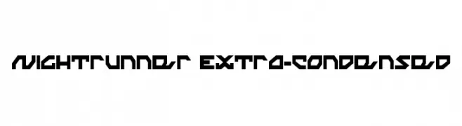
( Fonts by Daniel Zadorozny - www.iconian.com )
A bold, angular font with a futuristic and geometric design.
 Herunterladen 130 Downloads@WebFont
 -
( Fonts by www.blambot.com )
A bold, modern font with thick strokes and a strong, impactful presence.
![FirepowerBB Frei Schriftart Herunterladen]() Herunterladen 130 Downloads@WebFont
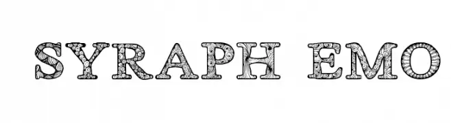
Herunterladen 130 Downloads@WebFont -
![ZsyraphDemo Frei Schriftart Herunterladen]() Herunterladen 130 Downloads@WebFont
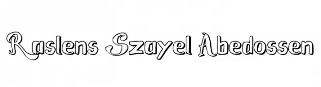
Herunterladen 130 Downloads@WebFont -
![Raslens Szayel Abedossen Frei Schriftart Herunterladen]() Herunterladen 130 Downloads@WebFont
Herunterladen 130 Downloads@WebFont -
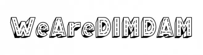
( Fonts by Eknoji Studio )
A bold, 3D decorative font with a playful and dynamic style.
![WeAreDIMDAM Frei Schriftart Herunterladen]() Herunterladen 130 Downloads@WebFont
Herunterladen 130 Downloads@WebFont -
-
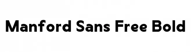
( Fonts by Maulana Creative - Gilang Maulana - Personal-use only. For commercial use please contact owner. )
A bold, modern sans-serif font with a clean and geometric design.
![Manford Sans Free Bold Frei Schriftart Herunterladen]() Herunterladen 130 Downloads@WebFont
Herunterladen 130 Downloads@WebFont -
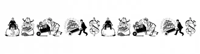
( Fonts by Manfred Klein. Free for private and charity use. Free for commercial with donation to organizations )
Cartoonish, money-themed decorative font with detailed illustrations.
![Moneymoney Frei Schriftart Herunterladen]() Herunterladen 130 Downloads@WebFont
Herunterladen 130 Downloads@WebFont -
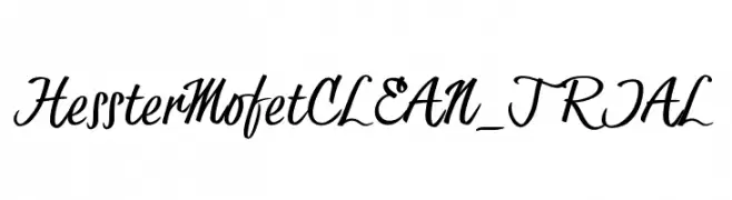
( JOEBOB graphics - Joe vanderHam - www.joebob.nl )
A dynamic and flowing script font with elegant, cursive letterforms.
![HessterMofetCLEAN_TRIAL Frei Schriftart Herunterladen]() Herunterladen 130 Downloads@WebFont
Herunterladen 130 Downloads@WebFont -
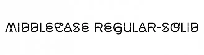
( Fonts by Morice Kastoun )
A modern, geometric font with rounded edges and consistent stroke width.
![Middlecase Regular-Solid Frei Schriftart Herunterladen]() Herunterladen 130 Downloads@WebFont
Herunterladen 130 Downloads@WebFont -
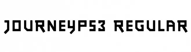
( Hauke Petersen )
A bold, geometric font with a modern and futuristic aesthetic.
![JourneyPS3 Regular Frei Schriftart Herunterladen]() Herunterladen 130 Downloads@WebFont
Herunterladen 130 Downloads@WebFont

Welche Schriften sind gerade am populärsten?
Poppins, Roboto, Montserrat, Open Sans und Lato sind wegen ihrer klaren Formen und breiten Einsetzbarkeit sehr gefragt – von Markenauftritt über Landingpages bis hin zu Postern.
Welche Fonts eignen sich für Logos?
Geometrische Sans‑Serifs (z. B. Poppins, Familien im Gotham‑Stil) sind ein häufiger Griff für sauberes, skalierbares Branding. Für eine persönlichere Note bleiben Scripts und Handschrift‑Stile beliebt. Kombinieren Sie einen prägnanten Headline‑Font mit einer neutralen Brotschrift für Wiedererkennung und Harmonie.
Wie oft wird die Top‑Liste aktualisiert?
Regelmäßig – basierend auf realen Downloads und Interaktionen. Schauen Sie öfter vorbei, um aufstrebende Favoriten früh zu entdecken.
💡 Tipp: Seite bookmarken – Trends wechseln schnell, und heutige Top‑Schriften inspirieren morgen vielleicht das Rebranding.