Willkommen bei den Top‑Schriften – hier treffen Beliebtheit und Qualität aufeinander. Das sind die in diesem Jahr am häufigsten heruntergeladenen und genutzten Fonts. Wenn Sie sichere Optionen für Logo, Web oder Social suchen, starten Sie hier.
Jeder Top‑Font überzeugt durch Balance, Lesbarkeit und Vielseitigkeit. Sie finden moderne Sans‑Serifs, elegante Scripts, Vintage‑Serifs und minimalistische Displays.
-
 Herunterladen 6076 Downloads@WebFont
 -
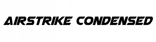
( Fonts by Daniel Zadorozny - www.iconian.com - Free for personal use )
A bold, angular font with a dynamic, forward-leaning slant and condensed width.
![Airstrike Condensed Frei Schriftart Herunterladen]() Herunterladen 6074 Downloads@WebFont
Herunterladen 6074 Downloads@WebFont -
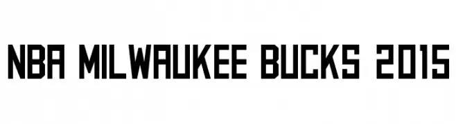
![NBA Milwaukee Bucks 2015 Frei Schriftart Herunterladen]() Herunterladen 6072 Downloads@WebFont
Herunterladen 6072 Downloads@WebFont -
( Fonts by www.legacyofdefeat.com )
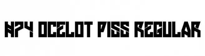
A bold, geometric font with sharp angles and a futuristic style.
![H74 Ocelot Piss Regular Frei Schriftart Herunterladen]() Herunterladen 6069 Downloads@WebFont
Herunterladen 6069 Downloads@WebFont -
( Copyright (c) 2014-2015, Sorkin Type Co (sorkintype.com | sorkintype@gmail.com) )
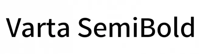
A modern, semi-bold sans-serif font with clean lines and balanced proportions.
![Varta SemiBold Frei Schriftart Herunterladen]() Herunterladen 6066 Downloads@WebFont
Herunterladen 6066 Downloads@WebFont -
-
( Fonts by www.typodermicfonts.com - Ray Larabie )
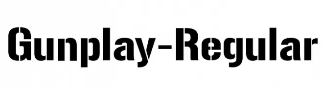
A bold, industrial-style font with strong, blocky characters.
![Gunplay-Regular Frei Schriftart Herunterladen]() Herunterladen 6065 Downloads@WebFont
Herunterladen 6065 Downloads@WebFont -
( Vladimir Nikolic - www.coroflot.com/vladimirnikolic )
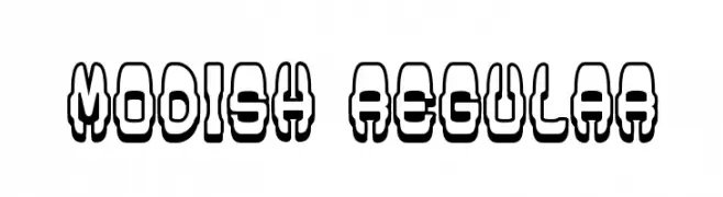
A bold, three-dimensional font with a geometric, outlined style.
![Modish Regular Frei Schriftart Herunterladen]() Herunterladen 6064 Downloads@WebFont
Herunterladen 6064 Downloads@WebFont -
![TitilliumText25L-600wt Frei Schriftart Herunterladen]() Herunterladen 6064 Downloads@WebFont
Herunterladen 6064 Downloads@WebFont -
![FastracFashion Regular Frei Schriftart Herunterladen]() Herunterladen 6064 Downloads@WebFont
Herunterladen 6064 Downloads@WebFont -
![Segan Light Frei Schriftart Herunterladen]() Herunterladen 6064 Downloads@WebFont
Herunterladen 6064 Downloads@WebFont -
( Fonts by Graham Meade - GemFonts )
A modern, ultra-bold sans-serif font with clean lines and balanced spacing.
![Walkway UltraBold Frei Schriftart Herunterladen]() Herunterladen 6064 Downloads@WebFont
Herunterladen 6064 Downloads@WebFont -
![Lakshmi Regular Frei Schriftart Herunterladen]() Herunterladen 6062 Downloads@WebFont
Herunterladen 6062 Downloads@WebFont -
( Copyright (c) 2012 by Jim Lyles for Astigmatic (AOETI) )
An elegant, flowing script font with interconnected letterforms and a sophisticated style.
![Stalemate Frei Schriftart Herunterladen]() Herunterladen 6061 Downloads@WebFont
Herunterladen 6061 Downloads@WebFont -
![NHL Chicago Frei Schriftart Herunterladen]() Herunterladen 6057 Downloads@WebFont
Herunterladen 6057 Downloads@WebFont -
( Copyright 2019 The Bevietnam Project Authors (https://github.com/bettergui/beVietnam) )
A bold, geometric sans-serif typeface with clean lines and modern appeal.
![Be Vietnam ExtraBold Frei Schriftart Herunterladen]() Herunterladen 6056 Downloads@WebFont
Herunterladen 6056 Downloads@WebFont -
( Copyright (c) 2015, Cadson Demak (info@cadsondemak.com) )
A bold, italic sans-serif font with a dynamic and modern style.
![Kanit ExtraBold Italic Frei Schriftart Herunterladen]() Herunterladen 6056 Downloads@WebFont
Herunterladen 6056 Downloads@WebFont -
![NBA Nets Frei Schriftart Herunterladen]() Herunterladen 6056 Downloads@WebFont
Herunterladen 6056 Downloads@WebFont -
( Fonts by Tobias Benjamin Kohler - www.uncia.de )
A modern, light sans-serif font with smooth, rounded edges and low contrast.
![eurofurence light Frei Schriftart Herunterladen]() Herunterladen 6055 Downloads@WebFont
Herunterladen 6055 Downloads@WebFont -
( Copyright (c) 2010, ParaType Ltd. (http://www.paratype.com/public) )
A classic serif typeface with a modern touch, offering elegance and readability.
![PT Serif Frei Schriftart Herunterladen]() Herunterladen 6053 Downloads@WebFont
Herunterladen 6053 Downloads@WebFont -
![Babe Bamboo Frei Schriftart Herunterladen]() Herunterladen 6052 Downloads@WebFont
Herunterladen 6052 Downloads@WebFont -
![NFL Jacksonville Jaguars Frei Schriftart Herunterladen]() Herunterladen 6049 Downloads@WebFont
Herunterladen 6049 Downloads@WebFont -
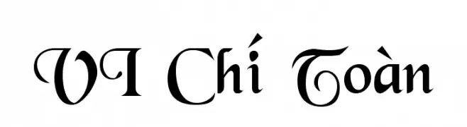
![VI Chí Toàn Frei Schriftart Herunterladen]() Herunterladen 6043 Downloads
Herunterladen 6043 Downloads -
Schriftart von danny91194. For commercial use please contact the owner.
( tricky )
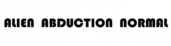
A bold, geometric font with a futuristic and playful design.
![Alien Abduction Normal Frei Schriftart Herunterladen]() Herunterladen 6042 Downloads@WebFont
Herunterladen 6042 Downloads@WebFont -
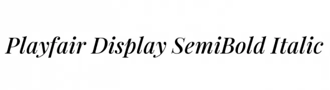
( Copyright (c) 2010, 2011 by Claus Eggers Sørensen (es@forthehearts.net) )
Elegant serif font with high contrast and italic style.
![Playfair Display SemiBold Italic Frei Schriftart Herunterladen]() Herunterladen 6040 Downloads@WebFont
Herunterladen 6040 Downloads@WebFont -
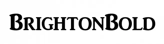
( Fonts by Altsys Metamorphosis )
A bold, classic serif font with strong strokes and pronounced serifs.
![BrightonBold Frei Schriftart Herunterladen]() Herunterladen 6038 Downloads@WebFont
Herunterladen 6038 Downloads@WebFont -
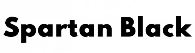
( Copyright 2020 The Spartan Project Authors (https://github.com/bghryct/Spartan-MB) )
A bold, geometric typeface with strong, uniform strokes and a commanding presence.
![Spartan Black Frei Schriftart Herunterladen]() Herunterladen 6035 Downloads@WebFont
Herunterladen 6035 Downloads@WebFont -
( Fonts by Yadhie Setiawan - typelinestudio.com - Personal-use only. For commercial use please contact owner. )
A sophisticated, cursive font with a handwritten signature style.
![Photograph Signature Frei Schriftart Herunterladen]() Herunterladen 6034 Downloads@WebFont
Herunterladen 6034 Downloads@WebFont -
( Fonts by Zetafonts - Personal-use only. For commercial use please contact owner. )
A bold, modern font with thick strokes and tight spacing, perfect for impactful headlines.
![Heading Now Trial 37 Extrabold Frei Schriftart Herunterladen]() Herunterladen 6033 Downloads@WebFont
Herunterladen 6033 Downloads@WebFont -
![Arista Frei Schriftart Herunterladen]() Herunterladen 6031 Downloads@WebFont
Herunterladen 6031 Downloads@WebFont -
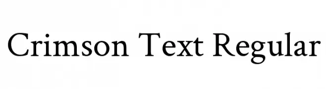
( Copyright (c) 2010, Sebastian Kosch (sebastian@aldusleaf.org) )
A classic serif font with elegant, well-proportioned letterforms and moderate stroke contrast.
![Crimson Text Regular Frei Schriftart Herunterladen]() Herunterladen 6029 Downloads@WebFont
Herunterladen 6029 Downloads@WebFont -
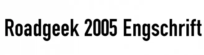
( Michael D. Adams - www.triskele.com/roadgeek-fonts/ )
A bold, condensed font with a modern, geometric style.
![Roadgeek 2005 Engschrift Frei Schriftart Herunterladen]() Herunterladen 6027 Downloads@WebFont
Herunterladen 6027 Downloads@WebFont -
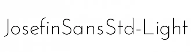
( Copyright (c) 2010, Santiago Orozco (hi@typemade.mx) )
A modern, minimalist font with clean lines and geometric shapes.
![JosefinSansStd-Light Frei Schriftart Herunterladen]() Herunterladen 6027 Downloads@WebFont
Herunterladen 6027 Downloads@WebFont -
( Fonts by Daniel Midgley )
A modern, handwritten font with a casual and flowing style.
![Daniel Frei Schriftart Herunterladen]() Herunterladen 6027 Downloads@WebFont
Herunterladen 6027 Downloads@WebFont -
![Disco Diva Frei Schriftart Herunterladen]() Herunterladen 6025 Downloads@WebFont
Herunterladen 6025 Downloads@WebFont -
( Copyright (c) 2012, Brian J. Bonislawsky DBA Astigmatic (AOETI) (astigma@astigmatic.com), with Reserved Font Names "Marcellus" )
A classic serif font with high contrast and elegant, sharp serifs.
![Marcellus SC Frei Schriftart Herunterladen]() Herunterladen 6024 Downloads@WebFont
Herunterladen 6024 Downloads@WebFont


Welche Schriften sind gerade am populärsten?
Poppins, Roboto, Montserrat, Open Sans und Lato sind wegen ihrer klaren Formen und breiten Einsetzbarkeit sehr gefragt – von Markenauftritt über Landingpages bis hin zu Postern.
Welche Fonts eignen sich für Logos?
Geometrische Sans‑Serifs (z. B. Poppins, Familien im Gotham‑Stil) sind ein häufiger Griff für sauberes, skalierbares Branding. Für eine persönlichere Note bleiben Scripts und Handschrift‑Stile beliebt. Kombinieren Sie einen prägnanten Headline‑Font mit einer neutralen Brotschrift für Wiedererkennung und Harmonie.
Wie oft wird die Top‑Liste aktualisiert?
Regelmäßig – basierend auf realen Downloads und Interaktionen. Schauen Sie öfter vorbei, um aufstrebende Favoriten früh zu entdecken.
💡 Tipp: Seite bookmarken – Trends wechseln schnell, und heutige Top‑Schriften inspirieren morgen vielleicht das Rebranding.