Willkommen bei den Top‑Schriften – hier treffen Beliebtheit und Qualität aufeinander. Das sind die in diesem Jahr am häufigsten heruntergeladenen und genutzten Fonts. Wenn Sie sichere Optionen für Logo, Web oder Social suchen, starten Sie hier.
Jeder Top‑Font überzeugt durch Balance, Lesbarkeit und Vielseitigkeit. Sie finden moderne Sans‑Serifs, elegante Scripts, Vintage‑Serifs und minimalistische Displays.
-
( Fonts by Almarkhatype - Abdul Malik Wisnu - Personal-use only. For commercial use please contact owner. )
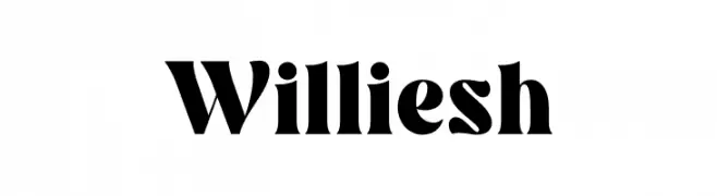
A bold, modern serif font with elegant curves and strong strokes.
 Herunterladen 121 Downloads@WebFont
 -
( Fonts by DmLetter31 - Dimas Prasetyo - Personal-use only. For commercial use please contact owner. )
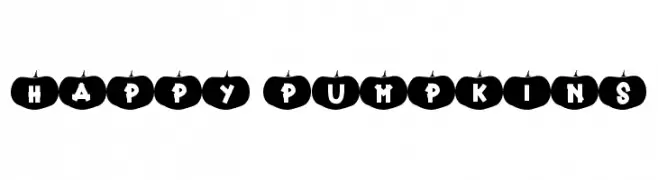
A playful font with characters inside pumpkin shapes, perfect for festive themes.
![Happy Pumpkins Frei Schriftart Herunterladen]() Herunterladen 121 Downloads@WebFont
Herunterladen 121 Downloads@WebFont -
( Fonts by a Max Infeld - XEROGRAPHER FONTS - xerographer.blogspot.com . Personal-use only. For commercial use please contact owner. )
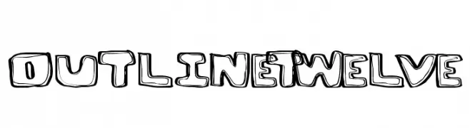
A bold, playful outline font with a hand-drawn appearance.
![OutlineTwelve Frei Schriftart Herunterladen]() Herunterladen 121 Downloads@WebFont
Herunterladen 121 Downloads@WebFont -
( Fonts by a cenz qobbal - www.facebook.com/cenzqobbalfonts. Personal-use only. For commercial use please contact owner. )
A modern, geometric font with double-line strokes and a sophisticated appearance.
![selari Frei Schriftart Herunterladen]() Herunterladen 121 Downloads@WebFont
Herunterladen 121 Downloads@WebFont -
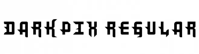
![DarkPix Regular Frei Schriftart Herunterladen]() Herunterladen 121 Downloads@WebFont
Herunterladen 121 Downloads@WebFont -
-
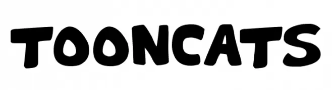
( Fonts by Darrell Flood )
A bold, playful font with rounded, cartoonish characters.
![Toon Cats Frei Schriftart Herunterladen]() Herunterladen 121 Downloads@WebFont
Herunterladen 121 Downloads@WebFont -
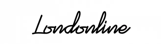
( Fonts by Mukh. std - Personal-use only. For commercial use please contact owner. )
A dynamic, flowing script font with elegant cursive letterforms and modern calligraphic style.
![Londonline Frei Schriftart Herunterladen]() Herunterladen 121 Downloads@WebFont
Herunterladen 121 Downloads@WebFont -
![Stormning Thor Oblique Frei Schriftart Herunterladen]() Herunterladen 121 Downloads@WebFont
Herunterladen 121 Downloads@WebFont -
![Arnot Hand Frei Schriftart Herunterladen]() Herunterladen 121 Downloads@WebFont
Herunterladen 121 Downloads@WebFont -
![Charger Sport Defiance Bold Frei Schriftart Herunterladen]() Herunterladen 121 Downloads@WebFont
Herunterladen 121 Downloads@WebFont

Welche Schriften sind gerade am populärsten?
Poppins, Roboto, Montserrat, Open Sans und Lato sind wegen ihrer klaren Formen und breiten Einsetzbarkeit sehr gefragt – von Markenauftritt über Landingpages bis hin zu Postern.
Welche Fonts eignen sich für Logos?
Geometrische Sans‑Serifs (z. B. Poppins, Familien im Gotham‑Stil) sind ein häufiger Griff für sauberes, skalierbares Branding. Für eine persönlichere Note bleiben Scripts und Handschrift‑Stile beliebt. Kombinieren Sie einen prägnanten Headline‑Font mit einer neutralen Brotschrift für Wiedererkennung und Harmonie.
Wie oft wird die Top‑Liste aktualisiert?
Regelmäßig – basierend auf realen Downloads und Interaktionen. Schauen Sie öfter vorbei, um aufstrebende Favoriten früh zu entdecken.
💡 Tipp: Seite bookmarken – Trends wechseln schnell, und heutige Top‑Schriften inspirieren morgen vielleicht das Rebranding.