Willkommen bei den Top‑Schriften – hier treffen Beliebtheit und Qualität aufeinander. Das sind die in diesem Jahr am häufigsten heruntergeladenen und genutzten Fonts. Wenn Sie sichere Optionen für Logo, Web oder Social suchen, starten Sie hier.
Jeder Top‑Font überzeugt durch Balance, Lesbarkeit und Vielseitigkeit. Sie finden moderne Sans‑Serifs, elegante Scripts, Vintage‑Serifs und minimalistische Displays.
-
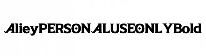
( Fonts by Mans Greback - Personal-use only. For commercial use please contact owner. )
A bold, striking font with thick strokes and unique character flair.
 Herunterladen 121 Downloads@WebFont
 -
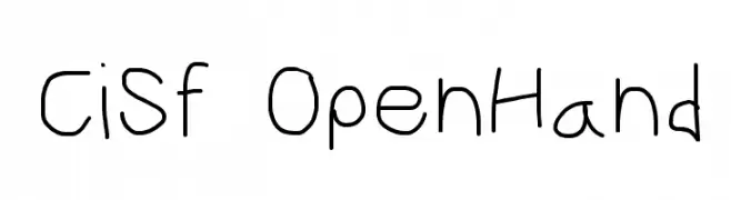
![CiSf OpenHand Frei Schriftart Herunterladen]() Herunterladen 121 Downloads@WebFont
Herunterladen 121 Downloads@WebFont -
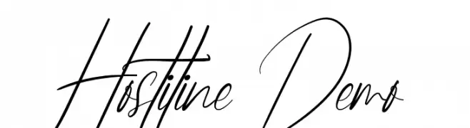
( Fonts by Nih Studio )
Elegant and artistic script font.
![Hostiline Demo Frei Schriftart Herunterladen]() Herunterladen 121 Downloads@WebFont
Herunterladen 121 Downloads@WebFont -
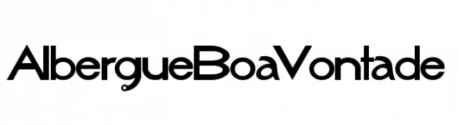
( Matias Romero - matiasromero.deviantart.com )
A modern, geometric font with clean lines and uniform stroke width.
![AlbergueBoaVontade Frei Schriftart Herunterladen]() Herunterladen 121 Downloads@WebFont
Herunterladen 121 Downloads@WebFont -
( Fonts by MJType )
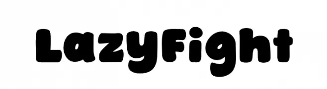
A bold, rounded font with a playful and friendly style.
![Lazy Fight Frei Schriftart Herunterladen]() Herunterladen 121 Downloads@WebFont
Herunterladen 121 Downloads@WebFont -
-
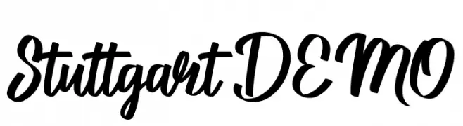
![Stuttgart DEMO Frei Schriftart Herunterladen]() Herunterladen 121 Downloads@WebFont
Herunterladen 121 Downloads@WebFont -
( Fonts by Andrew McCluskey - nalgames.com. Personal-use only. For commercial use please contact owner. )
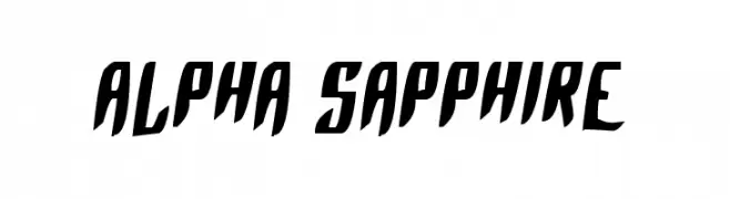
A bold, angular font with a futuristic and dynamic style.
![Alpha Sapphire Frei Schriftart Herunterladen]() Herunterladen 121 Downloads@WebFont
Herunterladen 121 Downloads@WebFont -
( Fonts by junkohanhero )
A hand-drawn, rustic font with a distressed and organic appearance.
![Dog Fox Zebra Frei Schriftart Herunterladen]() Herunterladen 121 Downloads@WebFont
Herunterladen 121 Downloads@WebFont -
( Fonts by Khurasan - Syaf Rizal - Personal-use only. For commercial use please contact owner. )
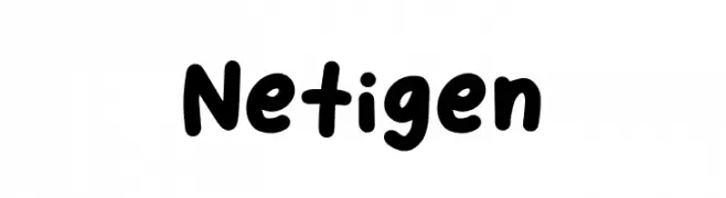
A playful, bold font with rounded, thick strokes and a hand-drawn feel.
![Netigen Frei Schriftart Herunterladen]() Herunterladen 121 Downloads@WebFont
Herunterladen 121 Downloads@WebFont -
![YBSingingTheBlues Frei Schriftart Herunterladen]() Herunterladen 121 Downloads@WebFont
Herunterladen 121 Downloads@WebFont

Welche Schriften sind gerade am populärsten?
Poppins, Roboto, Montserrat, Open Sans und Lato sind wegen ihrer klaren Formen und breiten Einsetzbarkeit sehr gefragt – von Markenauftritt über Landingpages bis hin zu Postern.
Welche Fonts eignen sich für Logos?
Geometrische Sans‑Serifs (z. B. Poppins, Familien im Gotham‑Stil) sind ein häufiger Griff für sauberes, skalierbares Branding. Für eine persönlichere Note bleiben Scripts und Handschrift‑Stile beliebt. Kombinieren Sie einen prägnanten Headline‑Font mit einer neutralen Brotschrift für Wiedererkennung und Harmonie.
Wie oft wird die Top‑Liste aktualisiert?
Regelmäßig – basierend auf realen Downloads und Interaktionen. Schauen Sie öfter vorbei, um aufstrebende Favoriten früh zu entdecken.
💡 Tipp: Seite bookmarken – Trends wechseln schnell, und heutige Top‑Schriften inspirieren morgen vielleicht das Rebranding.