Willkommen bei den Top‑Schriften – hier treffen Beliebtheit und Qualität aufeinander. Das sind die in diesem Jahr am häufigsten heruntergeladenen und genutzten Fonts. Wenn Sie sichere Optionen für Logo, Web oder Social suchen, starten Sie hier.
Jeder Top‑Font überzeugt durch Balance, Lesbarkeit und Vielseitigkeit. Sie finden moderne Sans‑Serifs, elegante Scripts, Vintage‑Serifs und minimalistische Displays.
-
( www.sparkybuddy.com - David Pustansky - www.sparkybuddy.com/fonts )
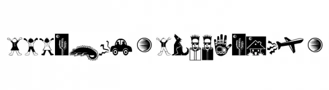
A bold, illustrative font depicting the NATO phonetic alphabet with unique graphics.
 Herunterladen 119 Downloads@WebFont
 -
( Fonts by hamizantype )
A playful, looped font with a hand-drawn, wire-like appearance.
![wire Frei Schriftart Herunterladen]() Herunterladen 119 Downloads@WebFont
Herunterladen 119 Downloads@WebFont -
![Pixelates Frei Schriftart Herunterladen]() Herunterladen 119 Downloads@WebFont
Herunterladen 119 Downloads@WebFont -
( Fonts by Manfred Klein. Free for private and charity use. Free for commercial with donation to organizations )
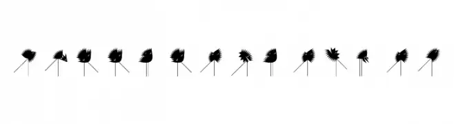
An abstract, spiky, and dynamic decorative design.
![RunningZigzags Frei Schriftart Herunterladen]() Herunterladen 119 Downloads@WebFont
Herunterladen 119 Downloads@WebFont -
![PopticsOneExtras Frei Schriftart Herunterladen]() Herunterladen 119 Downloads@WebFont
Herunterladen 119 Downloads@WebFont -
-
( imagex - www.imagex-fonts.com )
A bold, textured font with a distressed, vintage appearance.
![Afro Add Frei Schriftart Herunterladen]() Herunterladen 119 Downloads@WebFont
Herunterladen 119 Downloads@WebFont -
( Fonts by Apostrophic Lab )
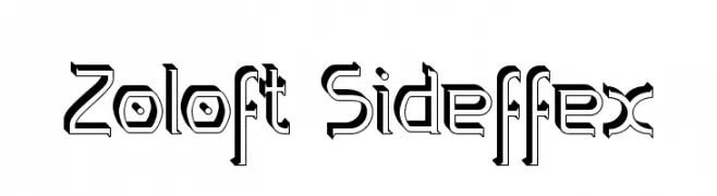
A bold, three-dimensional font with a futuristic and geometric style.
![Zoloft Sideffex Frei Schriftart Herunterladen]() Herunterladen 119 Downloads@WebFont
Herunterladen 119 Downloads@WebFont -
( M-Dfonts - Martin Steiner - photo.design-studio.sk )
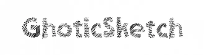
A bold, sketch-style font with diagonal hatching for a textured look.
![Ghotic Sketch Frei Schriftart Herunterladen]() Herunterladen 119 Downloads@WebFont
Herunterladen 119 Downloads@WebFont -
( Fonts by Aqeela Studio - Muhammad Nasir - Personal-use only. For commercial use please contact owner. )
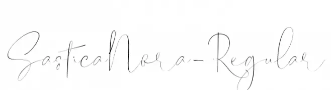
A delicate and elegant script font with flowing, cursive letterforms.
![SasticaNora-Regular Frei Schriftart Herunterladen]() Herunterladen 119 Downloads@WebFont
Herunterladen 119 Downloads@WebFont -
( Doel Creative - creativemarket.com/fajriyandi )
A classic, elegant script font with flowing, cursive letterforms.
![Kaeshum Frei Schriftart Herunterladen]() Herunterladen 119 Downloads@WebFont
Herunterladen 119 Downloads@WebFont


Welche Schriften sind gerade am populärsten?
Poppins, Roboto, Montserrat, Open Sans und Lato sind wegen ihrer klaren Formen und breiten Einsetzbarkeit sehr gefragt – von Markenauftritt über Landingpages bis hin zu Postern.
Welche Fonts eignen sich für Logos?
Geometrische Sans‑Serifs (z. B. Poppins, Familien im Gotham‑Stil) sind ein häufiger Griff für sauberes, skalierbares Branding. Für eine persönlichere Note bleiben Scripts und Handschrift‑Stile beliebt. Kombinieren Sie einen prägnanten Headline‑Font mit einer neutralen Brotschrift für Wiedererkennung und Harmonie.
Wie oft wird die Top‑Liste aktualisiert?
Regelmäßig – basierend auf realen Downloads und Interaktionen. Schauen Sie öfter vorbei, um aufstrebende Favoriten früh zu entdecken.
💡 Tipp: Seite bookmarken – Trends wechseln schnell, und heutige Top‑Schriften inspirieren morgen vielleicht das Rebranding.