Willkommen bei den Top‑Schriften – hier treffen Beliebtheit und Qualität aufeinander. Das sind die in diesem Jahr am häufigsten heruntergeladenen und genutzten Fonts. Wenn Sie sichere Optionen für Logo, Web oder Social suchen, starten Sie hier.
Jeder Top‑Font überzeugt durch Balance, Lesbarkeit und Vielseitigkeit. Sie finden moderne Sans‑Serifs, elegante Scripts, Vintage‑Serifs und minimalistische Displays.
-
 Herunterladen 120 Downloads@WebFont
 -
( Fonts by Vladimir Nikolic )
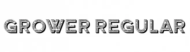
A bold, decorative font with a textured, three-dimensional style.
![Grower Regular Frei Schriftart Herunterladen]() Herunterladen 120 Downloads@WebFont
Herunterladen 120 Downloads@WebFont -
( Fonts by or from www.graffitifonts.net )
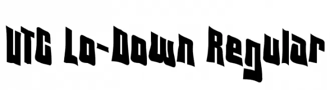
A bold, dynamic font with sharp angles and a slightly condensed form.
![VTC Lo-Down Regular Frei Schriftart Herunterladen]() Herunterladen 120 Downloads@WebFont
Herunterladen 120 Downloads@WebFont -
( Fonts by Miss Tiina at www.misstiina.com (please check the website before use) )
A whimsical, handwritten font with curly, decorative strokes.
![MTF Hunnie Frei Schriftart Herunterladen]() Herunterladen 120 Downloads@WebFont
Herunterladen 120 Downloads@WebFont -
![Purple Burple Frei Schriftart Herunterladen]() Herunterladen 120 Downloads@WebFont
Herunterladen 120 Downloads@WebFont -
-
( Fonts by Manfred Klein. Free for private and charity use. Free for commercial with donation to organizations )
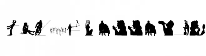
A pictogram font of bold, simplified human and object silhouettes.
![Silhouettes03 Frei Schriftart Herunterladen]() Herunterladen 120 Downloads@WebFont
Herunterladen 120 Downloads@WebFont -
( Illustrator Georgie Retzer - www.facebook.com/illustratorg )
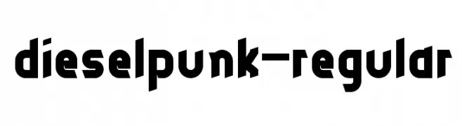
A bold, geometric font with an industrial and futuristic aesthetic.
![dieselpunk-regular Frei Schriftart Herunterladen]() Herunterladen 120 Downloads@WebFont
Herunterladen 120 Downloads@WebFont -
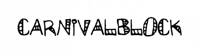
![CarnivalBlock Frei Schriftart Herunterladen]() Herunterladen 120 Downloads@WebFont
Herunterladen 120 Downloads@WebFont -
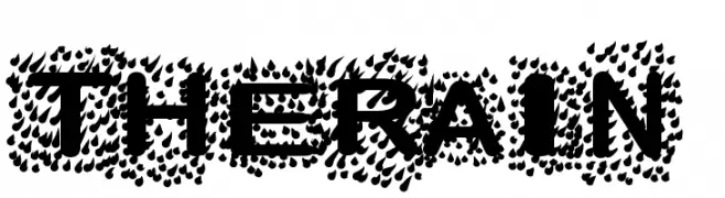
![TheRain Frei Schriftart Herunterladen]() Herunterladen 120 Downloads@WebFont
Herunterladen 120 Downloads@WebFont -
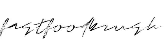
( Fonts by Mozyen Studio - Personal-use only. For commercial use please contact owner. )
A dynamic brush script font with expressive, hand-drawn strokes.
![Fastfood Brush Frei Schriftart Herunterladen]() Herunterladen 120 Downloads@WebFont
Herunterladen 120 Downloads@WebFont


Welche Schriften sind gerade am populärsten?
Poppins, Roboto, Montserrat, Open Sans und Lato sind wegen ihrer klaren Formen und breiten Einsetzbarkeit sehr gefragt – von Markenauftritt über Landingpages bis hin zu Postern.
Welche Fonts eignen sich für Logos?
Geometrische Sans‑Serifs (z. B. Poppins, Familien im Gotham‑Stil) sind ein häufiger Griff für sauberes, skalierbares Branding. Für eine persönlichere Note bleiben Scripts und Handschrift‑Stile beliebt. Kombinieren Sie einen prägnanten Headline‑Font mit einer neutralen Brotschrift für Wiedererkennung und Harmonie.
Wie oft wird die Top‑Liste aktualisiert?
Regelmäßig – basierend auf realen Downloads und Interaktionen. Schauen Sie öfter vorbei, um aufstrebende Favoriten früh zu entdecken.
💡 Tipp: Seite bookmarken – Trends wechseln schnell, und heutige Top‑Schriften inspirieren morgen vielleicht das Rebranding.