Willkommen bei den Top‑Schriften – hier treffen Beliebtheit und Qualität aufeinander. Das sind die in diesem Jahr am häufigsten heruntergeladenen und genutzten Fonts. Wenn Sie sichere Optionen für Logo, Web oder Social suchen, starten Sie hier.
Jeder Top‑Font überzeugt durch Balance, Lesbarkeit und Vielseitigkeit. Sie finden moderne Sans‑Serifs, elegante Scripts, Vintage‑Serifs und minimalistische Displays.
-
( Fonts by Winter Design Studio - winty5.wixsite.com/noahtheawesome/ - Personal-use only. For commercial use please contact owner. )
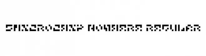
A pixelated, geometric font with a retro digital display style.
 Herunterladen 115 Downloads@WebFont
 -
( Iconian Fonts - Daniel Zadorozny - www.iconian.com )
A bold, futuristic font with outlined characters and rounded edges.
![Lightsider Academy Frei Schriftart Herunterladen]() Herunterladen 115 Downloads@WebFont
Herunterladen 115 Downloads@WebFont -
( Foxy Fonts )
A grunge, distressed font with rough, dynamic strokes.
![Foxgrunge Frei Schriftart Herunterladen]() Herunterladen 115 Downloads@WebFont
Herunterladen 115 Downloads@WebFont -
( www.tattoowoo.com )
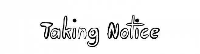
A bold, hand-drawn font with a playful and artistic style.
![Taking Notice Frei Schriftart Herunterladen]() Herunterladen 115 Downloads@WebFont
Herunterladen 115 Downloads@WebFont -
( Fonts by Castcraft Software - opti.netii.net - check the website before use )
A bold, rugged font with a distressed, hand-crafted appearance.
![Mainframe-NoNeufUnR Frei Schriftart Herunterladen]() Herunterladen 115 Downloads@WebFont
Herunterladen 115 Downloads@WebFont -
-
( Fonts by Edric Studio - Personal-use only. For commercial use please contact owner. )
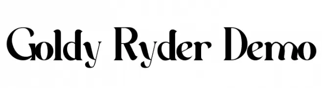
A bold, high-contrast serif font with a modern and classic blend.
![Goldy Ryder Demo Frei Schriftart Herunterladen]() Herunterladen 115 Downloads@WebFont
Herunterladen 115 Downloads@WebFont -
( Fonts by Jonathan S. Harris - www.tattoowoo.com. Personal-use only. For commercial use please contact owner. )
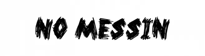
A bold, hand-drawn font with a rough, textured appearance, ideal for dynamic and unconventional designs.
![No Messin Frei Schriftart Herunterladen]() Herunterladen 115 Downloads@WebFont
Herunterladen 115 Downloads@WebFont -
( Fonts by Iconian Fonts )
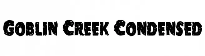
A bold, distressed, and condensed font with a rugged, vintage look.
![Goblin Creek Condensed Frei Schriftart Herunterladen]() Herunterladen 115 Downloads@WebFont
Herunterladen 115 Downloads@WebFont -
( Fonts by Benoit Champy - www.vnbc.fr - Personal-use only. For commercial use please contact owner. )
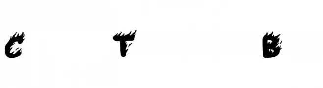
A bold, fiery font with a dynamic, flame-like design.
![Comic Tragedy Base Frei Schriftart Herunterladen]() Herunterladen 115 Downloads@WebFont
Herunterladen 115 Downloads@WebFont -
( Fonts by Winter Design Studio - winty5.wixsite.com/noahtheawesome/ - Personal-use only. For commercial use please contact owner. )
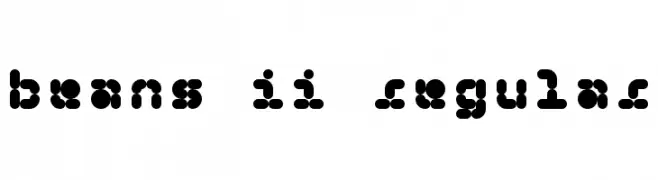
A playful, bean-shaped decorative font with tight spacing and uniform thickness.
![5Beans II Regular Frei Schriftart Herunterladen]() Herunterladen 115 Downloads@WebFont
Herunterladen 115 Downloads@WebFont


Welche Schriften sind gerade am populärsten?
Poppins, Roboto, Montserrat, Open Sans und Lato sind wegen ihrer klaren Formen und breiten Einsetzbarkeit sehr gefragt – von Markenauftritt über Landingpages bis hin zu Postern.
Welche Fonts eignen sich für Logos?
Geometrische Sans‑Serifs (z. B. Poppins, Familien im Gotham‑Stil) sind ein häufiger Griff für sauberes, skalierbares Branding. Für eine persönlichere Note bleiben Scripts und Handschrift‑Stile beliebt. Kombinieren Sie einen prägnanten Headline‑Font mit einer neutralen Brotschrift für Wiedererkennung und Harmonie.
Wie oft wird die Top‑Liste aktualisiert?
Regelmäßig – basierend auf realen Downloads und Interaktionen. Schauen Sie öfter vorbei, um aufstrebende Favoriten früh zu entdecken.
💡 Tipp: Seite bookmarken – Trends wechseln schnell, und heutige Top‑Schriften inspirieren morgen vielleicht das Rebranding.