Willkommen bei den Top‑Schriften – hier treffen Beliebtheit und Qualität aufeinander. Das sind die in diesem Jahr am häufigsten heruntergeladenen und genutzten Fonts. Wenn Sie sichere Optionen für Logo, Web oder Social suchen, starten Sie hier.
Jeder Top‑Font überzeugt durch Balance, Lesbarkeit und Vielseitigkeit. Sie finden moderne Sans‑Serifs, elegante Scripts, Vintage‑Serifs und minimalistische Displays.
-
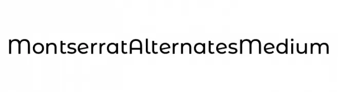
( Fonts by Julieta Ulanovsky )
A modern, geometric font with smooth curves and a clean design.
 Herunterladen 115 Downloads@WebFont
 -
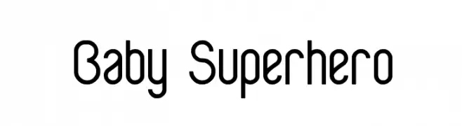
( weknow - Wino S Kadir - www.creativefabrica.com/designer/weknow/ )
A playful, modern font with rounded and angular elements, perfect for creative projects.
![Baby Superhero Frei Schriftart Herunterladen]() Herunterladen 115 Downloads@WebFont
Herunterladen 115 Downloads@WebFont -
( www.pleine-page.fr )
A bold, dynamic font with angular strokes and a futuristic style.
![Imbroglio Frei Schriftart Herunterladen]() Herunterladen 115 Downloads@WebFont
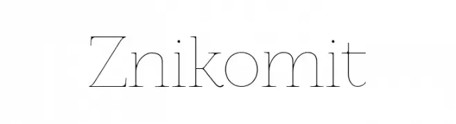
Herunterladen 115 Downloads@WebFont -
![Znikomit Frei Schriftart Herunterladen]() Herunterladen 115 Downloads@WebFont
Herunterladen 115 Downloads@WebFont -
( Fonts by www.junkohanhero.com - Personal-use only. For commercial use please contact owner. )
A hand-drawn, rustic font with a playful and organic style.
![Auribus tenere lupum Frei Schriftart Herunterladen]() Herunterladen 115 Downloads@WebFont
Herunterladen 115 Downloads@WebFont -
-
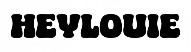
( Fonts by Eko Bimantara )
A bold, playful font with rounded edges and a vintage feel.
![HEY LOUIE Frei Schriftart Herunterladen]() Herunterladen 115 Downloads@WebFont
Herunterladen 115 Downloads@WebFont -
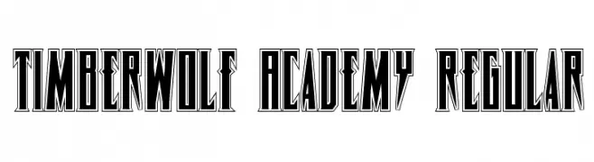
( Fonts by Daniel Zadorozny - www.iconian.com )
A bold, decorative font with sharp, angular edges and a gothic influence.
![Timberwolf Academy Regular Frei Schriftart Herunterladen]() Herunterladen 115 Downloads@WebFont
Herunterladen 115 Downloads@WebFont -
( Fonts by Typefar - Farul Arjianto - Personal-use only. For commercial use please contact owner. )
A bold, modern sans-serif font with clean lines and uniform strokes.
![Romedhal Sans Frei Schriftart Herunterladen]() Herunterladen 115 Downloads@WebFont
Herunterladen 115 Downloads@WebFont -
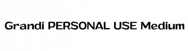
( Måns Grebäck - www.mansgreback.com )
A bold, modern sans-serif font with clean lines and strong presence.
![Grandi PERSONAL USE Medium Frei Schriftart Herunterladen]() Herunterladen 115 Downloads@WebFont
Herunterladen 115 Downloads@WebFont -
( گالری فانت فارسی پژوهش آريانا - only compatible with Farsi and Arabic )
An elegant, calligraphic script font with flowing curves and ornate details.
![Diwaani Frei Schriftart Herunterladen]() Herunterladen 115 Downloads@WebFont
Herunterladen 115 Downloads@WebFont


Welche Schriften sind gerade am populärsten?
Poppins, Roboto, Montserrat, Open Sans und Lato sind wegen ihrer klaren Formen und breiten Einsetzbarkeit sehr gefragt – von Markenauftritt über Landingpages bis hin zu Postern.
Welche Fonts eignen sich für Logos?
Geometrische Sans‑Serifs (z. B. Poppins, Familien im Gotham‑Stil) sind ein häufiger Griff für sauberes, skalierbares Branding. Für eine persönlichere Note bleiben Scripts und Handschrift‑Stile beliebt. Kombinieren Sie einen prägnanten Headline‑Font mit einer neutralen Brotschrift für Wiedererkennung und Harmonie.
Wie oft wird die Top‑Liste aktualisiert?
Regelmäßig – basierend auf realen Downloads und Interaktionen. Schauen Sie öfter vorbei, um aufstrebende Favoriten früh zu entdecken.
💡 Tipp: Seite bookmarken – Trends wechseln schnell, und heutige Top‑Schriften inspirieren morgen vielleicht das Rebranding.