Willkommen bei den Top‑Schriften – hier treffen Beliebtheit und Qualität aufeinander. Das sind die in diesem Jahr am häufigsten heruntergeladenen und genutzten Fonts. Wenn Sie sichere Optionen für Logo, Web oder Social suchen, starten Sie hier.
Jeder Top‑Font überzeugt durch Balance, Lesbarkeit und Vielseitigkeit. Sie finden moderne Sans‑Serifs, elegante Scripts, Vintage‑Serifs und minimalistische Displays.
-
( Fonts by Omega Font Labs )
A tall, jagged font with an eerie, playful horror theme.
 Herunterladen 550 Downloads@WebFont
 -
( Fonts by Graham Meade - GemFonts )
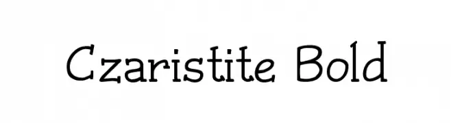
A bold, playful font with a hand-drawn aesthetic and varying line thickness.
![Czaristite Bold Frei Schriftart Herunterladen]() Herunterladen 550 Downloads@WebFont
Herunterladen 550 Downloads@WebFont -
( Fonts by Roland Huse - rolandhuse.com )
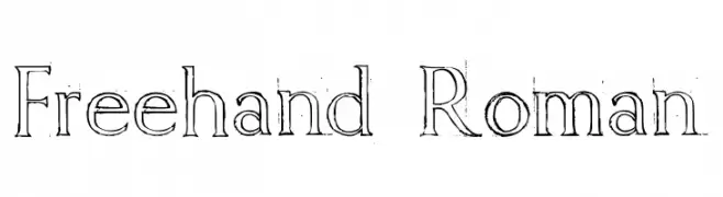
A hand-drawn, artistic font with an organic and informal style.
![Freehand Roman Frei Schriftart Herunterladen]() Herunterladen 550 Downloads@WebFont
Herunterladen 550 Downloads@WebFont -
( Fonts by Chris Vile - fontmonger.com - Personal-use only. For commercial use please contact owner. )
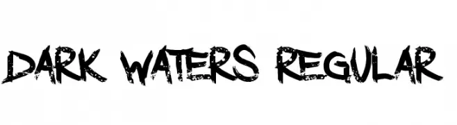
A bold, distressed font with a grunge, hand-drawn appearance.
![Dark Waters Regular Frei Schriftart Herunterladen]() Herunterladen 550 Downloads@WebFont
Herunterladen 550 Downloads@WebFont -
( Copyright © 2017 IBM Corp. with Reserved Font Name "Plex" )
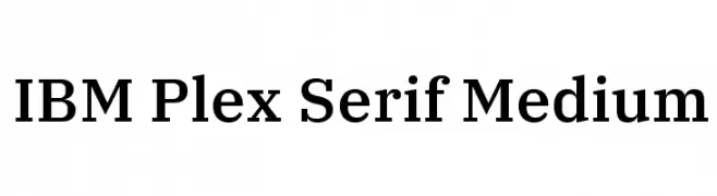
A modern serif font with clean lines and balanced proportions, ideal for versatile design applications.
![IBM Plex Serif Medium Frei Schriftart Herunterladen]() Herunterladen 550 Downloads@WebFont
Herunterladen 550 Downloads@WebFont -
-
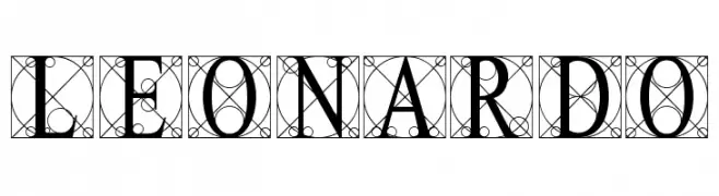
( Fonts by Levi Halmos )
A decorative and intricate font with classical and artistic elements.
![Leonardo Frei Schriftart Herunterladen]() Herunterladen 550 Downloads@WebFont
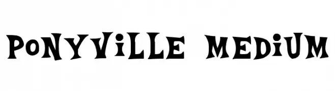
Herunterladen 550 Downloads@WebFont -
![Ponyville Medium Frei Schriftart Herunterladen]() Herunterladen 550 Downloads@WebFont
Herunterladen 550 Downloads@WebFont -
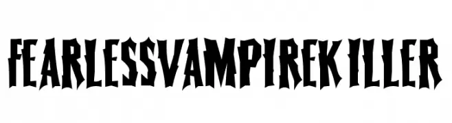
( Fonts by Daniel Gauthier )
A bold, gothic font with sharp, angular lines and a dramatic style.
![FearlessVampireKiller Frei Schriftart Herunterladen]() Herunterladen 550 Downloads@WebFont
Herunterladen 550 Downloads@WebFont -
( Fonts by Daniel Zadorozny - www.iconian.com - Personal-use only. For commercial use please contact owner. )
A bold, italicized font with a dynamic and modern style.
![Special Agent Xtra-Exp SupItal Frei Schriftart Herunterladen]() Herunterladen 550 Downloads@WebFont
Herunterladen 550 Downloads@WebFont -
![V5 Bloques Frei Schriftart Herunterladen]() Herunterladen 550 Downloads@WebFont
Herunterladen 550 Downloads@WebFont -
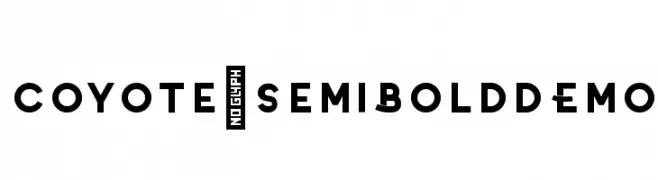
( Phitradesign - Philip Trautmann - www.phitradesign-fonts.com )
A bold, geometric font with a modern and impactful design.
![Coyote-SemiBoldDEMO Frei Schriftart Herunterladen]() Herunterladen 550 Downloads@WebFont
Herunterladen 550 Downloads@WebFont -
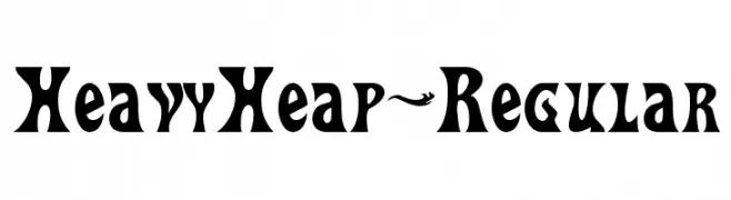
( Fonts by www.typodermicfonts.com - Ray Larabie )
A bold, dynamic font with exaggerated curves and sharp edges, perfect for standout designs.
![HeavyHeap-Regular Frei Schriftart Herunterladen]() Herunterladen 550 Downloads@WebFont
Herunterladen 550 Downloads@WebFont -
( Dimka.com - dimka.com/fonts )
A playful, handwritten font with smooth, rounded edges and consistent stroke width.
![Xarrovv Frei Schriftart Herunterladen]() Herunterladen 550 Downloads@WebFont
Herunterladen 550 Downloads@WebFont -
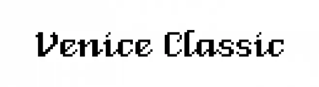
![Venice Classic Frei Schriftart Herunterladen]() Herunterladen 550 Downloads@WebFont
Herunterladen 550 Downloads@WebFont -
( Levi Szekeres - www.loremipsum.ro )
A modern, clean sans-serif font with uniform stroke width and geometric influence.
![Ogonek Frei Schriftart Herunterladen]() Herunterladen 550 Downloads@WebFont
Herunterladen 550 Downloads@WebFont -
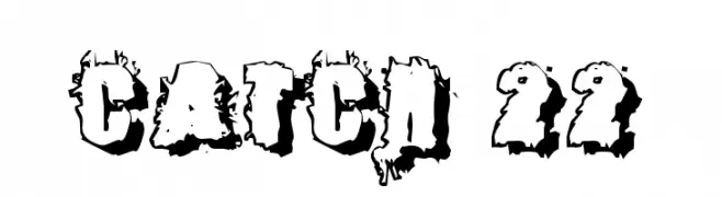
( Fonts by Rob Dobi - Toxic Type - www.dobi.nu )
A bold, distressed font with a rugged, eroded appearance.
![Catch 22 Frei Schriftart Herunterladen]() Herunterladen 550 Downloads@WebFont
Herunterladen 550 Downloads@WebFont -
( Font by Jonathan Harris - www.tattoowoo.com )
A dynamic, sketch-like font with overlapping strokes and artistic flair.
![Draw Freehand Frei Schriftart Herunterladen]() Herunterladen 550 Downloads@WebFont
Herunterladen 550 Downloads@WebFont -
( Fonts by Nur Khanifa Subkhi )
A whimsical, spiral-embellished font with a playful and artistic style.
![MOLLUSCA Frei Schriftart Herunterladen]() Herunterladen 550 Downloads@WebFont
Herunterladen 550 Downloads@WebFont -
![Chicagothic Frei Schriftart Herunterladen]() Herunterladen 550 Downloads@WebFont
Herunterladen 550 Downloads@WebFont -
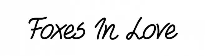
( mistifonts.com/ )
A playful and casual handwritten font with fluid, connected letterforms.
![Foxes In Love Frei Schriftart Herunterladen]() Herunterladen 550 Downloads@WebFont
Herunterladen 550 Downloads@WebFont -
( Fonts by weknow - Wino S Kadir )
A modern, geometric font with rounded edges and a clean, uniform appearance.
![internationalist Frei Schriftart Herunterladen]() Herunterladen 550 Downloads@WebFont
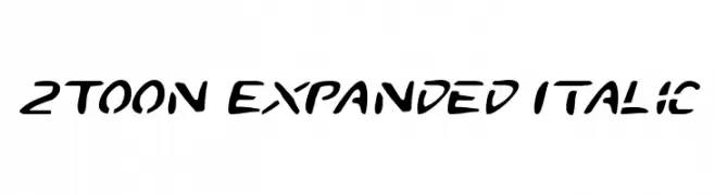
Herunterladen 550 Downloads@WebFont -
![2Toon Expanded Italic Frei Schriftart Herunterladen]() Herunterladen 550 Downloads@WebFont
Herunterladen 550 Downloads@WebFont -
( Fonts by www.paintblackeditions.org )
A bold, playful font with a hand-drawn, quirky style.
![Fake Smiths Frei Schriftart Herunterladen]() Herunterladen 550 Downloads@WebFont
Herunterladen 550 Downloads@WebFont -
![Skirt Girl Frei Schriftart Herunterladen]() Herunterladen 550 Downloads@WebFont
Herunterladen 550 Downloads@WebFont -
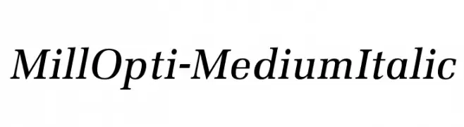
( Fonts by Castcraft Software - opti.netii.net - check the website before use )
A classic serif font with medium weight and italic style, offering elegance and readability.
![MillOpti-MediumItalic Frei Schriftart Herunterladen]() Herunterladen 550 Downloads@WebFont
Herunterladen 550 Downloads@WebFont -
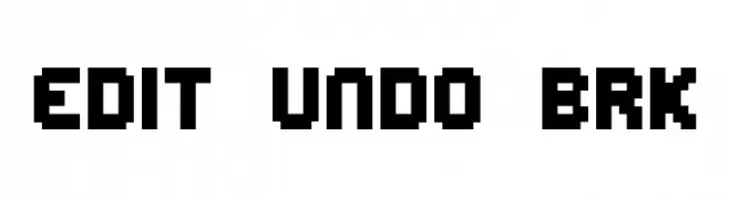
( Fonts by www.aenigmafonts.com )
A bold, pixelated font with a retro, 8-bit digital aesthetic.
![Edit Undo BRK Frei Schriftart Herunterladen]() Herunterladen 550 Downloads@WebFont
Herunterladen 550 Downloads@WebFont -
![Tengwar Annatar Bold Frei Schriftart Herunterladen]() Herunterladen 550 Downloads@WebFont
Herunterladen 550 Downloads@WebFont -
( Fonts by Fabula )
A bold, decorative font with high contrast and playful elements.
![Fabula Frei Schriftart Herunterladen]() Herunterladen 550 Downloads@WebFont
Herunterladen 550 Downloads@WebFont -
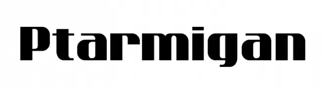
( Fonts by www.tepidmonkey.net )
A bold, geometric font ideal for impactful headlines and titles.
![Ptarmigan Frei Schriftart Herunterladen]() Herunterladen 550 Downloads@WebFont
Herunterladen 550 Downloads@WebFont -
![MARVEL HEROES Frei Schriftart Herunterladen]() Herunterladen 549 Downloads@WebFont
Herunterladen 549 Downloads@WebFont -
( Fonts by Manfred Klein. Free for private and charity use. Free for commercial with donation to organizations )
A refined serif font with elegant curves and a modern touch.
![Burklein Frei Schriftart Herunterladen]() Herunterladen 549 Downloads@WebFont
Herunterladen 549 Downloads@WebFont -
![U-Mix-U Frei Schriftart Herunterladen]() Herunterladen 549 Downloads@WebFont
Herunterladen 549 Downloads@WebFont -
( Fonts by David Espinosa - http://issuu.com/davidespinosa5/ )
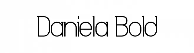
A modern, geometric font with consistent stroke width and a sleek appearance.
![Daniela Bold Frei Schriftart Herunterladen]() Herunterladen 549 Downloads@WebFont
Herunterladen 549 Downloads@WebFont -
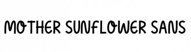
( Fonts by AV Type )
A playful, bold font with rounded, slightly irregular letterforms.
![Mother Sunflower Sans Frei Schriftart Herunterladen]() Herunterladen 549 Downloads@WebFont
Herunterladen 549 Downloads@WebFont -
( Fonts by Bumbayo Font Fabrik - bumbayo.blogspot.com )
A bold, vintage-style font with high contrast and strong strokes.
![Tuce Frei Schriftart Herunterladen]() Herunterladen 549 Downloads@WebFont
Herunterladen 549 Downloads@WebFont


Welche Schriften sind gerade am populärsten?
Poppins, Roboto, Montserrat, Open Sans und Lato sind wegen ihrer klaren Formen und breiten Einsetzbarkeit sehr gefragt – von Markenauftritt über Landingpages bis hin zu Postern.
Welche Fonts eignen sich für Logos?
Geometrische Sans‑Serifs (z. B. Poppins, Familien im Gotham‑Stil) sind ein häufiger Griff für sauberes, skalierbares Branding. Für eine persönlichere Note bleiben Scripts und Handschrift‑Stile beliebt. Kombinieren Sie einen prägnanten Headline‑Font mit einer neutralen Brotschrift für Wiedererkennung und Harmonie.
Wie oft wird die Top‑Liste aktualisiert?
Regelmäßig – basierend auf realen Downloads und Interaktionen. Schauen Sie öfter vorbei, um aufstrebende Favoriten früh zu entdecken.
💡 Tipp: Seite bookmarken – Trends wechseln schnell, und heutige Top‑Schriften inspirieren morgen vielleicht das Rebranding.