Willkommen bei den Top‑Schriften – hier treffen Beliebtheit und Qualität aufeinander. Das sind die in diesem Jahr am häufigsten heruntergeladenen und genutzten Fonts. Wenn Sie sichere Optionen für Logo, Web oder Social suchen, starten Sie hier.
Jeder Top‑Font überzeugt durch Balance, Lesbarkeit und Vielseitigkeit. Sie finden moderne Sans‑Serifs, elegante Scripts, Vintage‑Serifs und minimalistische Displays.
-
( Fonts by Justin Callaghan - mickeyavenue.com Sponsoren Schriftart )
A geometric Art Deco font with sharp angles and elegant curves.
 Herunterladen 549 Downloads
 -
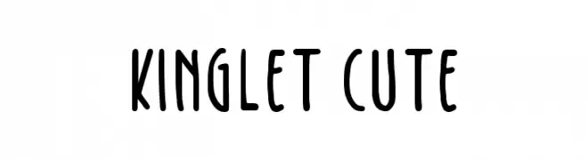
( mlkwsn - Malik Wisnu )
A playful handwritten font with rounded edges and a casual style.
![Kinglet Cute Frei Schriftart Herunterladen]() Herunterladen 549 Downloads@WebFont
Herunterladen 549 Downloads@WebFont -
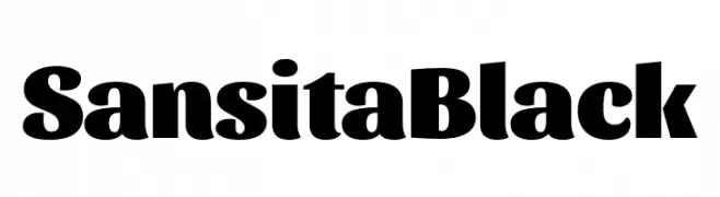
( Fonts by Omnibus Type )
A bold, modern font with thick strokes and a strong presence.
![Sansita Black Frei Schriftart Herunterladen]() Herunterladen 549 Downloads@WebFont
Herunterladen 549 Downloads@WebFont -
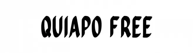
( Aaron Amar - www.behance.net/aaronamar )
A bold, dynamic font with a playful and energetic style.
![Quiapo Free Frei Schriftart Herunterladen]() Herunterladen 549 Downloads@WebFont
Herunterladen 549 Downloads@WebFont -
![AntPoltSemiExpd-Bold Frei Schriftart Herunterladen]() Herunterladen 549 Downloads@WebFont
Herunterladen 549 Downloads@WebFont -
-
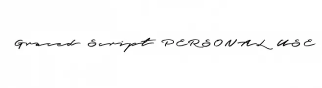
( Fonts by Måns Grebäck )
A graceful, cursive script font with a natural handwritten style.
![Graced Script PERSONAL USE Frei Schriftart Herunterladen]() Herunterladen 548 Downloads@WebFont
Herunterladen 548 Downloads@WebFont -
( www.decloedtkristof.be )
A playful, bold handwritten font with a lively and informal style.
![Geschrift Frei Schriftart Herunterladen]() Herunterladen 548 Downloads@WebFont
Herunterladen 548 Downloads@WebFont -
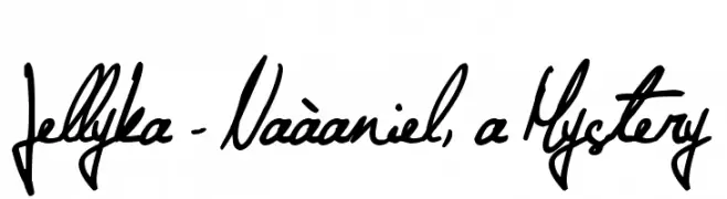
( Fonts are free for a personal use only - www.cuttyfruty.com )
A fluid and elegant handwritten script with expressive strokes.
![Jellyka - Naàaniel, a Mystery Frei Schriftart Herunterladen]() Herunterladen 548 Downloads@WebFont
Herunterladen 548 Downloads@WebFont -
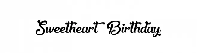
( Fonts by Agathe M.Joyce - www.foundmyfont.com - Personal-use only. For commercial use please contact owner. )
A playful and elegant script font with flowing, cursive letters and decorative flourishes.
![Sweetheart Birthday Frei Schriftart Herunterladen]() Herunterladen 548 Downloads@WebFont
Herunterladen 548 Downloads@WebFont -
( Fonts by Xerographer Fonts )
A bold, retro-inspired font with dynamic strokes and angular serifs.
![WickedSeventies Frei Schriftart Herunterladen]() Herunterladen 548 Downloads@WebFont
Herunterladen 548 Downloads@WebFont -
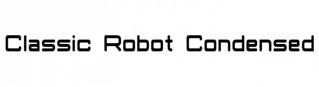
( Fonts by a Neale Davidson - www.pixelsagas.com. Personal-use only. For commercial use please contact owner. )
A futuristic, condensed font with rounded edges and a mechanical aesthetic.
![Classic Robot Condensed Frei Schriftart Herunterladen]() Herunterladen 548 Downloads@WebFont
Herunterladen 548 Downloads@WebFont -
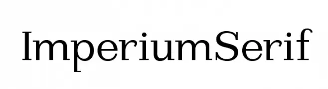
( Fonts by Manfred Klein - manfred-klein.ina-mar.com )
A classic serif typeface with sharp serifs and balanced proportions, ideal for formal and professional use.
![ImperiumSerif Frei Schriftart Herunterladen]() Herunterladen 548 Downloads@WebFont
Herunterladen 548 Downloads@WebFont -
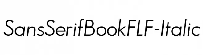
( Fonts by Casady & Greene )
A modern, italic sans-serif font with clean lines and excellent readability.
![SansSerifBookFLF-Italic Frei Schriftart Herunterladen]() Herunterladen 548 Downloads@WebFont
Herunterladen 548 Downloads@WebFont -
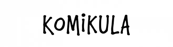
( Fonts by Locomotype )
A playful, handwritten font with bold, rounded strokes and a comic book style.
![Komikula Frei Schriftart Herunterladen]() Herunterladen 548 Downloads@WebFont
Herunterladen 548 Downloads@WebFont -
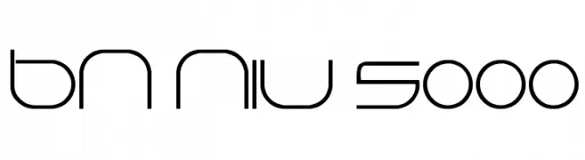
( Fonts by Ben Nathan )
A sleek, futuristic font with geometric and minimalist design elements.
![BN Niv 5000 Frei Schriftart Herunterladen]() Herunterladen 548 Downloads@WebFont
Herunterladen 548 Downloads@WebFont -
( Fonts by Eknoji Studio - www.eknojistudio.com - Personal-use only. For commercial use please contact owner. )
A modern, rounded monospaced font with a clean and uniform appearance.
![Home Away Frei Schriftart Herunterladen]() Herunterladen 548 Downloads@WebFont
Herunterladen 548 Downloads@WebFont -
( Fonts by Castcraft Software - opti.netii.net - check the website before use )
A tall, narrow, and modern typeface with high legibility.
![OPTIFranklinGothic-TrplCnd Frei Schriftart Herunterladen]() Herunterladen 548 Downloads@WebFont
Herunterladen 548 Downloads@WebFont -
( Fonts by Altsys Metamorphosis )
A diverse collection of electronics company logos showcasing varied typography styles.
![Electronics Regular Frei Schriftart Herunterladen]() Herunterladen 548 Downloads@WebFont
Herunterladen 548 Downloads@WebFont -
![Rina Frei Schriftart Herunterladen]() Herunterladen 548 Downloads@WebFont
Herunterladen 548 Downloads@WebFont -
![font3933 Frei Schriftart Herunterladen]() Herunterladen 548 Downloads@WebFont
Herunterladen 548 Downloads@WebFont -
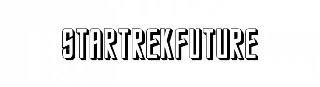
( Fonts by Alphabet & Type: Typography & Graphic - Paolo Vannucci - www.alphabetype.it )
A bold, futuristic font with a 3D shadow effect.
![StarTrekFuture Frei Schriftart Herunterladen]() Herunterladen 548 Downloads@WebFont
Herunterladen 548 Downloads@WebFont -
( Jane Bond )
A casual, handwritten font with a playful yet structured appearance.
![003 Engineer's Hand Frei Schriftart Herunterladen]() Herunterladen 548 Downloads@WebFont
Herunterladen 548 Downloads@WebFont -
![Gaivota Frei Schriftart Herunterladen]() Herunterladen 548 Downloads@WebFont
Herunterladen 548 Downloads@WebFont -
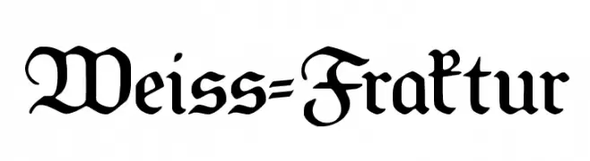
![Weiss-Fraktur Frei Schriftart Herunterladen]() Herunterladen 548 Downloads@WebFont
Herunterladen 548 Downloads@WebFont -
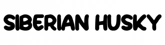
( Fonts by Hanna Bie )
A bold, playful font with rounded edges and a hand-drawn feel.
![Siberian Husky Frei Schriftart Herunterladen]() Herunterladen 548 Downloads@WebFont
Herunterladen 548 Downloads@WebFont -
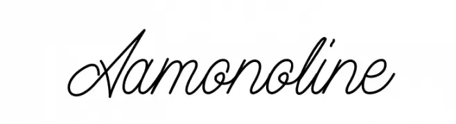
( Magang Letterhend - www.letterhend.com )
A graceful script font with fluid, cursive lines and elegant flourishes.
![Aamonoline Frei Schriftart Herunterladen]() Herunterladen 548 Downloads@WebFont
Herunterladen 548 Downloads@WebFont -
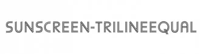
( Fonts by Simon Cozens )
A modern triline font with geometric, parallel line design.
![Sunscreen-TrilineEqual Frei Schriftart Herunterladen]() Herunterladen 548 Downloads@WebFont
Herunterladen 548 Downloads@WebFont -
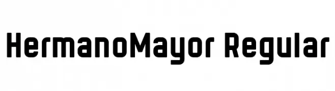
( Fonts by Levi Szekeres - Personal-use only. For commercial use please contact owner. )
A bold, modern font with geometric lines and strong presence.
![HermanoMayor Regular Frei Schriftart Herunterladen]() Herunterladen 548 Downloads@WebFont
Herunterladen 548 Downloads@WebFont -
( Fonts by Zetafonts - Personal-use only. For commercial use please contact owner. )
A modern, sleek font with tall, narrow characters and a clean, professional appearance.
![Heading Now Trial 24 Regular Frei Schriftart Herunterladen]() Herunterladen 548 Downloads@WebFont
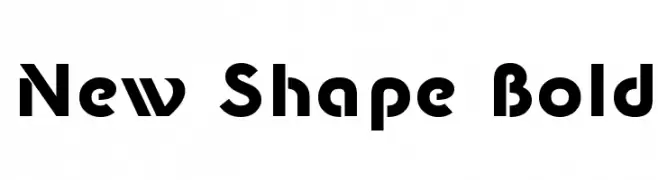
Herunterladen 548 Downloads@WebFont -
![New Shape Bold Frei Schriftart Herunterladen]() Herunterladen 548 Downloads@WebFont
Herunterladen 548 Downloads@WebFont -
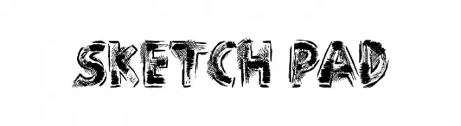
( Font by Jonathan Harris - www.tattoowoo.com )
A bold, sketch-like font with a hand-drawn, artistic aesthetic.
![Sketch Pad Frei Schriftart Herunterladen]() Herunterladen 548 Downloads@WebFont
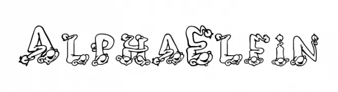
Herunterladen 548 Downloads@WebFont -
![AlphaElfin Frei Schriftart Herunterladen]() Herunterladen 548 Downloads@WebFont
Herunterladen 548 Downloads@WebFont -
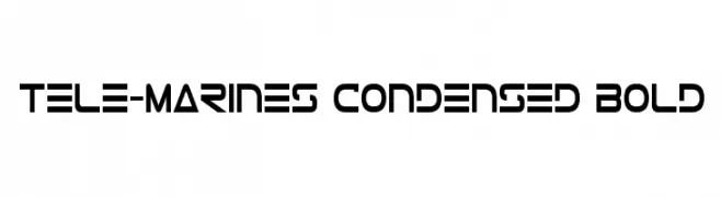
( Fonts by Iconian Fonts - Daniel Zadorozny )
A bold, condensed, and futuristic font with geometric shapes and sharp angles.
![Tele-Marines Condensed Bold Frei Schriftart Herunterladen]() Herunterladen 548 Downloads@WebFont
Herunterladen 548 Downloads@WebFont -
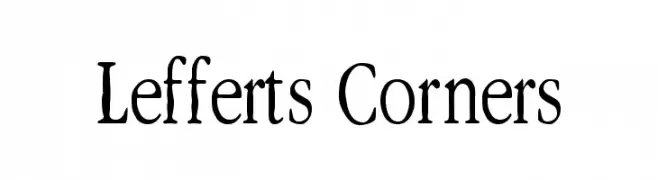
( Fonts by Levi Halmos )
A hand-drawn, artistic font with expressive and whimsical characters.
![Lefferts Corners Frei Schriftart Herunterladen]() Herunterladen 548 Downloads@WebFont
Herunterladen 548 Downloads@WebFont -
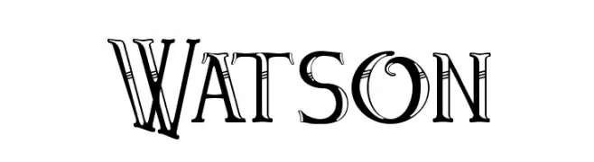
( Fonts by Paul Lloyd )
A decorative font with vintage flair and intricate details.
![Watson Frei Schriftart Herunterladen]() Herunterladen 548 Downloads@WebFont
Herunterladen 548 Downloads@WebFont


Welche Schriften sind gerade am populärsten?
Poppins, Roboto, Montserrat, Open Sans und Lato sind wegen ihrer klaren Formen und breiten Einsetzbarkeit sehr gefragt – von Markenauftritt über Landingpages bis hin zu Postern.
Welche Fonts eignen sich für Logos?
Geometrische Sans‑Serifs (z. B. Poppins, Familien im Gotham‑Stil) sind ein häufiger Griff für sauberes, skalierbares Branding. Für eine persönlichere Note bleiben Scripts und Handschrift‑Stile beliebt. Kombinieren Sie einen prägnanten Headline‑Font mit einer neutralen Brotschrift für Wiedererkennung und Harmonie.
Wie oft wird die Top‑Liste aktualisiert?
Regelmäßig – basierend auf realen Downloads und Interaktionen. Schauen Sie öfter vorbei, um aufstrebende Favoriten früh zu entdecken.
💡 Tipp: Seite bookmarken – Trends wechseln schnell, und heutige Top‑Schriften inspirieren morgen vielleicht das Rebranding.