Willkommen bei den Top‑Schriften – hier treffen Beliebtheit und Qualität aufeinander. Das sind die in diesem Jahr am häufigsten heruntergeladenen und genutzten Fonts. Wenn Sie sichere Optionen für Logo, Web oder Social suchen, starten Sie hier.
Jeder Top‑Font überzeugt durch Balance, Lesbarkeit und Vielseitigkeit. Sie finden moderne Sans‑Serifs, elegante Scripts, Vintage‑Serifs und minimalistische Displays.
-
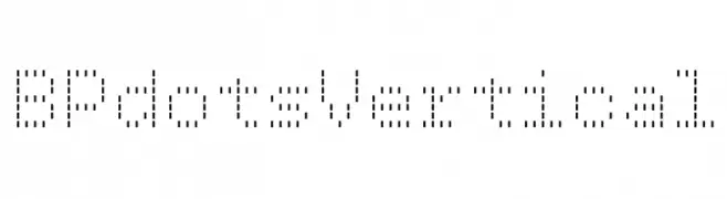
( Fonts by backpacker.gr )
A modern, dot-based font with a digital, pixelated style.
 Herunterladen 111 Downloads@WebFont
 -
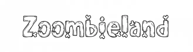
( Fonts by Mehibi )
A playful, bone-themed font with a spooky, hand-drawn style.
![Zoombieland Frei Schriftart Herunterladen]() Herunterladen 111 Downloads@WebFont
Herunterladen 111 Downloads@WebFont -
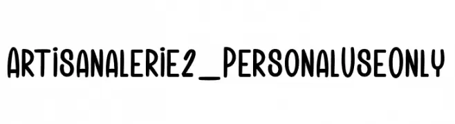
( Fonts by dcoxy - Greg Medina - Personal-use only. For commercial use please contact owner. )
A playful, rounded font with bold, smooth curves and a modern, whimsical style.
![Artisanalerie 2_PersonalUseOnly Frei Schriftart Herunterladen]() Herunterladen 111 Downloads@WebFont
Herunterladen 111 Downloads@WebFont -
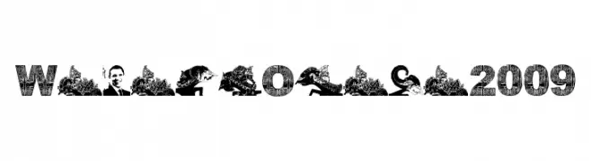
( Asia Culture - Sutrisno Budiharto - www.sutrisnobudiharto.net )
A decorative typeface featuring intricate patterns and cultural motifs within each character.
![WayangObama2009 Frei Schriftart Herunterladen]() Herunterladen 111 Downloads@WebFont
Herunterladen 111 Downloads@WebFont -
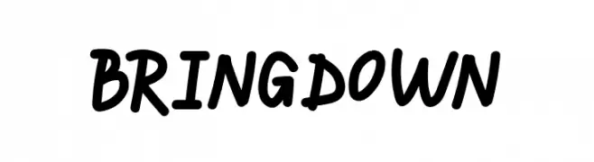
( Fonts by Fanastudio )
A playful and dynamic handwritten font with fluid, slightly slanted letterforms.
![BRINGDOWN Frei Schriftart Herunterladen]() Herunterladen 111 Downloads@WebFont
Herunterladen 111 Downloads@WebFont -
-
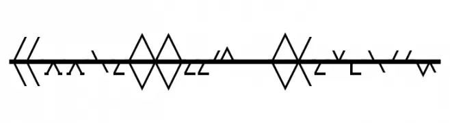
( Fonts by www.omniglot.com )
A decorative, abstract font with geometric and angular designs.
![AppleBeech Regular Frei Schriftart Herunterladen]() Herunterladen 111 Downloads@WebFont
Herunterladen 111 Downloads@WebFont -
( Nuria Casanova )
A modern, geometric font with tall, narrow characters and clean lines.
![Mooky Frei Schriftart Herunterladen]() Herunterladen 111 Downloads@WebFont
Herunterladen 111 Downloads@WebFont -
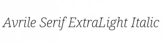
( Fonts by Cristiano Sobral - Personal-use only. For commercial use please contact owner. )
An elegant, extra light serif font with an italic style.
![Avrile Serif ExtraLight Italic Frei Schriftart Herunterladen]() Herunterladen 111 Downloads@WebFont
Herunterladen 111 Downloads@WebFont -
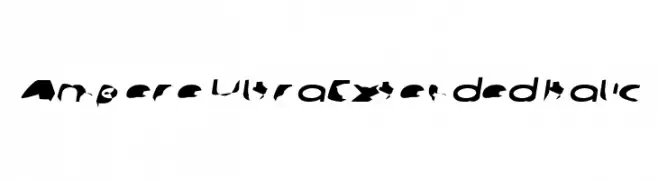
![Ampere UltraExtended Italic Frei Schriftart Herunterladen]() Herunterladen 111 Downloads@WebFont
Herunterladen 111 Downloads@WebFont -
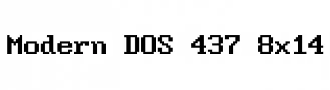
( Jayvee Enaguas )
A pixelated, monospaced typeface with a retro digital aesthetic.
![Modern DOS 437 8x14 Frei Schriftart Herunterladen]() Herunterladen 111 Downloads@WebFont
Herunterladen 111 Downloads@WebFont

Welche Schriften sind gerade am populärsten?
Poppins, Roboto, Montserrat, Open Sans und Lato sind wegen ihrer klaren Formen und breiten Einsetzbarkeit sehr gefragt – von Markenauftritt über Landingpages bis hin zu Postern.
Welche Fonts eignen sich für Logos?
Geometrische Sans‑Serifs (z. B. Poppins, Familien im Gotham‑Stil) sind ein häufiger Griff für sauberes, skalierbares Branding. Für eine persönlichere Note bleiben Scripts und Handschrift‑Stile beliebt. Kombinieren Sie einen prägnanten Headline‑Font mit einer neutralen Brotschrift für Wiedererkennung und Harmonie.
Wie oft wird die Top‑Liste aktualisiert?
Regelmäßig – basierend auf realen Downloads und Interaktionen. Schauen Sie öfter vorbei, um aufstrebende Favoriten früh zu entdecken.
💡 Tipp: Seite bookmarken – Trends wechseln schnell, und heutige Top‑Schriften inspirieren morgen vielleicht das Rebranding.